Update…
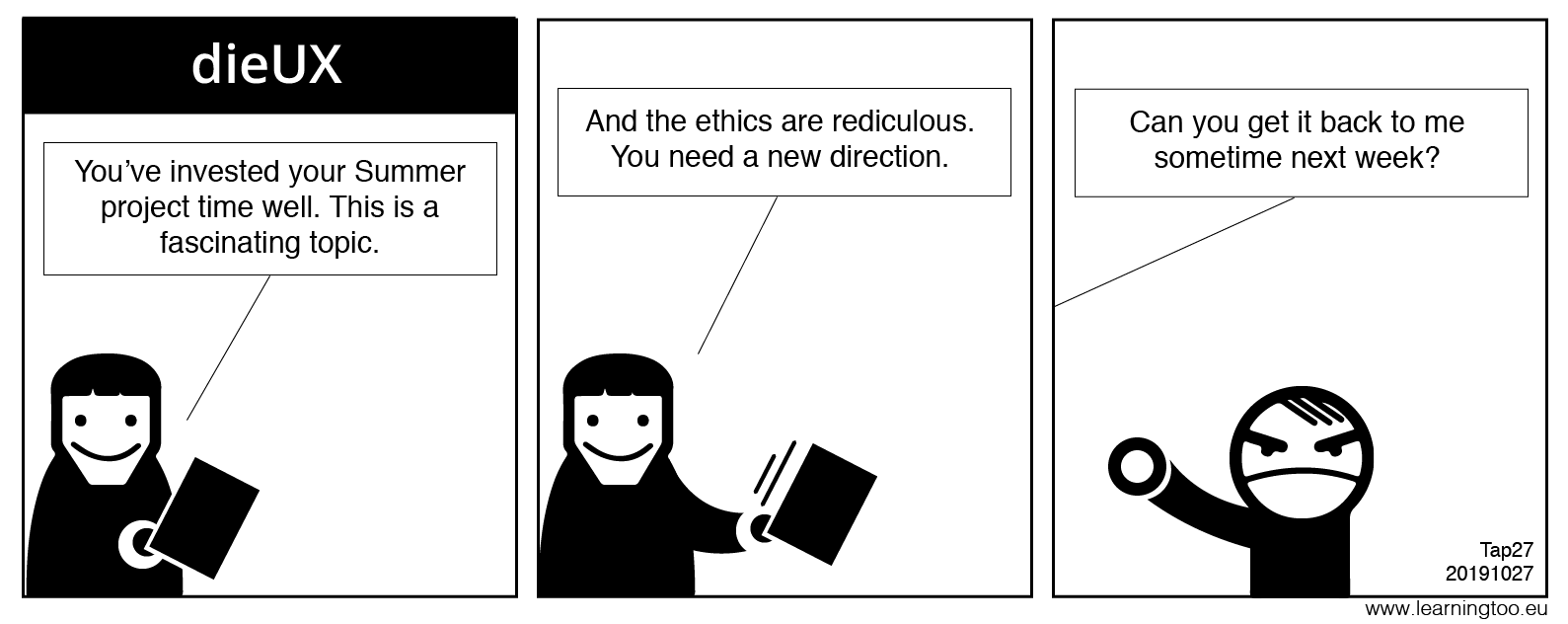
All change! My research on the In-Vehicle Information System (IVIS) ground to a halt and our ethics council were unlikely to enable the study of drivers actively driving on our roads. It’s a shame.
Firstly, I was enjoying the topic.
Secondly, my summary finding is that all IVIS, in-vehicle media and entertainment devices, navigation, information displays, and even rearview mirrors are driver distractions. Designers seeking to employ alternative input paradigms such as thumb scrolling or voice interfaces are missing the point if feedback requires eyes on a display: even a heads-up display.
We’re doomed, doomed, I say.
Accessibility is Ableist?
I am a self-professed accessibility evangelist. At the least, I read some books and keep up to date with accessibility issues and press forward with the accessibility agenda in my design practice. I wish I were the expert others claim. Perhaps I only have a smattering more knowledge than they believe they have? Or maybe I cannot fully appreciate the levels of inclusivity installed in me throughout my career?
What really sparked me off was being presented a book on the close of a teaching contract in 2007 involving my first step towards eLearning, The Art & Science of CSS (published by SitePoint with Jonathon Snook).
- Page one: headings.
- Page 2: hierarchy.
- Page 7. Image replacement.
Throughout that book, the authors drive home the importance of semantic HTML markup and of not introducing unnecessary DIV and SPAN soup.
The Problem
What do I find when I interrogate most webpages in 2019? DIV and SPAN soup and non-semantic and invented interaction elements with trite references to ARIA attributes while still hiding content from the DOM and disadvantaging our users with their own style sheets or disabling Javascript. Even the European Commission can’t advertise their inclusive web policy without stuffing up their use of alternative text on images.
The link block

The HTML
Note: class names are removed for ease of comprehension.
<li class="">
<a href="link_URL" class="">
  <div class="">Making key products and services accessible across the EU: Statement by Commissioner Thyssen following agreement between EU institutions </div>
  <div class="">
   <p class="">
     <img src="image-URL" alt="Making key products and services accessible across the EU: Statement by Commissioner Thyssen following agreement between EU institutions " title="Making key products and services accessible across the EU: Statement by Commissioner Thyssen following agreement between EU institutions ">
   </p>
  </div>
    <div class="">
     <div class="">
      <div class=""><span class="">08/11/2018</span></div>
      </div>
      <h3 class="">Making key products and services accessible across the EU: Statement by Commissioner Thyssen following agreement between EU institutions</h3>
    <div class=""></div>
   </div>
  </a>
</li>
Analysis
- The link block is all selectable however, there is no visual boundary of what or isn’t selectable. In parts, such as over the image, the only change of state is the pointer. Only the
<H3>has a hover state. - The image is not optimised for display within its container. It is intrinsically 1200px wide and displays at 202px wide. The size of the image is incorrect and squashed, which may compound visual acuity. (Performance, data use, and accessibility).
- Unnecessarily placing the image within a paragraph tag. (Using HTML for styling?).
- Placing the date in a non-semantic container and without a reference to its meaning when experienced by non-visual users. I.e. Place within a meaningful context and enable the date to be understood as a date by using an HTML5 container, or appropriate introductory copy text.
- The alternative text repeats the link text, which is not necessary as the
<H3>is the link text.(Not a comparable experience to seeing the image). - The alternative text should either describe the image or if that description is distracting to the experience of the link, left empty. I.e.
alt=" ", or if identity is important—as it is here,alt="Commissioner for Employment, Social Affairs, Skills and Labour Mobility, Marianne Thyssen". (Unnecessarily repeating content for some users, and denying an equivalent experience). - The image title text repeats the incorrect alternative text. The title should assist comprehension of where the link is to go or do. For example, “go to…”, or “Opens in a new window or tab”. (Not a comparable experience).
And HTML isn’t important to UX? Go on with you! This is basic Universal Design stuffed up by the WordPress CMS, which can be better configured by the right developer. (I still struggle with this WordPress blog, too. Horrid.)
A solution?
Let’s give the content semantic HTML landmarks and reduce all that DIV and SPAN soup clutter. We’ll inform our user with a heading and paragraph, and support the experience of seeing Marianne with an informative description of the image. (There’s no need to add, “speaking”, “microphones”, or “dark background”).
The image now follows the text. We may visually recognise the link pattern and read the copy text almost simultaneously whereas assistive technologies may read in a linear fashion. The image’s alt text is not the primary content or meaning of the interaction.
We’ve also used an accessible text-displacement technique to remove unnecessary text from visual users. That content is implied visually by the context which visually impaired users may not cognate.
<article class="">
 <a href="#">
   <h3>Making key products and services accessible across the EU</h3>
   <p><span class="hidden">Learn more about the </span><span class="CAPS">s</span>tatement by Commissioner Thyssen following agreement between EU institutions.<p>
   <p>Published <time datetime="20191010">10/10/2019</time></p>
   <img src="image-URL.file" alt="Commissioner for Employment, Social Affairs, Skills and Labour Mobility, Marianne Thyssen" width="300" height="200">

</a>
</article>
Note: Positioning of the image above the copy text is possible using CSS3. For example, Flexbox or Grid.
What’s so difficult in that reduction in development overhead? 🙂
I KNOW there is a better way. It’s the way I design: content out. And is it best practice? You’re getting the idea. I’m testing my soapbox.
DreamWeaver Fail
Adobe’s Dreamweaver (DW) team fails to adhere to WCAG!
DW is or was once the defacto web development program or application. I use it by preference to manage www.lwarningtoo.eu and started developing with it when still owned by Macromedia way back in 2005.
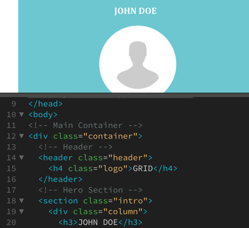
DW 2020 has just updated on my Mac. I explored and found a ‘Grid’ template. Is this a grid CSS template? No, and I am amazed to find a professional development suite offer the accessibility mistake of misusing headings. Seriously! DW has used H3 and H4 headings as visual styles. Who do WCAG accessibility guidelines apply to if not those responsible for educating rookies? Amazing, or what? And what else do they do under the hood if they can’t get that right?
Motivation
As a former Learning Designer, I am ardent in my quest to give all of our users a comparable experience. Not only an inclusive one and regardless of our users’ abilities. I believe that content should lead the UI and UX design and return constant disappointment when the reverse seems normal. I term it, “Universal Experience Design”, which can be confused with Universal Design, which is similar and not as full an experiential approach.
Note: DW 2020’s misuse of headings in a template leaves me exasperated.
Why do we make visual designs accessible to the blind? It requires an overhead in development apparently (rolls eyes in exasperation), and only presents our design to be ableist. Yes, that’s a word. Go look it up and discuss it with yourself in a mirror.
UX design is not all Photoshop and Sketch. I firmly believe it is a technical task. And if our UX designer isn’t technical? Not a problem; we reach out to those who are and we ensure the content is designed for all before we manipulate it to boost our CVs.
Research
From the outset, there is sufficient peer-reviewed research and guidance available to inform accessibility and inclusivity, and a paucity in the area of our providing a fully comparable or equitable experience to all users.
Education
I am hugely disappointed that the MSc UX Design curriculum only skimmed the surface of accessible design. And that surface was on the presentation layer of digital and didn’t once step into our true medium of HTML. There was even criticism when I linked HTML to content architecture.
Potentially, that leaves IADT ‘qualified’ UX designers unwittingly working to an ableist philosophy, no? Perhaps we should explore who informed the curriculum. Top dollar expectations are that their backgrounds are in visual design and do not include the technology of our medium? I don’t know. Maybe we should find out? Why not? It’s not a bad thing?
We only need to communicate and encourage a balance.
Note: It is the over-complication of our HTML that feeds the borrowed belief that HTML is too difficult for UX designers to understand. Simplify the HTML and our UX designers can easily learn its syntax, and police its accessible implementation in our interfaces and improving the experience for our less able users.
Getting Started
I’ve three weeks (A few days the time of writing, in fact) to re-jig my direction and submit my draft Research Proposal, work on our team speculative design project, and earn a living. Forgive me. I’m off…