Published
Where is Search?
Where do we find the site search interaction on a web page? OK, generally we expect it to be at the top right of the page—visually. Sometimes it may move elsewhere—visually. The idiom is generally set.
How do we find the Search feature without the gift of vision? We can navigate through the page tab index. All we need are the necessary flags, or “landmarks”:
- Orientation to the Search feature.
- A label.
- A text input (type=”search” is desirable), or dynamic select or data option group.
- A Submit button.
The design pattern appears logical. Often, its location is not. For example, if Search is included within the site navigation blocks, the HTML may be located at the base of the file. Is Search a navigation element? There’s no right answer. Guidance is sketchy in places or conflicts in others. We may investigate that later. Our emphasis is for now on the Search component.
Examples of the Search Component
Although our expectations of Search include a form element, it is always surprising to find Search components made from anything but form controls and inputs. ARIA to the resue. Why?
More commonly, and particularly when “created” by a CMS, the Search component comprises at the least a text input. Sadly, little else. Figures 1 and 2 are examples.
<div class="search-container">
  <form action="/search" method="get" class="search">
    <input type="text" name="query" placeholder="Search..." size="20">
  </form>
</div>

The ‘sins’ committed are:
- No label.
- Using an input type of Text and not Search.
- Using the placeholder attribute as a label.
- Using three periods in place of the correct horizontal ellipsis markup:
…, for example. - No executable Submit button.
- There is no instruction to press ENTER or RETURN to submit the query.
Note: The <div> container may be unnecessary as the <form> is a block-level element, which can be styled—just like a <div>—using CSS.
<div class="soa-control-cm-top-search-container soa-ui-cm-top-search-container">
  <form class="search-form">
    <p class="search-p">
      <input type="text" name="keyword" class="ssearch-input" placeholder="Search" value="">
      <button type="button" class="search-button"><span class="icon-search">Go</span></button>
    </p>
  </form>
</div>

The ‘sins’ committed are:
- No label.
- Using an input type of Text and not Search.
- Using the placeholder attribute as a label.
Notes: The <div> container may be unnecessary as the <form> is a block-level element, which can be styled—just like a <div>—using CSS. The button ‘hit area’ is CSS-styled at 16 pixels by 16 pixels, which is smaller than the 36 to 42 pixels recommended in, and depending on varying guidelines.
An Improved Search Component
If we write our HTML semantically, we can give a clear indication (available to the DOM) of the interaction. See Figure 3 for an example. We can also provide semantic elements on which to pin our visual styles and provide a future-proof environment in which to home additional search feature buttons and, or instructions.
<form id="searchForm" role="search">
  <fieldset>
   <legend>
     <span>Search</span>
   </legend>
    <label for="search">Search<span class="hidden"> our website</span></label>
    <input id="search" type="search"/>
    <button id="searchSubmit" type="submit"><span>Go</span></button>
  </fieldset>
</form>
The default HTML renders accessibly by default in DOM and the browser and with CSS and some JavaScript, can be styled and animated as desired. (Caution the label displacement interaction needs a careful design not to confuse some user groups.) The <label for=""> attribute is highlighted. It is a priority requirement for accessibility and usability that labels have this attribute with a value equal to the input id.
Note: An ARIA role of “search” is added to the <form> tag to demonstrate where, although the form has its own semantic meaning, we can reinforce the exact meaning of the Search form for those who can access ARIA. This is a move toward a comparable experience for blind users who may better recognise the Search idiom sighted users may learn and take for granted. More on ARIA elsewhere.
Forms generally have business rules to determine how they will operate to facilitate our users’ journey. The Submit button can be programmatically tied to the form, which enables its activation on pressing the ENTER or RETURN key on the keyboard. Error management requires at least one or more letters to be typed into the input before the button is “enabled”.
The approach is flexible and can contain additional controls such as a button for “speak your search” (microphone icon) and, or others including filters, etc. It’s a form after all.

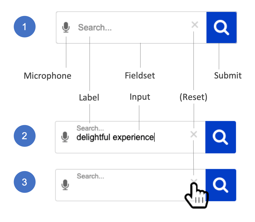
Note: The “speak your search” (microphone icon) button is encoded before the Search label. This helps our less able users who may need to use it will encounter it first in the DOM. This avoids the frustration when the button is discovered only after making the effort to enter text into the search input. As always, the visual and encoded positioning will depend on your application and testing.
“The CMS Done It!”
Codswallop.
The CMS page is created, “on the fly” when it loads. A server-side script such as PHP compiles the HTML from components. The components are often associated with themes. Themes and their components can be updated. There is no excuse for shoddy UI even when created by a WYSIWYG CMS.
Summary
The visually presented Search interaction is easily and accessibly created to offer a comparable and equitable experience for less able users.
Care remains over how search results are presented. And that’s another story…