Published
Introduction
As part of my research project, I have scheduled building a web page to test and compare across different carousel and other design idioms.
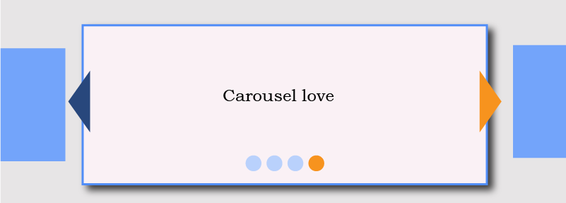
Carousels
The carousel (and slideshow) interface is a popular method to present small pieces of visual content. It is widely criticised as an ableist visual strategy that makes our less able users work harder than our fully able users to navigate or even to access the content.
Like the tabbed content pattern, carousels on web pages and platforms are often created with frameworks that spu DIV and SPAN soup (barfff). From my studies, the better ones sport navigation created using a script. Better ones still consider how our keyboard users may become trapped within the slides. Better still carousels may receive a wide array of ARIA attributes to make their creators feel a little better about having tried to make the pattern accessible.
You may detect some hubris toward carousels? I prefer the term, prejudice. They have been a bain of eLearning—the never ending stream of Next and Previous buttons witless instructional designers string together in the hope of claiming an interactive and engaging product. News: clicking is not engagement!
Attitudes
Our industry seems at best ambivalent toward carousels. Popular frameworks invent complex versions that can meet WCAG and we know that when designed and executed right, they are “accessible” to our blind users. And here’s that boundary I am looking for between defining what is “accessible” and what provides a comparable experience to fully able users.
The best advice appears to be not to use carousels at all (See Pernice 2013; Nielsen 2013). And they remain so handy in the pressured world of screen real estate and visual aesthetic habit.
“Accessibility is hard. And it gets super complicated fast when you want to do it right…not so much because of how complex each Success Criteria is. Some of them are a bit cryptic, granted…After all, there’s a reason why hundreds of “Understanding” pages are needed to explain what WCAG is really about.”
Boudreau goes on to extoll the virtues of Nielsen’s 10 usability heuristics, which are undoubtedly applicable to guide the accessible experience of our visual (read, “ableist”) design patterns.
“Research has shown that approaching accessibility through the lens of these heuristics is better adapted to how we think as designers.”
I must add a large caveat. Excusing our ableist design by reason our less able users can use them is not the same as designing inclusive experiences. It fails to appreciate the additional work so many ableist design strategies impose on some users in order to access some understanding of what has become a complex interaction.
Issues
There are many. You know.
Attraction
Nielsen (2013) noted that carousels are not the ideal place to place essential content. In his studies, users overlooked the carousel. The explanation is “banner blindness”. I guess that’s much the same as in any health provider’s waiting room where countless information leafless litter the walls unnoticed save to take in the colourful effect their cluttering can have against the battered paint and chipped plaster. I digress.
Let’s not ignore the fact of Nielson’s being totally ableist in assessing the carousel from only a visual perspective. ‘Just saying.
To avoid our users’ overlooking the carousels, front end developers added whiz-bang animation to attract our users’ visual attentions. Carousels automatically animate between slides and often with scant regard for reading speed or other cognitive considerations. I guess their additional code complexity resulted in a proliferation of images with text, which may remain a habit on some sites. There’s nothing better than a WCAG-compliant slideshow of speeding alternative image texts when images fail to load. In the old days, we called that scrolling text. Ticker-tape. Basically a near useless if only irritating content presentation strategy.
And how does this work for our users relying on audible cues of what is, or is not available to them and how to navigate it?
JavaScript
The Mozilla developer website explain how, when using JavaScript on a web page we must consider a back-up plan for when JavaScript is not enabled in a browser. WHAT?! People use browsers without JavaScript enabled? Poppycock!
Actually, the last survey on JavaScript use in the UK showed just less than 1% of website users had JavaScript disabled in their browser. That’s nothing? Well, 1% of the UK’s Internet population is 1% of 99% of UK adults who used the Internet in 2018 (Office for National Statistics 2018). Thats over 500,000 people; half a million. I thought you should know that.
I accept that there are some things that I may not be able to do without JS and that’s fine, but equally I expect that basic functions that can easily be delivered purely through HTML+CSS will be, and that I won’t be blocked from accessing those basic elements of a site.
Stevie_D. (2013, February). Re: Who has javascript turned OFF? [Messaging Board]. Retrieved from https://www.sitepoint.com/community/t/who-has-javascript-turned-off/27257.
HTML
Semantic HTML is largely accessible out of the box. Yet most frameworks feck it all up with their lazy components made from DIV and SPAN soup (barrrf!).
Seriously, how can anything so amazingly clever as these incredibly useful frameworks present such a dumb code signature? To top it off, to fix the accessibility issues and to comply with WCAG, they throw ARIA attributes around and sometimes, get them in the right places. I liken it to slashing someone in the face with a broken beer bottle to grab attention; unnecessary; effective. Don’t worry. Here’s a bandaid. Everything is better. (Too much? Maybe). Why not just talk?
Remember:
- HTML for content.
- CSS for presentation.
- JS for function.
ARIA
I’m looking for an answer on whether ARIA is universal yet, or not. In the meantime I recall this from Heydoworks, (2016):
“We need to talk about aria-controls. It’s poorly supported, does very little, and does what it does when it does badly. It is poop and we rely on it way too much. We are short-changing assistive technology users when we do.”
Developers and Engineers
Why—and really, why does any developer choose to employ DIV and SPAN soup in place of semantic HTML elements and then go to all the effort to add additional ARIA attributes to make claim on accessibility?
Sorry. I am not a developer so forgive me when I label such thinking as Arrogant madness. I get that some creative interactions and presentations are far more complicated than my tiny mind can appreciate and then, a carousel? Oh, come on. Someone is being silly if they can’t employ some form of recognisable element other than DIV and SPAN?
Heydon (2019) calls the developer an a’hole. Here’s an extract:
PATIENT ACCESSIBILITY ADVOCATE: But, wait, a minute ago you didn’t seem to know what accessibility even is? In any case, the Domino’s case sets a legal precedent whereby—
DEVELOPER: LAWS. Do we even need them? Fecked if I know. Take away the laws, and what do you get? Freedom, that’s what. Give me the FREEDOM to make my websites accessible, that’s what I say.
PATIENT ACCESSIBILITY ADVOCATE #2: You already have the freedom to—
DEVELOPER: Make all my websites just with
<div>s. That’s what I’ll do. That’ll teach the standards b’stards to make me not make my websites accessible. Tough love, someone’s gotta do it.ME: First of all, that doesn’t make sense. Secondly, you’re being an a’hole. Just take the time to—
DEVELOPER: GAH!!!! ARRGGHHHHH!!!! NO!! NONONONO!!! PLEASE NO!!! STOP!!!!
PATIENT ACCESSIBILITY ADVOCATE: What’s happening?
ME: I’m not sure.
DEVELOPER: That word. That word you used on me. That “a” word. I… I’ve never… never in my life have I…oh God
ME: You can’t be seri—
DEVELOPER: I was just asking questions, that’s all, *sob*. And you just… went for me. Like I was nothing to you. Can’t you see I’m just a poor wee baby, with pink marshmallows for limbs, and a candy floss heart? Just asking questions, I was. Just asking.
Unfair? Not always. Someone has to take responsibility and stop pushing ableist design drivel? Who, if not the developer?
So the designer fails to include accessible adjuncts to their design. Who spots that? It MUST be the developer (who will aim to test for “compliance” at the least, no?) Not enough time or resource? Then the developer should press the team for the necessary support. Who else? Certainly not QA—that’s too late! The products already messed up and will be very difficult to reverse engineer.
Compliance
“Compliance” with the laws and regulations supporting WCAG is often a mockery. An image can be “compliant” because it has a height, width, and alternative text. It’s nominally accessible. It doesn’t mean the image is optimised, or that the alternative content has a comparable meaning or impact to the visual representation.
The Carousel
So, if we look for an out-of-the-box solution we can only be concerned for it’s value. If it proves to support one of the “issues” above, then it will be very difficult to remodel its engineering to make it work to expectations.
We could look to W3C’s example ARIA-supported carousel and discover it carries the DIV and SPAN soup (Barrfff) flaw. Obviously because it is an example of fixing crap with ARIA, which we know isn’t as widely supported as we have been led to believe. Heydon (2016) suggests this may improve as ‘standards’ are adopted across technologies and we know how that works–not.
In education, we are often concerned that by exemplifying a poor practice that poort practice is learned and adopted as common and then the expected practice: a Ouroboros cycle of decaying standards. In my opinion, we’re there already. Too much has been invested in the staus-quo and as it proves “compliant” there will be no appetite to improve. Until, that is, our less able users still take the big companies to court because their experience is still discriminated by ableist design. It is not comparable and, or equitable to that of our fully able users.
Looking for solutions
The solution needs a process. The one I will try to work to is based on my ‘upbringing’ within the design cycles of inclusive eLearning design and my early-most reference books:
- Adams, C., Bolton, J., Johnson, D., Smith, S., & Snook, J. (2007). The Art of CSS, create inspirational, standards-based web designs. Collingwood, VIC, Australia: Sitepoint.
- Grannell, C. (2005). Web Designer’s Reference: An integrated approach to web design with XHTML and CSS. New York, NY, USA: Friends of Ed.
- Sydik, J. (2007). Design Accessible Websites. Raleigh, NC, USA: Pragmatic Bookshelf.
More recently, I have found the following books most useful in their profession of an accessible experience:
- Horton, S., & Quesenbery, W. (2013). A Web For Everyone, Designing Accessible User Experiences. Brooklyn, NY, USA: Rosenfeld Media.
- Pickering, H. (2016). Inclusive Design Patterns, Coding Accessibility Into Web Design. [Kindle Edition]. Retrieved from Amazon.co.uk.
In common, they each put our users first and follow graceful degradation.
Graceful degradation to semantic HTML
We see little mention of that now so many of our industry’s staff enjoy lightening-speed broadband connectivity. Yet, out in the styx, many of us still enjoy connection speeds closer to 4 Mbps than the dizzying heights of 16 Mbps at which point many townies start complaining.
Graceful degradation also enables our users’ choice to engage with our CSS and script files. The idea is to enable the content to be accessed–and enjoyed as basic HTML, which is something of a litmus test for the strategies’ success criterion.
The strategy requires us to code with semantic HTML, which many will tell you cannot be used for more complex interactions and information presentation and media. That’s true. Only, that content’s alternative CAN be semantic AND accessible AND still facilitate our users’ tasks. HTML5 even extends the possibilities of HTML tags and data in the browser. For example, accessing local storage.
That’s not to occlude scripts from our carousel. It simply means the content is available to read and enjoy be everyone under as many circumstances as we can imagine there being, or needing to be.
CSS to style
We know this. CSS also contains some aspects of function:
- Transitions
- Transformations
- Animations
Using these alongside semantic markup and landmarks, we can go some way to building an accessible carousel and offer a comparable experience to our able users for those with degraded abilities. The current script-first carousels present a challenge to understanding for some of our less able users with complex controls and messaging via ARIA (if it is enabled in the browser). This is exacerbated when scripts introduce CSS attributes, where scripts should only update the presentation using classes.
Inclusive Design
When HTML content is removed from the DOM using the HTML “hidden” attribute (hard-coded into the page) and scripts fail to remove the attribute, content may be excluded from our visual users experience. That’s hardly inclusive design?
We use Show and Hide techniques to remove visual clutter and reduce cognitive overload caused by either the scale or choice of content to consume. Our users are fickle, we are told. And that’s OK when the visual idioms on the page indicate that content has been hidden. Audible Show and Hide idioms are also possible for screen-reader and Braille display users. Do they need to be? It seems that they may already be challenged only navigating our content audibly without the ability to scan (as quickly) as sighted users do.
I’m hoping to discover the preference. Most accessibility references appear to demonstrate how to cope with poor design. Few suggest the ideal.
Alternative Content
Alternative content crops up a lot in this discussion. From eLearning design and more recently too, my colleagues failed to understand that video content isn’t always appropriate to closed caption, or to transcripts.
Branching scenarios were particularly tough–they thought. The key is to understand the content, it’s context, and the learning or end-action expected of our users. From there it’s a doddle: branching video scenarios; long assessments; image-based content delivery by video and audio. Written well, the alternative content delivers learning as effectively.
Yes. Alternative content is not restricted to alternative image text attributes or captions. The longdesc is dead, long live the long description! Seriously, it does. It has only taken a different form. We offer the alternative content to everyone rather than only to those who can perceive the image longdesc attribute. That’s inclusive design right there, no?
Designing a Prototype to test
What do we need our carousel to do?
- Provide the content in a digestible format.
- Provide semantic content semantically in the HTML.
- Enable navigation through and around the content within the HTML.
- Enhance the style with Show and Hide to ease visual cognition, comprehension, and understanding.
- Style for usability.
- Add scripted functions to enhance the former and to add functions where there is no alternative to using scripts.
- Test with CSS off and Scripts on; Scripts off and CSS available; with no CSS or Scripts.
Content
I’ve chosen visual content that needs more than alternative text for blind users to comprehend it. My cartoon strip will do nicely. There is image text and visual cues that need careful writing in an alternative format. Clearly, not all the visual nuances can be communicated, only the essence is intended experienced in an improved format to only image alternative text.
Usability
The page usability strategies are intended to enable the focus on the comparison between the experience of the proposed solution vs. an existing one:
- Content is simple and the three-columns-abreast cartoon strips will show as three rows in narrower viewports. The intention is an inclusive experience, after all.
- Visual design will avoid pretty and stick with a high-contrast and monochromatic theme to match the black and white of the cartoon strip. The rest depends on the prototype architecture and build, I guess.
It is intended for screen reader users to navigate between the page content easily and for visual users to operate the content presentation idioms using a pointer or keyboard. Inclusive design, of course.
The hard part perhaps–as I am not a developer–is to encompass all these great promises within the carousel.
Experience
This is difficult to ensure. The content may not appeal to everyone and certainly not to people outside the topic’s homeland of design. As I am not testing a demographic with a shared interest, it’ll need to do.
Summary
A carousel is ill advised and still we employ them as an everyday idiom. Our blind users must learn and navigate the visual idiom audibly. That’s a burden on their cognition and possibly a distraction from the content when there is no standard carousel pattern identified.
ARIA is a bandaid and not known to be available to everyone. Our less able users may not have the financial capital to purchase the latest assistive technologies. We cannot assume ARIA or indeed our advanced HTML and CSS will assist them, or whether it will impede.
And that’s the test. Can we provide a comparable and, or equitable experience of visual content to our non-visual users while including pretty much everyone. Perhaps too, without prejudicing the strengths of the carousel pattern exalted by marketing teams and web developers stuck in their frameworks and other funny ways.
I’ll give it a go.