This Ulster Bank iOS app review is compiled using an iPhone 6 on September 28, 2018, and combines a heuristic review and resulting opinion measured against widely available usability and accessibility guidelines.
A usability heuristics quick reference (Neilson 1995) was used to summarise Neilson’s (1994) researched review process. W3C (2018) Web Accessibility Initiative WCAG AA standard was employed as a general accessibility and usability “rule of thumb”.
The review includes the user interface (UI), user experience design (UX), and universal experience (the experience beyond the viewport). A review of the universal design is restricted to that appearing in the presentation layer as an interrogation of the HTML was not available.
Impressions
Onboarding
Onboarding needs simultaneous cell and data/Wi-Fi connection. The process fails when SMS is not available. During testing the poor cell signal was not noticed and the failure of repeated code requests was unexplained before a cell was reconnected with.
Security risks
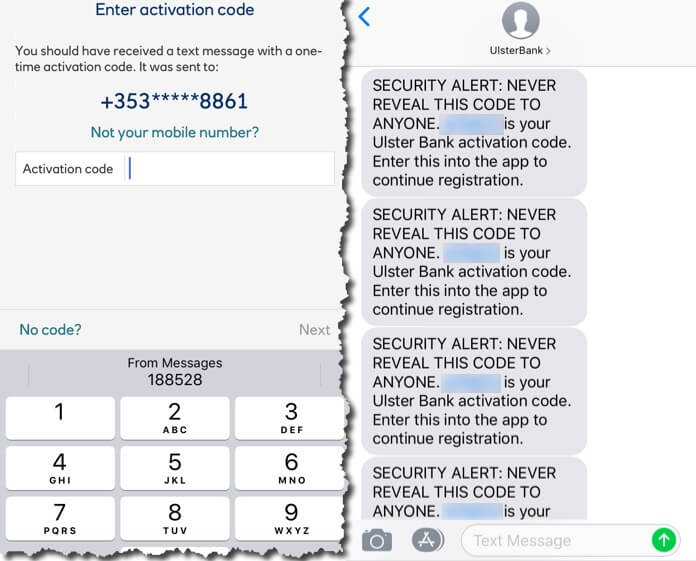
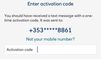
SMS of activation codes. iOS displays incoming SMS content on a locked iPhone screen. The app SMS carries an activation code that is potentially available to anyone where the SMS specifically instructs NEVER to reveal the code with ANYONE (Figure 1). And here’s a UX design dichotomy: when the SMS arrives while in the banking app, iOS will reveal the first portion of an SMS in a dialogue overlaid over the app. This is useful if the code is viewed, remembered, and recalled within the time it displays within the app experience. On the other hand, on the homepage, the code should not surface in the preview?
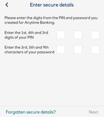
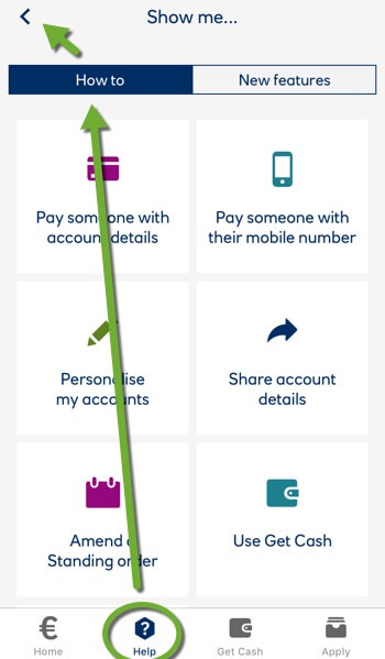
Memory. Our users must remember seldom-used Anytime Banking credentials when calculating character positions (Figure 2). An app access PIN is created and remembered. Our users may note their credentials for reference. This security risk is a consequence of the app design unfairly made our users’ responsibility.
Session security
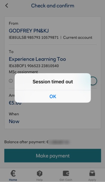
The session timer does not account for journeys out of the app. The session can time-out during our user tasks when active in the app and frustratingly losing all inputs (Figure 3).
Task models
App tasks are generally easy to choose, understand, and to complete flows. Examples at Appendix 2.
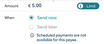
Task flows may benefit if forms complete outside the security firewall. This would enable quick app-swapping in iOS. App-swapping otherwise causes logging off. This also mirrors real-world form-filling in a branch. (See Appendix 3).
There are management options made available in the Pay task flow UI that should be relocated to a settings area to simplify the flow by removing a page and also to better organise the information architecture into Do and Manage flows.
Performance support
Errors are managed. Support is available. Strategies display an inconsistent design (Figures 4 and 5).
Inconsistent UI
The UI follows many axioms. There are inconsistencies. These may cause additional effort and learning particularly with the secondary (top-right) navigation and the choice of the homepage icon.
Accessibility
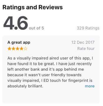
Accessibility is reviewed positively on the App Store website (Figure 6). Testing is outside the scope of this review.
Copy texts
Copy texts meet digital consumers’ needs clearly in a semantic hierarchy of headings and scale. Font colours and styles convey interaction inconsistently. The designers could improve copywriting with a reference to the guidelines at Redish (2007) or Microsoft (2012), particularly around link writing and instructional texts.
Design and Brand
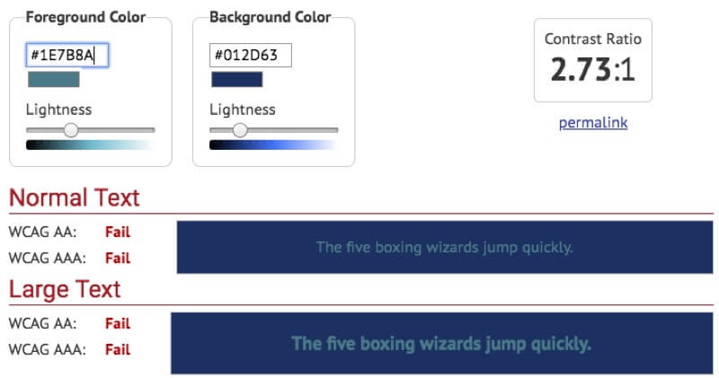
The white space and limited colour pallet reflect the bank’s branding. Colours are not applied consistently across the UI’s visual dialogue (Figure 7). Contrasts do not always meet the W3C (2016a) visual contrast guidelines easily assessed using Webaim’s (2018) Color Contrast Checker (Figure 8).

Controls
Controls are inconsistent and serve art direction over common sense or axiom. (Skip to Buttons and links for examples).
Breadcrumbs
There are no breadcrumbs. The Back button (Figure 9) returns the app to a previous state. Page headings describe page tasks. As some UI elements use a chevron to suggest an anchor links movement to another page, partnering the heading and Back strategy risks confusing our user with where the chevron actually goes as the heading appears to be its label.
The Permanent navigation is given a breadcrumbing strategy and the contrasts between the dark-grey and blue are too low to be visually noticeable.
Permanent navigation
Permanent navigation (Figure 10) is positioned fashionably for thumb reach. Four buttons are labelled. Icon signifiers convey no meaning increasing learning effort. The useful labels are tiny.
The Home button does not always return our user to the homepage. It appears to navigate inconsistently to the last page in a flow commenced from the homepage. This may further disorient our user and confuse what is actually the homepage (as recorded by two independent user tests available as videos in Blog 1).

Breadcrumbing is attempted indicated by the icons changes in colour and the contrast is again too low (at 2,25:1). A contrast of at least 4.5:1 is recommended. To include our users with colour perception differences, a change of shape is recommended, too. Colour should not be relied upon alone to indicate a change in system status (W3C 2016b).
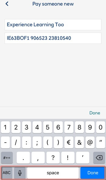
Access to the primary navigation is removed when iOS keyboards display (Figure 11).
Secondary navigation
Secondary navigation is positioned top-right displaying contextually and one interaction at a time in the same space (Figure 12). This makes the inconsistent UI conspicuous.
Some Next and Continue buttons display here. This is not ideal for Western reader’s top-left to bottom-right eye journey pattern.
Profile settings are in the Secondary navigation. Promotion to the Primary navigation may improve access, motor and cognitive effort or at the least making the display of the icon permanent in the secondary navigation.
Buttons and links
App controls meet UI guidelines for buttons to update page content and links to navigate named anchors and pages. Visual design and copy is inconsistent (Figures 13 to 18).
UI display features
- Overlays meet axioms. Close button position meets the iOS/Mac axiom; top-left.
- Where many carousels are each of three slides, signifiers are three pagination ‘dots’ perhaps too similar to the horizontal “kebab” menu in the Secondary navigation and perhaps confusing an ellipses’ indication of, “more” with the similar, “menu”. Our user is uncertain of what will happen: new menu or next slide?
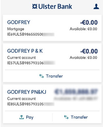
- Account cards meet popular “material” fashion. When they are clickable or not needs better communicating.
Page flow
Generally, pages “drill-down” as expected. Sub-tasks open on new pages where they could be included more centrally on the form or in an overlay over the form, reducing the navigation away from the main task. An example is within the international payee flow, requiring a choice from three radio buttons.
Forms
Form errors are managed by the disablement of the Submit button.
Some inputs require retrieval from outside the app causing our user to traverse app security again.
User testing
User testing the live app cannot compare to a paper prototype test. The media and experiences are too different. The Ulster Bank app was converted into a paper presentation although our narrow project scope negated narrowing the experiences further.
The test candidates were briefed to complete the Pay and Transfer tasks. Pages were added and removed to represent progress through the app.
Brief
Using the paper prototype, show and explain to the moderator what links and buttons you want to press to complete the task.
- Task No. 1.
- Make a payment from your Main Account to My Best Friend.
- Task No. 2.
- Transfer funds from your Main Account to your Future House savings account.
My project teammate, Goran Peuc User Tested a paper-styled emulation of the Ulster Bank app presented on a device:
My own testing used paper cuttings to mitigate any discrimination between the real-world app’s presentation and that of our paper prototype. I did not test the Transfer flow as there multiple flows of interest were tested within the Pay flow.
Each test gave valuable insights. The paper-style also introduced distractions. An analysis and our discriminatory opinion determined which was which.
Results
Each candidate completed the tasks. The paper presentation created unrealistic usability difficulties while also highlighting issues with control positioning. Representing keyboard input was one area the paper presentation could not replicate.
References
Microsoft, (2012). Microsoft Manual of Style (4th Edition). Redmond, WA, USA: Microsoft Press.
Nielsen, J. (1994). Enhancing the explanatory power of usability heuristics. Proc. ACM CHI’94 Conf. (Boston, MA, April 24-28), 152-158.
Nielsen, J. (1995). 10 Usability Heuristics for User Interface Design. Nielson Norman Group. Retrieved October 8, 2018, from https://www.nngroup.com/articles/ten-usability-heuristics/
Redish, J. (2007). Letting Go of the Words: Writing web content that works. San Francisco, CA, USA: Morgan Kaufman.
W3C (2018). Web Content Accessibility Guidelines (WCAG) Overview. W3C.org. Retrieved October 8, 2018, from https://www.w3.org/WAI/standards-guidelines/wcag/
W3C (2016a). Techniques for WCAG 2.0, G18: Ensuring that a contrast ratio of at least 4.5:1 exists between text (and images of text) and background behind the text. W3C.org. Retrieved October 8, 2018, from https://www.w3.org/TR/WCAG20-TECHS/G18.html
W3C (2016b). Techniques for WCAG 2.0, Use of Color, Understanding SC 1.4.1. W3C.org. Retrieved October 8, 2018, from https://www.w3.org/TR/UNDERSTANDING-WCAG20/visual-audio-contrast-without-color.html. W3C.org. Retrieved October 8, 2018, from https://www.w3.org/TR/WCAG20-TECHS/G18.html
Webaim (2018). Color Contrast Checker. Webaim.org. Retrieved October 8, 2018, from https://webaim.org/resources/contrastchecker/