☰ Navigate this post:
Published October 25, 2018
Goran Peuc and I formed the P&G UX Team for this inaugural project.
Executive summary
As of October 9, 2018, our (Goran Peuc’s and my) research and app reviews suggest the Ulster Bank iOS app offers a satisfactory user experience (UX).
We find the user interface (UI) and task flows have inconsistencies that may confuse orientation and increase cognitive and motor effort. An improved visual design language and combining different Pay streams may elevate the usability and UX to expectations and onward to delight.
Heuristic evaluation
Nielson’s heuristic evaluation checklist (Nielson 1990) offers ten criterion useful to guide a user-centric app review. The (W3C) Web Content Accessibility Guidelines (WCAG) add detail (W3C 2018). The design principles, usability and UX goals in Preece, Rogers, and Sharp (2015) also give context to Krug’s (2014) user insights.
I reviewed the UI, flow, and resulting user and universal experience. (See Figure 1). The review is available at Appendix A.
To remove any confusion between the terms Universal Design and Universal Experience Design:
- Universal Design
- Designing the accessibility, usability, and learnability of products to make them available to the widest range of people (users) regardless of ability.
- Universal Experience Design
- Designing the universal impact of the product and enterprise across their widest influences on the user experience from conception to reflection.
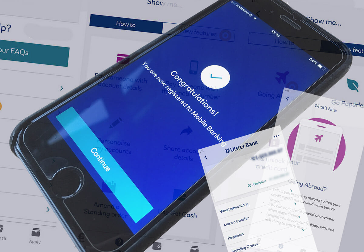
The Pay and Transfer banking tasks display prominently on the Ulster Bank iOS app homepage (Figure 2): we assume, following research of our users’ priority banking needs. They formed the initial foci of our evaluations.

We determined with the support of competitor analysis that Pay and Transfer mean the same. The destination of funds differs: to an external payee or to a sibling account. The Bank of Ireland app uses only the Transfers term (Figure 3).

Setting up and the security experience
Downloading the app from the Apple Store and installing on the iPhone worked well. Setting up security was a distraction to the overall experience.
Cell connection
Connected to the internet via Wi-Fi, the onboarding process cannot complete without Two-Factor Authorisation (2FA) via SMS over a cell signal. When the problem was understood and corrected, four SMS messages arrived at once.
Due to contemporary issues with cell signal transmissions in Ireland (The Journal, 2018), cell coverage differs from network to network depending on topography, architecture, and phone storage.
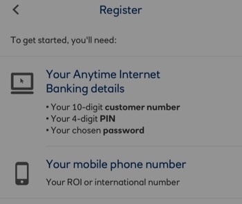
A “Cell signal” is not listed as required to get started (Figure 4) with;
- 10-digit customer number
- 4-digit PIN
- Password
- Mobile phone number
The memory of an elephant?
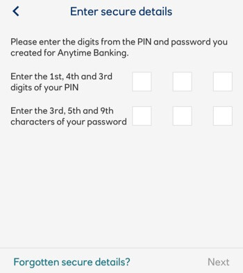
Authorising the app takes cognitive and fine motor effort to remember, visualise, and then dissect and input the:
- 5 to 8-digit app passcode
- Anytime Banking PIN
- Anytime Banking password
Recalling specified characters from seldom used credentials is difficult (Figure 5). It encourages noting down codes to count and identify characters (Preece et al, 2015) devolving responsibility onto our user given Ulster Bank’s Mobile Banking Security guidelines (Ulster Bank 2018) stating not to.
The patience of a Saint?
On-boarded, our users can set up Touch ID to replace entering the app PIN to log on. This is handy as the app frequently logs or times out.
Note: Apple Touch may have been “killed” since iPhone X (Franceschi-Bicchierai, 2018).
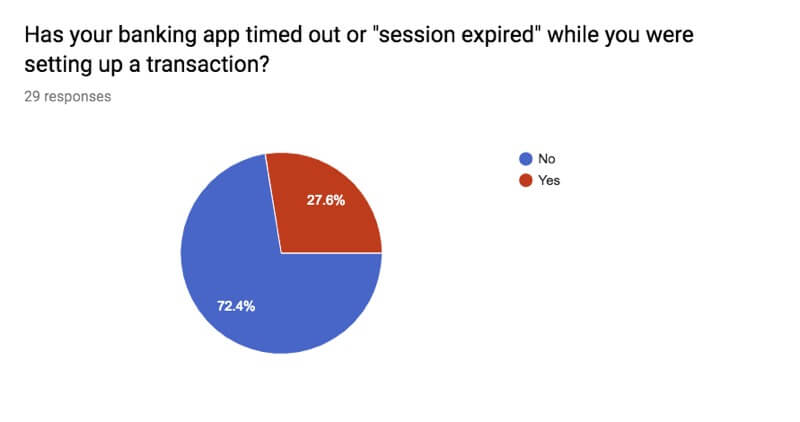
The session timer appears to count from opening the app. Counting from the last interaction is expected? Sessions time out frequently and during transactions, and losing our users’ input (Figure 6): a frustrating and unnecessary flaw.
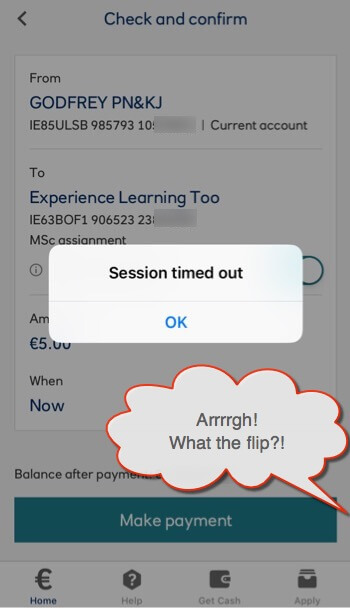
Banking app user research (at Appendix A to Blog 2) revealed 27% of 29 respondents had experienced a session time-out during a transaction (Figure 7). That’s 1 in 3: this needs addressing.
I explored a new task model (at Appendix C) to allow drafting and saving forms offline for secure transmission later. Unknown regulatory considerations and 85% of my research respondents being overall satisfied with their app’s experience (Figure 8), this flow was moved outside our project scope.

Using the app
The homepage lists accounts and balances on UI cards. We tap them to drill down to account tasks grouped by “Pay” topic and not by “Pay” task models.
Priority and Frequent tasks
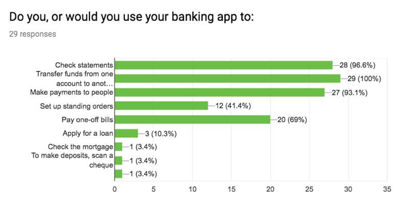
Our banking app user research suggests our users prioritise Pay-type tasks (Figures 9 and 10) and use them most frequently. We assume the app promotes these tasks deduced from similar findings.

Task models
Generally, the Pay and Transfer task models (at Appendix B) are easy to follow, logical and simple to complete. We looked for opportunities to “prune” the app.
User testing
We determined that testing a live app against a paper prototype was weighted toward the UI experience. Goran created and user-tested a paper-styled click-thru of the Ulster Bank app on an iOS device:
I printed the emulation to mitigate discrimination between its device experience and our anticipated project paper prototype and to look for discrepancies in the testing:
Each test added similar and valuable insights to our heuristic findings:
- The home button, Euro icon is wrong
- The homepage is not recognisably the homepage
- An interstitial page menu stumbles the flow
- Input boxes are not obvious
- Adding a new payee may, or may not save that user to the payees list?
Solutions
Our heuristic evaluations and user testing reveals the app offers Pay-related goal and excise tasks (defined in Cooper, Reimann, Cronin, Noessel, 2014) together on an interstitial page (Figure 11). This interrupts the intended Pay task and tests our users’ learning of how the app works for them. Combining the goal tasks within the Pay flow and moving the excise tasks out of the flow removes the interstitial page.
Improving the inconsistent UI and adding accelerator and privacy features may solve identified flow and experience issues and perhaps move the experience toward delight? That Euro sign on the Home button goes for a start! Why change the near-global idiom of a house?

The system status is inconsistently signified where the secondary navigation changes contextually. A persistent menu button removes the inconsistency and gives trust on where features may always be found. That button could also move to the Primary navigation area?
A Favourite Transactions feature will accelerate repeated payment transactions.
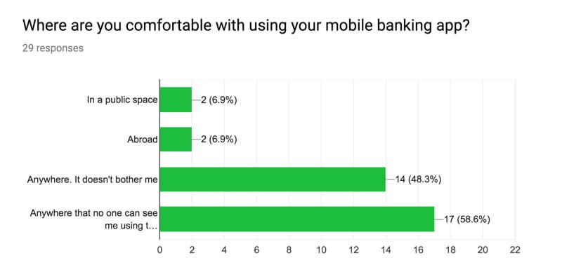
Privacy was a concern raised during our user research of 118 banking app users (Figures 12 and 13). Goran suggests a “Stealth” feature to enable our users to access the app in public spaces without displaying balances.
Summary of changes to investigate
- Combine pay flows (saved payee, new/add payee, international payee, manage payee, schedule payment)
- Improve options menu; remove inconsistent UI elements from secondary navigation.
- Update Home icon and breadcrumbing the primary navigation
- Consider a Favouriting accelerator
- Consider a privacy feature
Caveat
Some intended updates may be global and introduce unknown issues elsewhere in the app. Although a consideration, this is not a priority concern to this project.
References
Cooper, A., Reimann, R., Cronin, C., and Noessel, C. (2014). About Face, The essentials of interaction design. Indianapolis, IN, USA: John Wiley & Sons.
Dingley, K. (2018). Dr Kate Dingley. The University of Portsmouth School of Computing. Retrieved October 19, 2018, from http://www2.port.ac.uk/school-of-computing/staff/dr-kate-dingley.html
Franceschi-Bicchierai, L. (2018, September 12). Apple killed TouchID Live In Front of Thousands of Eyewitnesses. Motherboard Vice. Retrieved October 14, 2018, from https://motherboard.vice.com/en_us/article/j54qmx/apple-iphone-xs-touchid-dead.
Krug, S. (2014). Don’t Make Me Think, Revisited: A common sense approach to web usability (4th Edition). Berkley, CA, USA: New Riders.
Nielsen, J. (1994a). Enhancing the explanatory power of usability heuristics. Proc. ACM CHI’94 Conf. (Boston, MA, April 24-28), 152-158.
Preece, J., Rogers, Y., and Sharp, H. (2015). Interaction Design: beyond human-computer interaction. Chichester, West Sussex, UK: John Wiley & Sons.
Ulster Bank (2018). Mobile Banking Security. Retrieved October, 18, 2018, from https://digital.ulsterbank.ie/personal/security-centre/mobile-app-security.html
W3c (2018). Web Accessibility Initiative. Retrieved September 30, 2018, from https://www.w3.org/WAI/standards-guidelines/wcag/
Woods, K. (2018, February 11). Feuds between telcos and councils are fuelling Ireland’s mobile coverage black spots. The Journal.ie. Retrieved October 8, 2018, from http://www.thejournal.ie/mobile-phone-coverage-ireland-2-3854044-Feb2018/
Navigate this post
Word count less figures, captions, and navigation: 1076