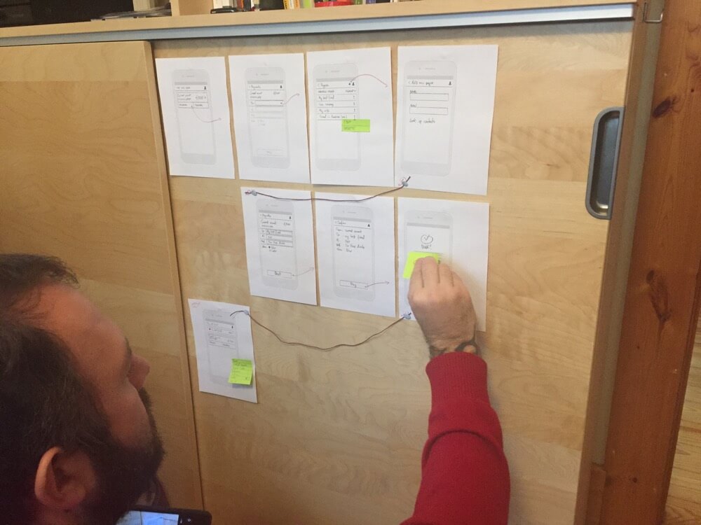
The project required a paper prototype of our new solutions to test. We were concerned that a hand-sketched prototype would not be compared fairly with the well-presented paper-style click thru Goran created. And we wanted to preserve our privacy and prevent comparison in turn with the real UI.
For fun and from habit, I added some interaction to the Axure. As a Hi-Fi Axure prototype, it proved to identify a potential UI problem our solutions had caused.
Using paper-styled click-thrus
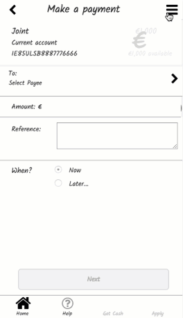
Our initial approach was to take the banking app UI and transform it to paper to remove the distraction of art direction from comparative tests. Goran kindly created a paper-style click through, which Goran user-tested using a tablet and I tested using prints taken from the click-thru.
It became arguably necessary to test the new prototype in the same way, so I created a click thru using Axure. For fun, the click-thru became more a hi-fi prototype.
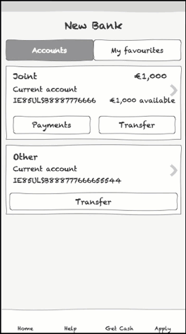
The click thru modelled exactly the paper wireframing and prototyping we conducted in my design studio in Wexford (Figure 1.) with only one exception.
We had glossed over the Favourites flow. The Axure Hi-Fi click thru highlighted this would create an issue raising awkward questions in our future presentation of our ideas. Our original plan was to present the list of accounts and favourites on the homepage together in series. We chose to ignore what effect this may have as being out of project scope. We’d explain that, when more than one or two favourites displayed, the UI would “scale” to a different and undetermined pattern accordingly.
While juggling with the “scale” concept in the fun and Hi-Fi Axure, I recognised that “scaling” would present a jarring experience where our user had learned the favouriting pathway and then later would need to learn another.
Problem solving with tools
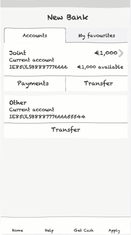
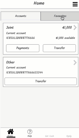
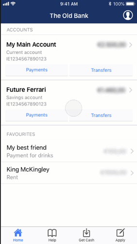
I described my preference for a tabbed UI to separate the Favourites list from the Accounts list – still on the on the Homepage to avoid upsetting the Apply button. Ideally, we’d place the Favourites feature behind the Apply button in the permanent navigation. And we figured the Apply is there for marketing if not our users’ purposes and our fictional stakeholders would push back. I transmitted a GIF (Figure 2.) to Goran to communicate my concerns. The Axure’s draft tab style alerted Goran to the iOS style guides.
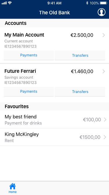
The drafted visual tab style conflicted with the iOS UI kit and the existing tab pattern in the parent app. He transmitted a series of Hi-Fi artworks to demonstrate our original plan against my suggestion and we both agreed the tabs was likely the better UX (Figure 4).
Updating our solutions
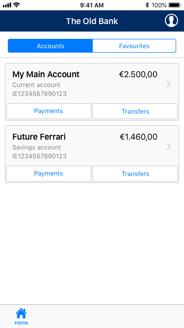
So, I quickly updated the Axure’s draft tab style on which we both agreed to be a major improvement on a feature we’d partially dismissed (Figure 5). The favourites feature had become a usable and useful accelerator.
On reflection, Goran agreed that, as had surfaced in my usability test video, the “tab buttons” did not carry the visual cues required to that signify tabs are available on the page. We returned the prototype to combine the tabbed content with its relevant UI control (Figure 6). Gestalt rules.
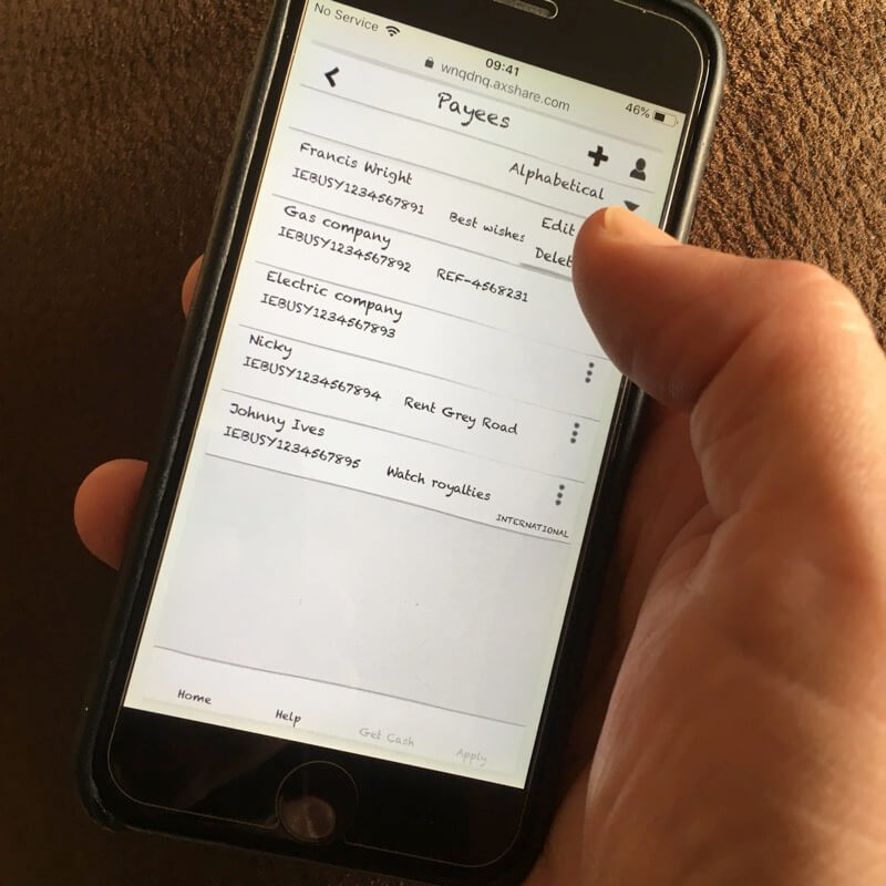
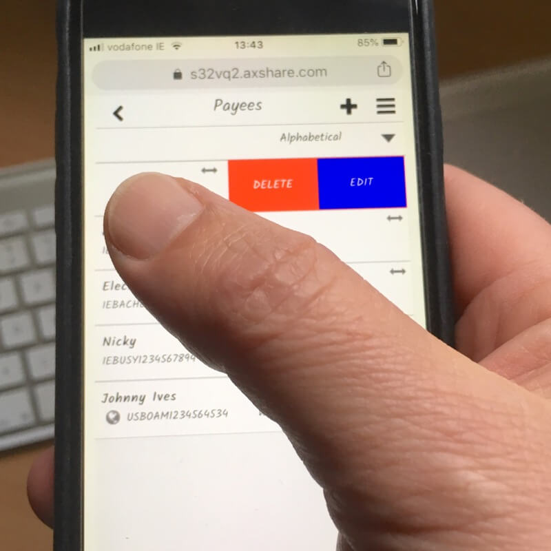
And the issues keep surfacing, such as list item menus that are fiddly for thumbs and may need replacing with bolder swipe gestures (Figures 7 and 8). Perhaps complete the filter, or enable drag-to-reorder list items to our users’ preferences?
Of course, such improvements are now out of the scope of this project… if not my own personal development.
Permanent navigation
Our dissatisfaction with the primary navigation icons crept into our work. Goran’s high-fidelity wireframe (Figure 9) is an improvement on the Ulster Bank’s design. In time, and following Bank of Ireland’s example, the “hamburger” menu may move from the secondary to the primary location. It’s upper right position perhaps given to Favourites?
More research needs completing to make the right choices. For example, the book icon is not a universal icon for Help. The convention is a question mark and replacing the Euro symbol with a house for Home cannot be argued?
Presentation detail aside, the intention remains a temptation at each iteration.
And, while we were at it: Stealth
Goran’s concept of a Stealth setting resulted from our combined user research. It needed examining, even if it is a secondary feature. It sounded too good not to explore and Stefan had suggested a tantalising drag gesture.
I included a rough sketch of the feature in the Axure prototype for Goran to feedback on (Figure 10).
Goran employed the animation software, Principle to craft and return an improved visualisation of the feature (Figure 11).
What appeared a bolt-on to our project appears to have grown legs?
Summary
The Ulster Bank’s art direction and UI design are flawed. When aiming to improve the Pay flow the UI design was proven in usability testing to require updating.
While testing “paper” prototypes seemed a poor second-cousin to software prototyping and wireframing, it proved its worth toward the use of technology. Although the technology was reassuring and a bit of fun, the “paper” click-thru helped confirm our assumptions. Technology helped us to feel the experience and in real-time.
Our remaining differences are all representational: how an overlay or dialogue looks. I’m happy with that. We cannot really go straight to production at paper prototyping? More testing and design discussion is needed.