☰ Navigate this post:
Published October 25, 2018
Research
The implications of our research on our personas are recorded in Blog Post 2. The research and personas drove our mission to update the payments flow and to add a Favouriting accelerator and “Stealth” feature to preserve privacy.
Ideation
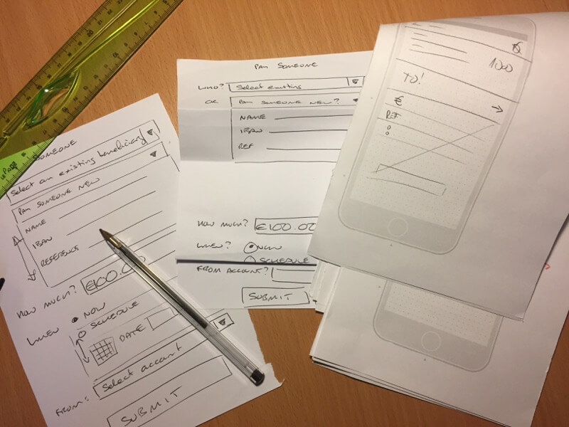
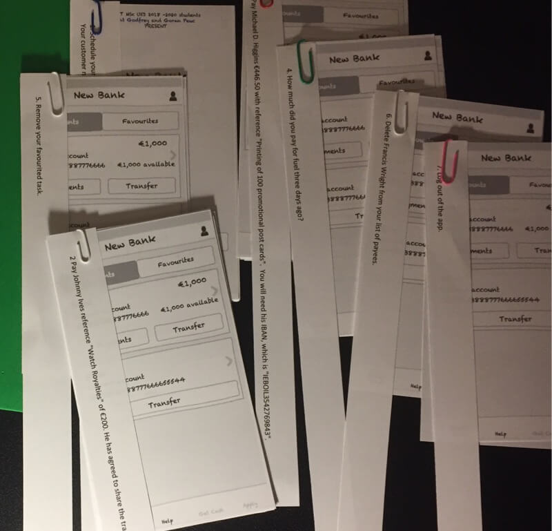
Ideation and discussion were supported with sketches and hasty kinetic artefacts (folded paper prototyping at Figure 1). User research confirmed that the Pay flows were disparate.
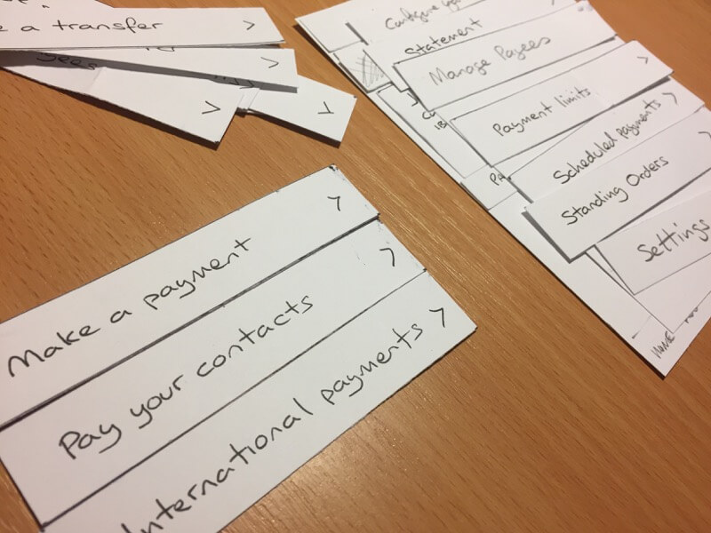
Our objective became to remove an interstitial stage of six payment-related flows and combine the three payment tasks into a branching flow.
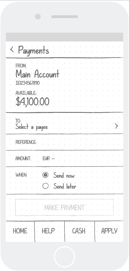
We agreed the Payments form layout was satisfactory. Improving the poor UI criticised in our heuristic evaluations was out of scope although a result of our design was to remove the confusions in the Profile/Menu/Next/ and Continue secondary navigation, top-right.
After prototyping using technology later, we identified that the International flow could fit on the form. Later, working at scale, it was too cramped.
Working toward prototyping
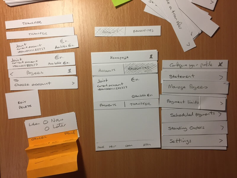
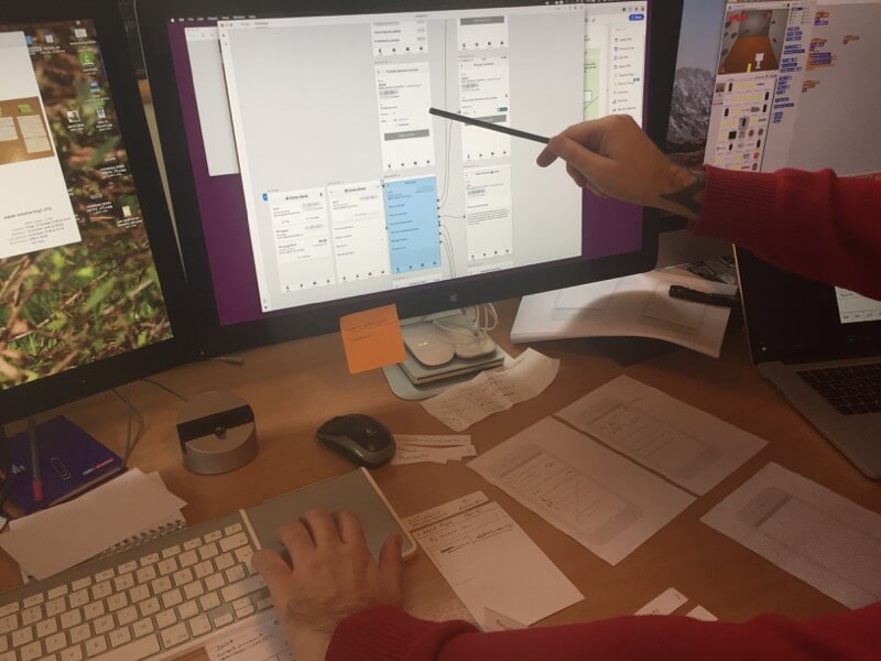
I had made a cardboard model of Ulster Bank UI elements to help us move features around the flows and to ‘card sort’ features into goal priorities and task models.
Accessing the live banking app threatened our own privacy. I had used Adobe XD to visualise the existing flow through screen-grabs. This supported our discussions, card sorting, and sketching probable solutions.
We progressed toward our solutions iteratively.

The solution(s)
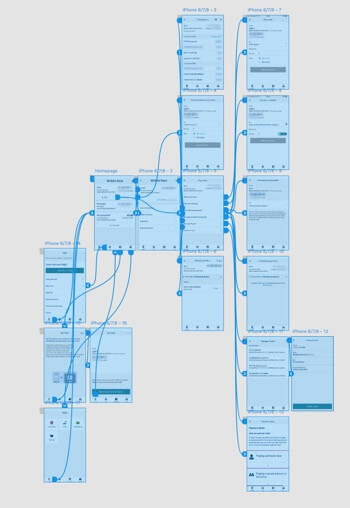
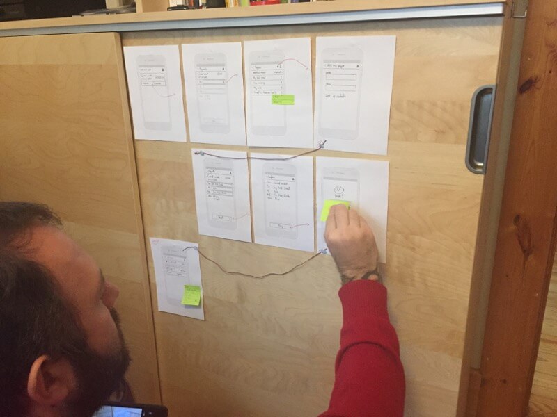
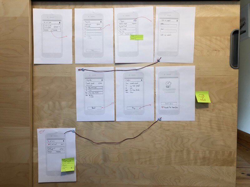
With our flow mapped on the desk, adjusted and dry-finger-tested for accuracy we arranged our final paper wireframes onto a door to compare the flow against the Ulster Bank on display in Adobe XD (Figure 7). It was clearly lighter.

Moving usefully out of scope
It was perhaps predictable that our professional workflows and passion would take us beyond paper drawings. Snyder (2003) allows that when digital wireframes are printed with meaningful content they are paper prototypes. Greenberg, Carpendale, Marquardt & Buxton (2011) promote recording and presenting paper prototypes digitally, too. After working in paper, we hopped into technology at least twice.
The first technology was Goran’s click-through of the Ulster Bank app. This was reasoned to remove the distraction of a completed UI when compared to a paper model in testing.
The second was to present our finished paper prototype in a similar “digital” paper style – now to avoid discrimination between a smart print and hand-drawn artifacts. Of course, while having fun with Axure I was able to emulate our design digitally. (Axure click-through as an emulation (V.1.)).
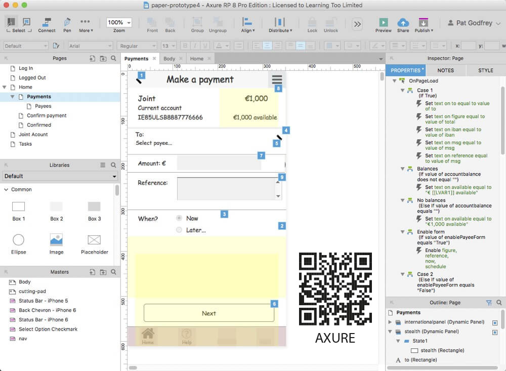
The Axure emulation was unnecessary and also useful. It tested concepts including the Favouriting and “Stealth” features. Favouriting was incomplete, which could detract from our improvements. User testing surfaced other concerns, too.
Detailed discussions and solutions arising from testing are highlighted in Appendix B.
New Flows
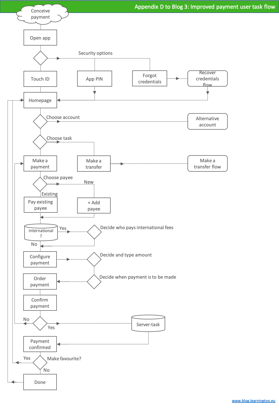
Although work continues around the presentation layer, our new pay flow is set (Figure 13) and available at Appendix D (PDF 35 KB).
This video runs through the seven tasks completed during user testing of the first paper prototype.
The following video is the original app’s click-thru created by Goran Peuc for comparison.
The Pay a saved payee task is the same number of steps. The new flow is an improvement. It removes needing to choose a task flow and embeds separate flows into one.
The new Paying a new payee task is a step less than the original app. The pay flow is more efficient if performance is evaluated across all Pay processes including cognitive and motor effort and experience – and not only steps or speed. These are difficult to measure. User testing is required.
Usability testing
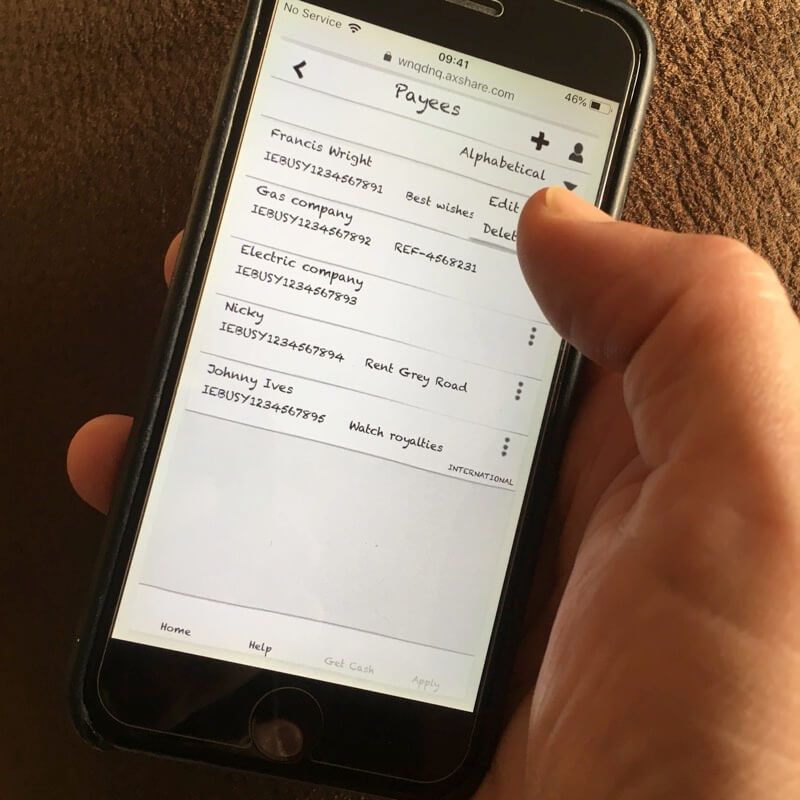
Seven tasks were assigned to test the Pay flows (Figures 14 and 15).
- Schedule your usual electric bill payment of €350 for February 11, 2018. Use your customer number as a reference. Your customer number is “ESP-WX-3465”.
- Pay Johnny Ives reference “Watch Royalties” of €200. He has agreed to share the transaction costs with you. Favourite this task.
- Pay Michael D. Higgins €446.50 with reference “Printing of 100 promotional postcards”. You will need his IBAN, which is “IEBOIL3542769843”.
- How much did you pay for fuel three days ago?
- Remove your favourited task.
- Delete Francis Wright from your list of payees.
- Log out of the app.
The video of a candidate attending usability testing discovers UI assumptions that did not meet their mental model. This is an excellent result from a candidate keen to, “do well” as we have identified areas for improvement or redesign.
Findings
- The Profile icon was not understood to signify system settings and options and the candidate unexpectedly navigated to the Payees page following the memory of a previous task.
- The candidate did not recognise the “kebab” menu on list items to open options.
- Once shown these functions she demonstrated her learning by completing further tasks using the intended UI features.
- The Accounts and Favourites tabs on the Homepage were not obvious.
- The candidate wanted to click on list items to drill into more detail.
- The Favouriting feature had not been seen before. Cool! A competitive advantage?
Axure UI test
The “live” Axure was now tested.
Highlighted improvements are:
- Cognitive. On favouriting, our user must be navigated to the Favourites tab on Homepage.
- Motor. The Kebab menus on list items are too fiddly. Make swipes.
- Cognitive. Update the tab design to look like tabs.
Learnings
- More care needs taking not to mislead candidates with fictional dates, data, and copy texts.
- Paper is not our users’ natural medium. Our users expect screen interactions. Paper may distract?
- We should anticipate procedural differences, assume nothing, and learn to shuffle more quickly!
Detailed UI discussions arising from testing are highlighted in Appendix B.
Summary
The Ulster Bank’s art direction and UI design are flawed. While aiming to improve only a flow, heuristic evaluations and usability testing proved the UI required some updating too.
While testing “paper” prototypes seemed a poor second-cousin to software prototyping and wireframing, it proved its worth toward our use of technology. Although the technology was reassuring and a bit of fun – and if not entirely outwith the project scope – the Axure click-thru and Principle animations helped confirm and shape our assumptions made during “paper” prototyping. We – and our users – are able to feel the experience in real-time.
The result is contained in my final version of the Axure click-thru and Goran’s final video, which differ slightly–as they should at this stage. Is the design finished? No. Or, it depends.

References
Greenberg, S., Carpendale, S., Marquardt N., and Buxton, B. (2011). Sketching User Experiences, The workbook. Waltham, MA, USA: Morgan Kaufmann.
Snyder, C. (2003). Paper Prototyping, The Fast and Easy and Refine User Interfaces . San Francisco, CA, USA: Morgan Kaufmann Publishers.
Navigate this post
- Research
- Ideation
- Working toward prototype
- The Solutions
- Moving usefully our of scope
- Usability testing
- Summary
- References
- Appendix A. Prototype click thru v.1
- Appendix B. Paper problems, tech solutions
- Appendix C. Improved prototype click thru v.4
- Appendix D. New pay flow (PDF 35 KB).
Word count less figures, captions, and navigation: 970