The new app Pay flow design is near completion. A small number of presentation strategies require further testing, iteration, and agreement.
The following is a summary of the design work to date. Further iterations are necessary to agree and to discover the most delightful experience. Given disagreements between me and Goran are all visual, it is encouraging that paper prototyping has taken us this far in a design.
The flow
We aimed to remove cognitive effort or the need for prior expertise with the app when selecting a Pay flow.
Making a payment
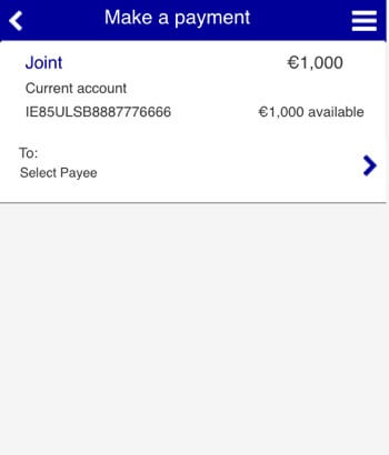
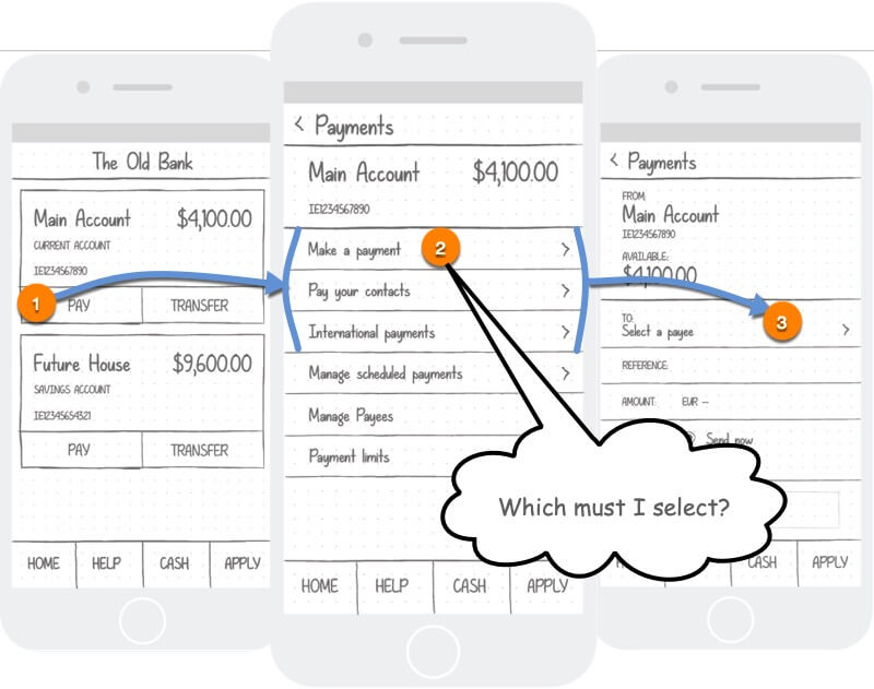
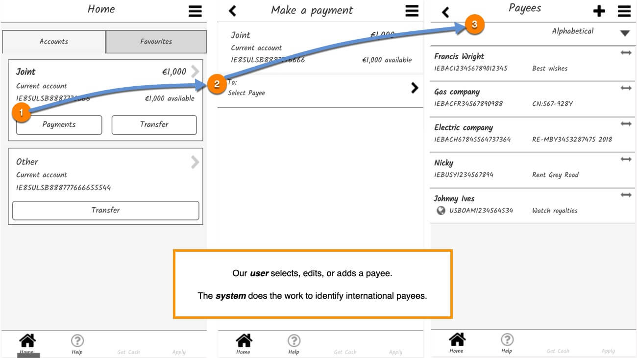
Our solution is to remove the interstitial page (Figure 1) and integrate the three banking flows into one user flow (Figure 2).


International payees
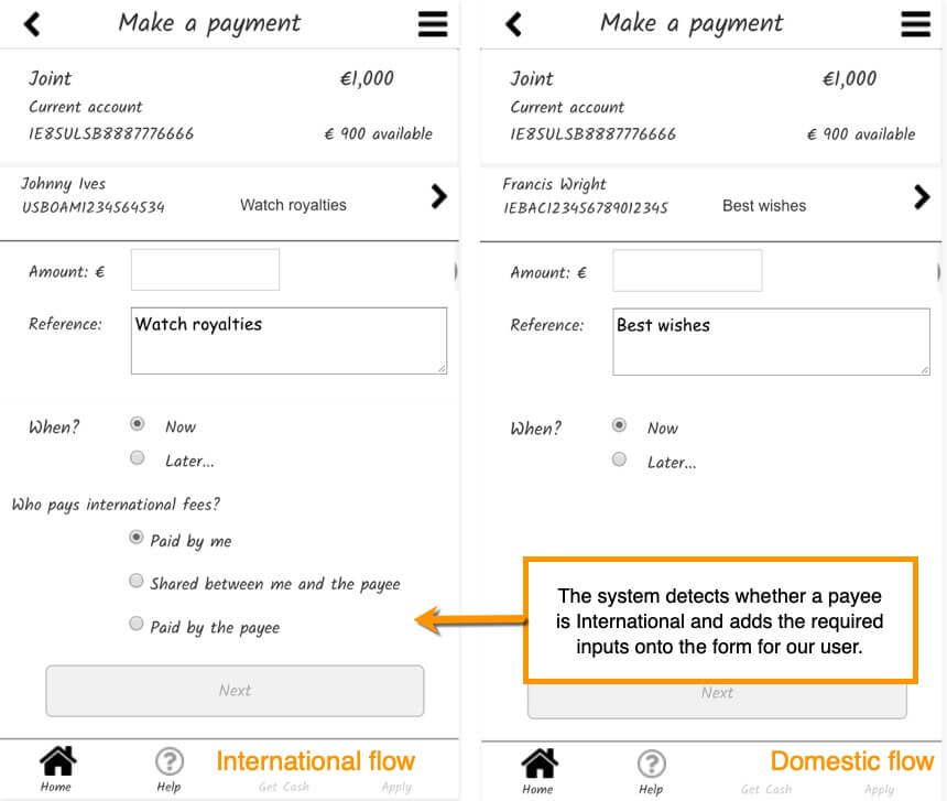
When an International payee is detected by the system (via the IBAN input), the system presents the international fees choice (Figure 3).
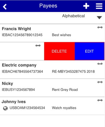
It is no longer necessary for our user to recognise who is, or is not an international payee although an indicator will be available in the payee list view. (See, the “Johnny Ives” payee at Figure 2).


Add payees
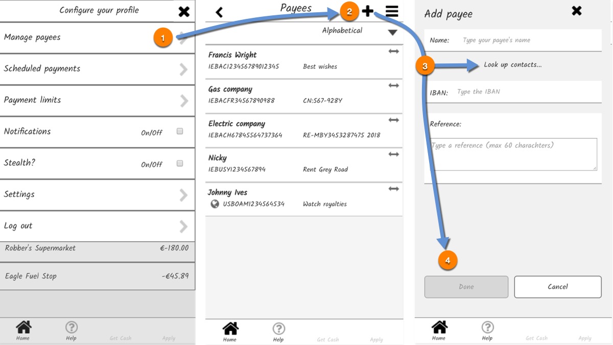
The payees list is accessed contextually during the Pay flow (Figure 2) or directly from the new settings menu (Figure 6).
The Add Payee form is in a dialogue or overlay. We differed on the presentation. That’s OK. It’s for our users to decide which suits them best.
My concern is that overlays may cause confusion if their presentation is not right and revealing the parent UI as if it is still available. On the other hand, covering the entire parent UI can jar an experience. As always, it depends. It needs testing.


New features
We added two new features:
- The Favouriting feature is an accelerator to speed frequent transactions.
- The “Stealth mode” to obscure balances. Our research revealed that our users value their privacy when using the app, which may restrict their use. Goran thought to obscure balances with a setting available from the configuration menu. (Find the menu at Figure 6).
- The listed item Edit and Delete feature.
Favourites
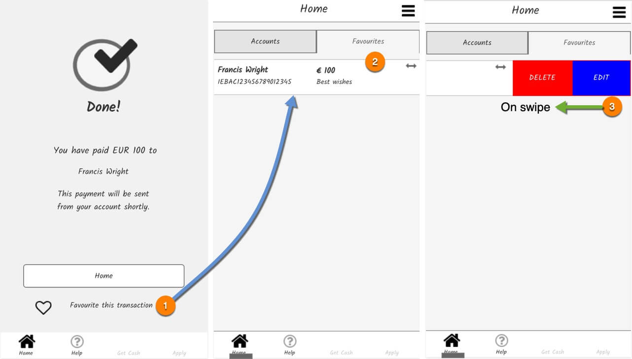


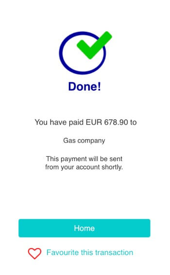
Having completed a transaction, our user may save it, or “Favourite” it for quick use later. The favourited transaction is listed on the Favourites tab on the homepage.
Our user may edit or delete the transaction. Editing the transaction takes our user to the Payments page to create a new transaction, or to cancel it.
“Stealth mode”
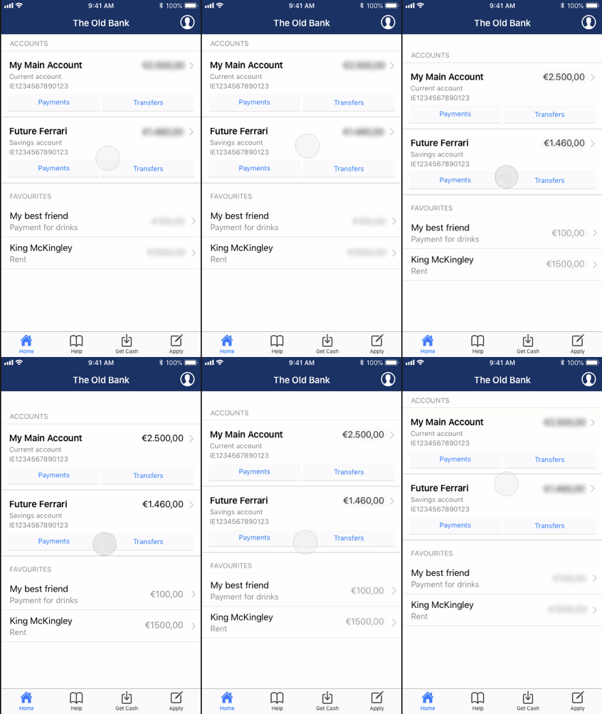
A “Stealth” setting is added. When activated, all balances are obscured before a user gesture on the UI reveals the balance. Releasing the gesture obscures the balance again. Goran’s GIF animation created in Principle best demonstrates this function.


The listed item edit and delete feature
I believe that list items created by our users should be manageable. List items including Payees and Favourited transactions have a swipe feature that reveals controls for Edit and Delete.
Improved UI
The original app suffered inconsistency in the contextual secondary navigation top-right of the viewport and many visual design issues.
New menu
Having removed excise tasks from the Pay flow, we placed these with other app and banking configuration settings in an expansible and global menu.
We failed to agree on an icon for the menu control button at this time. Goran preferred the Profile icon while I preferred the wider axiom of a “hamburger”.
Presentation aside, the menu gives accelerated access to manage the Payees list or scheduled payments, etc.
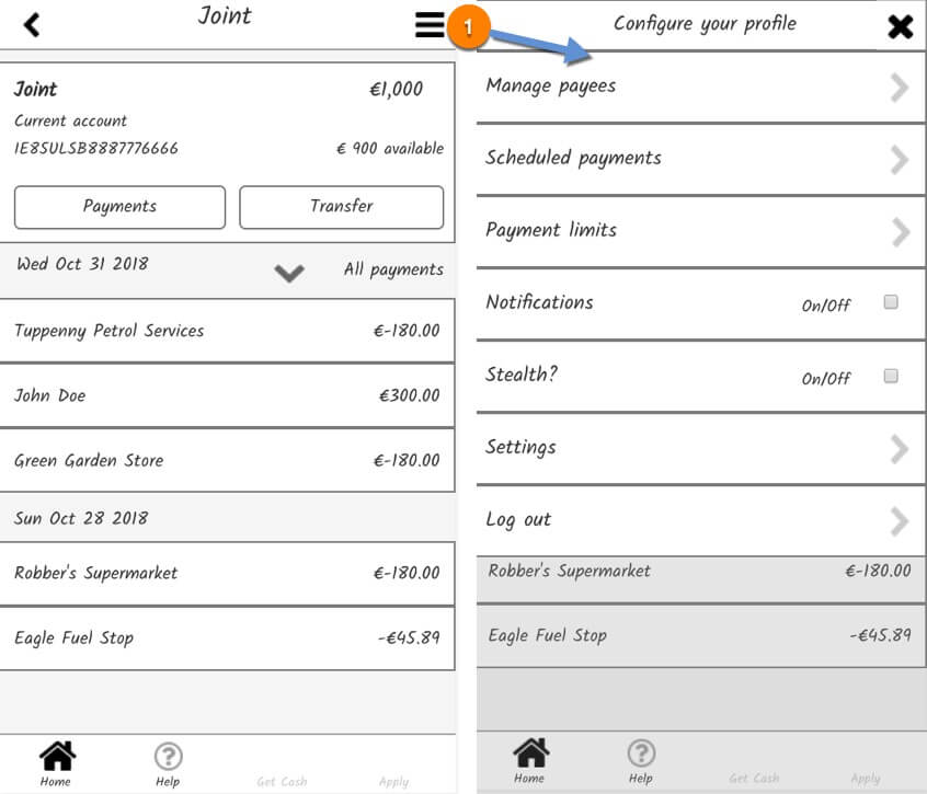


The menu button is currently situated where the original secondary navigation was placed. It occurs to me that this can now be located in the Primary Navigation at the bottom of the viewport. The secondary navigation is then reserved for when Adding a payee, for example – still contextual, only less confusing.
We have assumed that all Next, Continue, and other contextual controls once positioned in the secondary navigation placement are negated using our improved Submit button strategies.
Allied visual design issues
The app’s visual design was confused and provided few hints regarding the hierarchy of submit buttons, performance support texts and links, or links and buttons. These may be improved with our new flow.
For example, by adding a little colour to the Axure prototype:
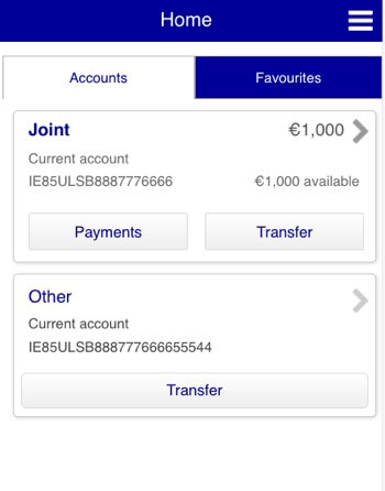
- Improve the tabbed content affordance and better indicate what is clickable on the account cards (Figure 7).
- Visually guide interactions (Figure 8).
- Offer Edit and Delete on swipe (Figure 9).
- Improve visual hierarchies of buttons and links (Figure 10 and 11).
