☰ Navigate this post:
Published January 8, 2018
Learning Objectives
This blog post sets out with others to meet the following learning objective:
| Learning Objective 3 |
|---|
Blog post(s) and associated artefacts describing and demonstrating:
|
Design concept
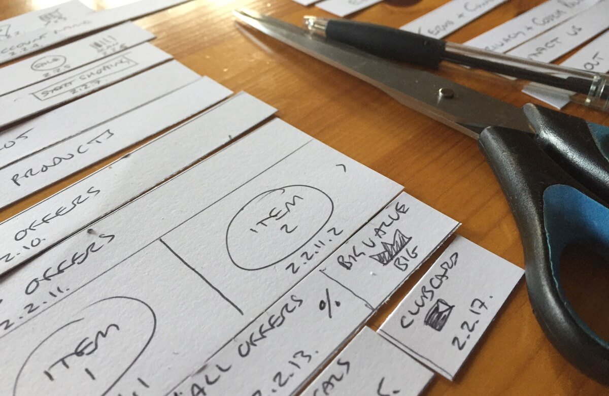
During our December workshop, we explored improving the experience of making a shopping list and then transferring it into the shopping app. (see Figure 1). We wanted to bring the list making into the app and enable device sensors to accelerated the process.
Tesco list making
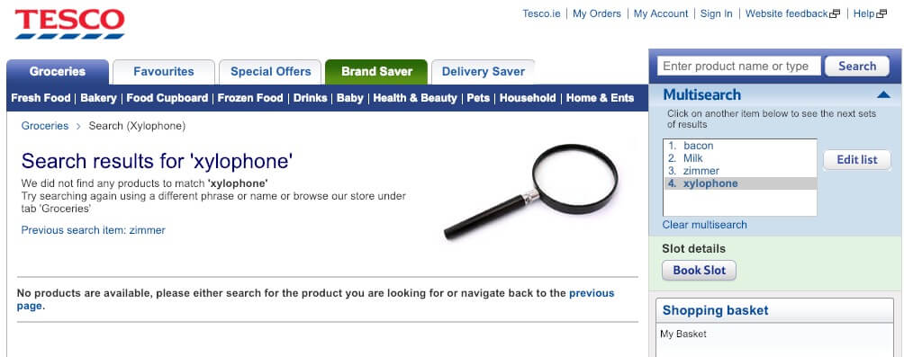
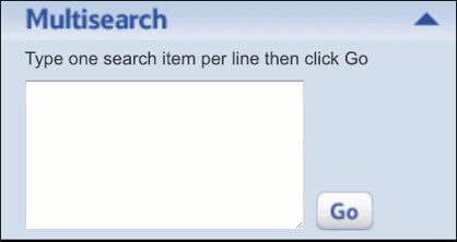
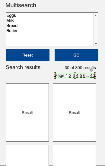
The Tesco desktop platform enables users to list arbitrary items in their Multisearch feature (Figures 2 and 3). On Go, users click on each item to initiate search results. This is a sensible solution to searching over 30,000 product lines.
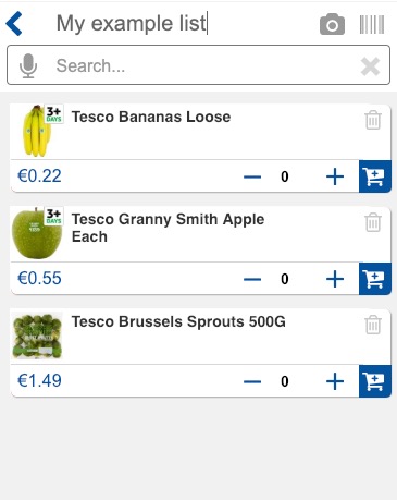
Multisearch in the mobile app
It is possible that, if Tesco had designed their platform as mobile first, a mobile solution would already exist.
Investigating a solution
When wireframing concepts, I found transferring Multisearch to the mobile environment was constrained by real estate (see Figure 4). The experience may not be as positive.
Incremental search pattern
Multisearch results appear quickly on the desktop platform. This suggests opportunity for an incremental or auto-suggest search pattern initiated on key-up when typing in the Search text box.
You can open an early Axure wireframe of the list concept in your browser. Search for Apple or Banana (see Figure 5.)
Search and mobile device sensors
Our team were keen to leverage mobile device technology and software to ease search tasks using typical sensors including:
- Text entry
- Speech recognition
- Bar code and QR code scanning
- Image recognition using the camera
These extend the accessibility and utility of the search task and may add delight?
Accessibility and presentation
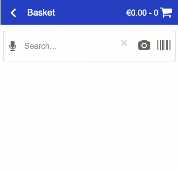
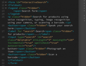
For accessibility, the search features are semantically positioned in the HTML according to their useable order in assistive browsing technologies: aural, text, and then vision. CSS can arrange the buttons to art direction. In this case, we present the buttons to a universal experience. (Figure 6).
In testing, orientation to the controls appeared natural. We determined that a simple user performance support may assist less expert digital users. (See Figure 7. UX text to be confirmed.)
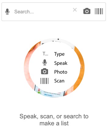
Figure 8 lists the considerations of the search interaction designs.
NOTE: Although discussed in the following sections, sensor error handling is not included in the prototype.
Voice recognition
Voice recognition search is available across many platforms and systems. As it requires access to the microphone, it is only emulated in the prototype.
Text input
Popular search form patterns execute with a submit button. The button function is signaled with a magnifying glass icon.
Text input can also control system actions. For example, on key-up. Using an incremental search pattern negates the need for a submit button, The label signals the form’s function. This negates needing a Search icon. (Figure 9).
Error handling covers:
- App access to the system microphone
- Unrecognised speech snippet
Image capture
Karen promoted an image recognition feature demonstrated on an Android device. The user points the camera, takes a snapshot, and gestures over the image to prompt an image search. The system returns results and shopping suggestions.
Including real-time access to the device camera requires specialist code and the right development environment so we can only simulate:
- Selecting the image recognition feature
- Lifting the phone camera to an object
- The system recording and parsing the image
- The system returning results
Error handling
- App access to the system camera
- Unrecognised image
Barcode and QR code scanning
Barcode scanning is included in the existing app. As it requires access and control of the camera, it is only emulated in the prototype. See Figure 9
Error handling:
- App access to the system camera
- Unrecognised code
User testing the technologies
Accessible architecture
I wireframed an accessible HTML architecture to prove the concept using a content-first approach. (See Figure 10).
Using CSS classes, we can wireframe hiding copy texts from the visual presentation without hiding them from alternative browsing technologies. (See Figures 11 and 12.)

Handling unknown products
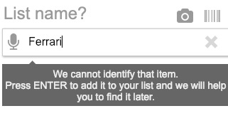
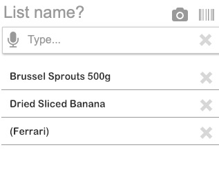
The Tesco desktop grocery shopping platform fails to process unknown inputs. Our user may want to add arbitrary text strings their list. It’s their list, after all.
We can enable our users to input any text string as a list item and mark it, “unlisted”. This feature could make the list useful to a whole shopping experience and opportune allied services. (Figure 13).
The strategy could also manage input errors without roadblocking our users’ list making activity.
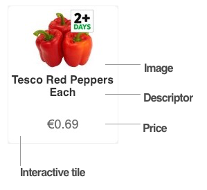
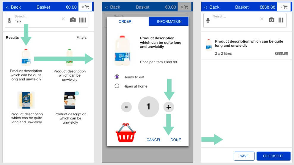
Product Selection
We have challenged the popular shopping flow of search, list results, add to basket by placing Search and result inside the basket. And we have added a quality feature to select whether fresh products should be:
- Ready to eat, or
- Ripen at home
This selection cannot easily fit into the typical result tile (Figure 14). Our solution is to move the order configuration tasks (typically a quantity selection and Add to Basket button) in to a tabbed dialogue with access to mandatory nutritional, allergy, and promotional information. It replicates our real-World store shopper behaviours when evaluating products.
To scroll, or not to scroll results?
Scrolling of large search results is discussed in Figure 15. There are strategies to choose and which we have not fiallised in the scope of this student project.
Designers may borrow others’ beliefs that scrolling and pagination are bad, or that our users cannot process volumes of content or choice. They will censor search results to protect their users from excess cognitive and motor loads.
Here’s a problem – it’s a supermarket! Don’t customers demand choice and the enterprise wants to sell?
UX Magazine report Apple’s removal of the scrollbar from browsers: not because our users don’t scroll, but because they know when and how to. Research by the Nielson Normon Group (Fessenden, 2018) suggests that our users will scroll and may not scroll beyond the third page equivalent length.
This does not mean we only serve three pages. It means we surface the most relevant (or sponsored) data in that space and leave our users the choice to scroll further. Our user chooses how many and how quickly they scan results and whether to refine or filter their search criteria or to accept a reduced choice from the top “three pages”.
Conversely, shoppers are reported in The Telegraph to be overwhelmed by choice (Henry, 2015) and to buy less. (Find similar articles with Google). And how much choice is offered is an enterprise decision based on their economics of choice (Nipun, n.d.). And we must anticipate that Tesco has already managed the economics of choice in their product offer of over 30,000 products.
Our users’ memory uses in search and retrieve cases is discussed briefly by Preece, Rogers, Sharp, (2015, pp. 74-75) where they touch upon retention and limits of working memory (the classic, seven plus or minus two).
In Learning Design these limits are managed by clumping information in meaningful ontologies or catagories, or by easing the cognitive process using recall and recognition. The product photography displayed in results will aid recall, prompt our users to catagorise and discern groups of results through the process of recognition: exploiting prior learning and familiarity. A picture paints a thousand words – if we let it. The images must be meaningful and clear.
Cooper, Reimann, Cronin, Noessel, (2014, pp.546-548) briefly touch on search strategies designers may evaluate to mitigate our users’ dissatisfaction and Hoober & Berkman, (2011) provide useful discussion on design patterns to contain them.
As UX designers, we must take responsibility for the meta-data large data sets require designed to enable effective search. We should not hide poor information design by controlling our users’ access to the data they and our enterprise want offered in context.
As always, it depends. (Test!)
Listing
Basket contents listing follows Material design guidelines.
I wanted to implement a (Material) swipe-to-delete feature, which my team colleagues had reason to resist in favour of a trash can icon (Delete button) and a system confirmation alert. The swipe-to-delete advantages the confirmation strategy in one or two gestures. It is efficient and removes clutter.
On the other hand, without testing real users the trash can is advised for its universal recognition.
User testing
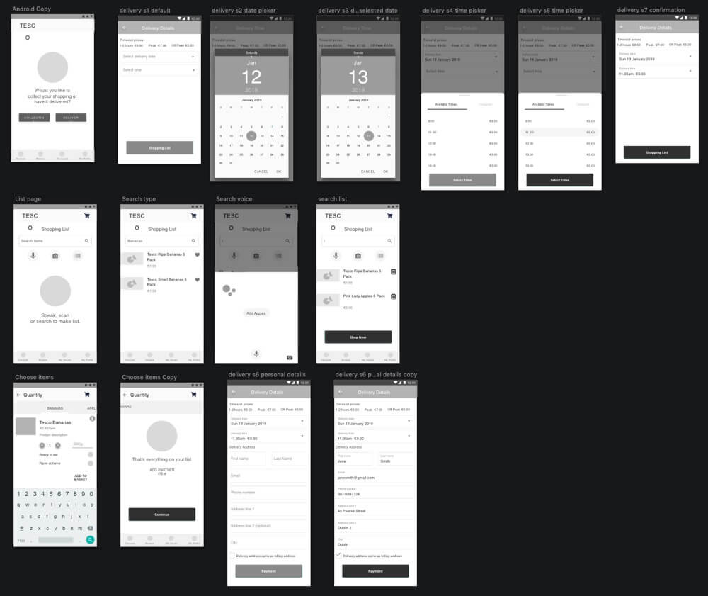
In user testing, we found our participants did not like to list products twice: search, add, and then configure. That prototype separated the experience of building the list and then adding it to the basket. (See Figure 16.)
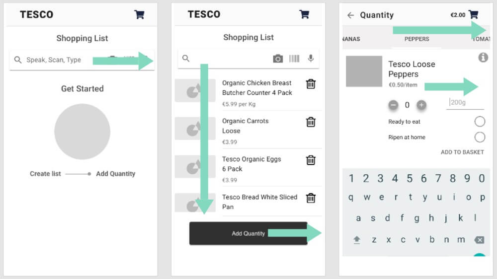
Iteration Two
In our revised solution (see Figures 17 and 18), we have integrated the actions into one flow:
- Search
- Pick
- Confirm and configure
- Review
And all in the basket page. And our users choose to just shop, set up collection, or order a delivery when they choose; before, during, or after filling their basket.
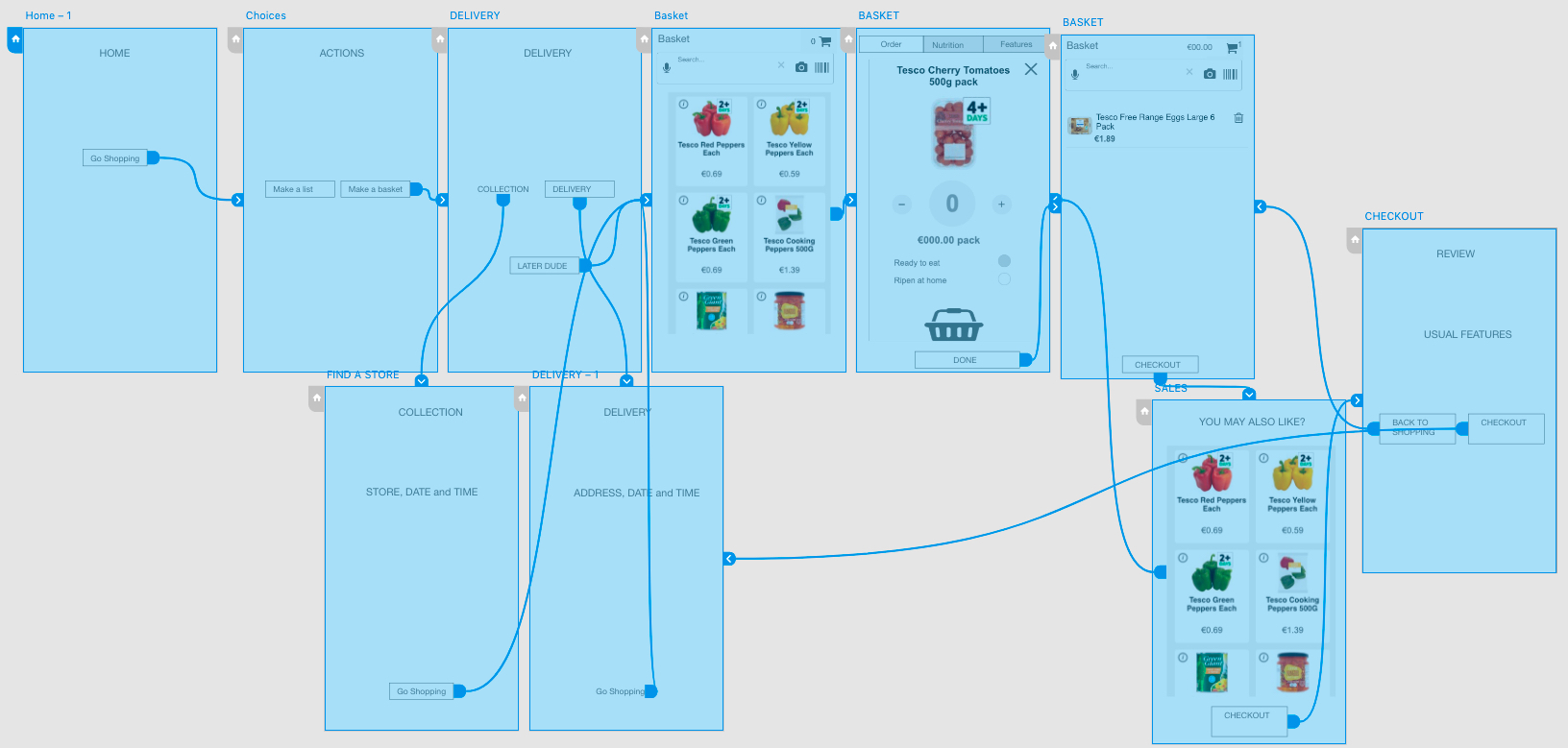
Mary wireframed the newly agreed flow in Sketch with Karen’s input (see Figure 19.) to guide my Axure re-work (see Figure 20.) Product image treatments were not possible as I was loading Tesco images and creating a new fleet of 50+ would take too much time.
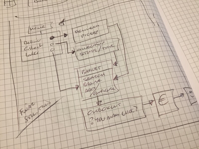
Delivery, Collection, and Shopping
The Tesco-preferred flow is to book a delivery or collection before creating a basket. A future Save Basket feature will enable our users to update to any saved basket before booking delivery or collection.
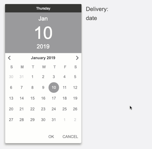
Mary wireframed the ‘date-picker’ and I set up Axure to enable the display of today’s date (in January) and place the counter on the correct day. (See Figure 21.) Data driven details like this help suspend disbelief during our prototype testing and enable participants to more closely experience our design.
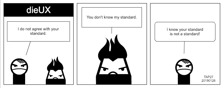
Standards
There were one or two interesting observations regarding UI and interaction design ‘standards’ summarised at Figure 20.
We decided to use Material design as a basis for our prototype’s presentation. Although art direction was not a factor at this stage, Material offers a clarity that presents wireframes well.
And whenever implementing a “standard”, there will be arguments. It is my understanding that there is no Standard unless our enterprise creates one. We experienced moments where “standards” were applied from belief or preference.
OK and Cancel
Mary noted that I swapped OK and Cancel from her wireframe I was working to. I agreed to return the buttons back observing there is no Material standard button layout, e.g. Material Design in XAML uses OK-Cancel. Nielson (2008) provides the choice is a matter of design.
In the words of Bowels and Box (2011),
“There’s no guarantee that a solution is right just because it’s on a famous website.”
Bottom navigation bars and menu buttons
We placed a draft navigation bar at the bottom of the page. As part of placeholder content, I inserted a ‘Kebab” menu button in it, which was challenged for not being “standard” by Karen.
I’m familiar with Material design guidelines and shared the link to the Material Design, App bars: bottom page illustrating a “Kebab” menu button in the bottom navigation bar of a Material Design “standard”.
Summary
Large organisations such as Google and Apple have invested in user research to develop and prove their patterns. That doesn’t mean the patterns are right for our own users. We should still user test them.
User Experience Designers are right to apply popular standards and should appreciate that there are no standards. Only guidelines unless directed to use them by our enterprise and as standard. A little research goes a long way too.
References
Bowles, C., and Box, J. (2011). Undercover User Experience Design. Berkley, CA, USA: New Riders.
Cooper, A., Reimann, R., Cronin, C., and Noessel, C. (2014). About Face, The essentials of interaction design. Indianapolis, IN, USA: John Wiley & Sons.
Fessingdon, T., (April 15, 2018). Scrolling and Attention. Nielson Normaon Group. Retrieved January 20, 2019 from, https://www.nngroup.com/articles/scrolling-and-attention/
Henry, D., (October 21, 2015). Help! There’s too much choice in the supermarket (and it’s all mediocre anyway). The Telegraph. Retrieved January 20, 2019 from, https://www.telegraph.co.uk/food-and-drink/features/help-theres-too-much-choice-in-the-supermarket/
Hoober, S. and Berkman, E. (2011). Designing Mobile Interfaces: Patterns for interaction design. Sebastopol, CA, USA: O’Reilly Media.
Nielson, J., (May 27, 2008). OK-Cancel or Cancel-OK? The Trouble With Buttons. Nielson Norman Group. Retrieved January 13, 2019 from https://www.nngroup.com/articles/ok-cancel-or-cancel-ok/
Nipun, (n.d.). Economics is the Science of Choice. Retrieved January 20, 2019 from, http://www.economicsdiscussion.net/economics-2/economics-is-the-science-of-choice-with-diagram/25116
Preece, J., Rogers, Y., and Sharp, H. (2015). Interaction Design: beyond human-computer interaction. Chichester, West Sussex, UK: John Wiley & Sons.
Turrell, A., (March 22, 2012). The Extinction of the Scrollbar. UX Magazine. Retrieved January 20, 2019 from, http://uxmag.com/articles/the-extinction-of-the-scrollbar