
☰ Navigate this post:
Published January 26, 2019
Learning Objectives
This blog post sets out with others to meet the following learning objective:
| Learning Objective 4 |
|---|
Blog post(s) and associated artefacts describing and demonstrating:
|
Planning
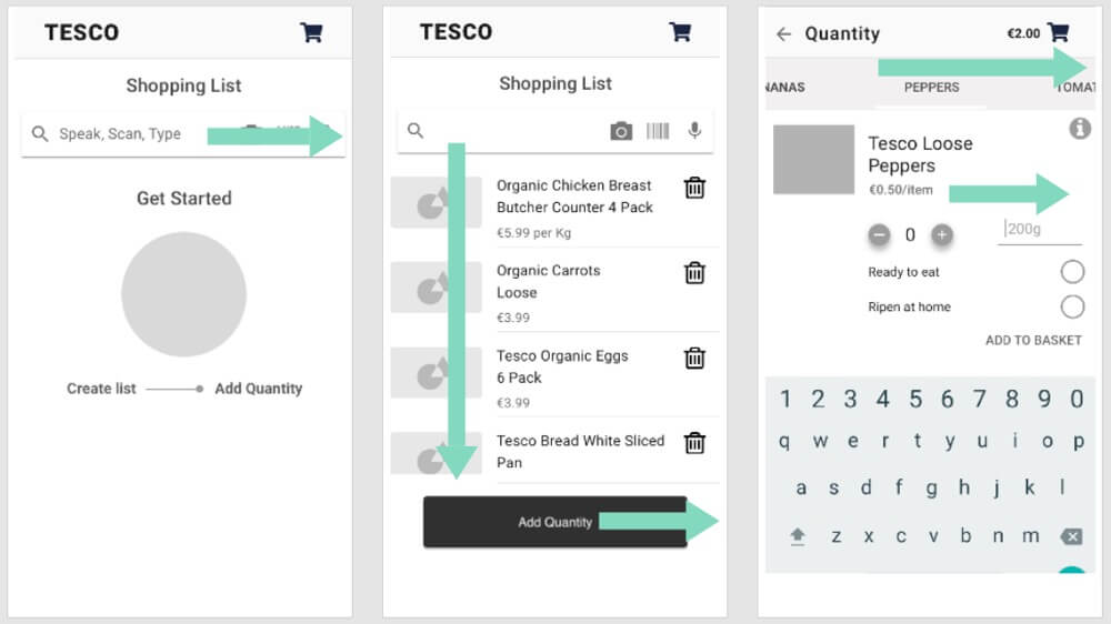
As a study team, we needed to validate an early design concept for a grocery shopping app that may disrupt a universal shopping pattern and flow. (See Figure 1.)
Our methodology followed Rubin and Chisnell’s (2008, p.25) basic elements of usability testing (summarised in Table 1.) with caveat to student resources.
| Basic elements |
|---|
|
I wrote a User Testing Plan (Appendix A) to assist the preparation for, and conduct of the user tests. It guided a consistent approach.
When to user test
Our student project hypothesis was tested early to confirm our direction. The project pace negated the ideal administrations of recruitment, which in turn affected the numbers and quality of participant screening. The testing remained invaluable.
What to test
Teammate, Mary produced a low-fidelity interactive prototype of our project’s flow. We reviewed her standardised Test Script (Appendix B) carefully to present an objective, unbiased, and standardised test.
Four discrete User Tasks were set to a scenario drawn from persona work:
- Select your preferred delivery time in the app
- Start shopping for the listed items.
- Add the quantity of the items you require to your basket
- Proceed through to checkout
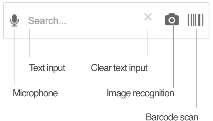
An interaction design for Search also needed testing. The low-fidelity prototype could not emulate it. An optional high-fidelity (Axure) emulation was made available. (See Figure 2.)
Sampling
Travis (2017) highlights the myth of, “five participants will find 85% of usability problems”: the source research by Neilson (2000) continued, “…that affect 1 in 3 users.”
A sample of six (two each between three students) met our learning objectives. We tested four: two each between two of us.
Ethics
The Invitation Letter (Appendix C) and Consent Form (Appendix D) included ethical content. Copy texts were modelled on IADT’s example consent form.
Following a pilot review of the letter and form, option boxes were added to capture exactly what each participant agreed to have recorded. Choices were confirmed while recording.
Equipment and logistics
| Consideration | Checklist |
|---|---|
|
Safety |
|
|
Comfort |
|
|
Stationery |
|
|
Equipment |
|
Setup and record keeping
The set up was a:
- prototype running as an “app” from an iPhone 6 home screen
- iPhone 5S on a tripod looking down to record it.
Having reviewed the videos, I am satisfied they captured participant’s verbalisations and hand expressions. They are almost as illuminating as the facial expressions and body language observed off camera.
I wanted to screen-capture the iPhone 6 presentation. In piloting, the Recording bar impacted on the prototype presentation. The overhead view proved adequate in the context of early testing.
Test conduct
Reception
I received participants warmly and made them comfortable. As Goodman et al, (p.96) advise, we chatted about the equipment and put them at ease before delivering the Test Script.
Script
Task instructions were scripted. Rather than a verbatim speech, my experience with observing mentees adjusted my delivery tailored to my participants. This did not compromise the test. It put me and my participants more at ease.
User orientation and pace
In examples of user testing shared in class, I criticised moderators enabling participants to take an unrealistic time orienting to and analysing the interface on new pages. It interrupted the task and negated the emulation and true measure of the participant’s experience.
I aimed to maintain a realistic pace through our flow, encouraging and prompting actions when judged necessary. The test felt a natural experience of the prototype and perhaps improved the validity of this test?
Test example
Watch the video of participant “Karen”
Testing the search features
Analysing results
A success metric and a mini-survey added a quantitative element to our user testing research. The click-thru on test is highly prescriptive and leading; highlighting hints guide what to click. I used a User Testing Result Sheet (Appendix E) to note findings.
Quantitative results
The success metric captured all tasks completed successfully – albeit P2 was thrown when under very real time pressure and wanting to add quantities, tapped Home (for Back), and we needed to reset the test. P3 and P4 are Mary’s participants. (See Table 3.)
| Success | Task 1: Delivery selection | Task 2: List creation | Task 3: Quantity / quality | Task 4: Checkout |
|---|---|---|---|---|
| 0 (Failure) | – | – | – | – |
| 1 | – | – | P2 | – |
| 2 | – | – | – | – |
| 3 | – | – | – | – |
| 4 (Success) | P1, P2, P3, P4 | P1, P2, P3, P4 | P1, P2, P3, P4 | P1, P2, P3, P4 |
Qualitative results
Quantitative feedback was extracted from the video transcripts. (See an example at Table 4.) Mary’s two tests reported very similar findings.
| Task / Feature | Key Comments |
|---|---|
| 1. Creating a list | [Karen]
[Pat] OK. So that’s interesting. We’ll go down and type another one into the list. Let’s finish the list. OUTCOME: Listing without quantities does not meet the mental model/expectancy. |
| 2. Configuring the listed items to basket |
[Pat] Try the Add Quantity button. You tried that before. Try that. [Karen]
OUTCOME: Listing and then reviewing the list to add to basket does not meet the mental model/expectancy. Karen wanted to place items directly into the basket. Remove the repeat. |
| 3. Orientation to search features | [Karen]
OUTCOME: UI controls and icon semiotics recognisable |
| 3.1. Search features: voice recognition | [Kare]
OUTCOME: Success and useful |
| 3.2. Search features: image recognition |
|
| 3.3. Search features: barcode scan |
OUTCOME: Success and useful |
| 4. Ripeness feature |
[Pat] Just if we pause there while we’re doing this you can see on the screen that we’ve got “Ready to Eat” or “Ripen at Home”. Would that be a useful option to you? [Karen] Yeah, because it gives you the opportunity to have longer lifespan of the fruit and veg. So, if you want to have like a week to two weeks’ worth of shopping then Ripen at Home gives you more opportunity, but obviously if you need it for the next day on a menu. [Pat] You do Tesco’s online quite a bit. Would that help, do you think with the quality of fruits and vegetables that come through? [Karen] Definitely would make a difference. OUTCOME: Success and useful |
Results summary
Thank goodness for user testing! We had proved our flow hypothesis incorrect early enough to re-analyse our research and determine an improved design before committing resources to higher fidelity prototypes. Job done.
Refinements
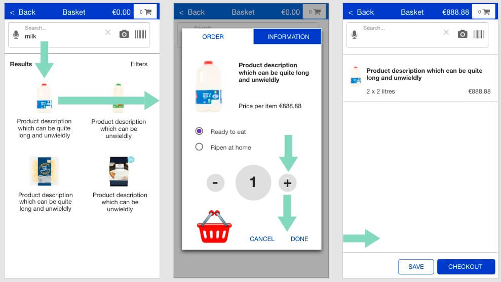
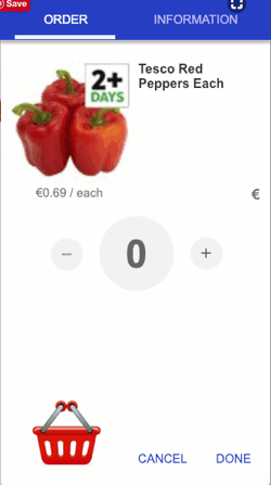
Our initial prototype tested the flow. Its prescriptive clicking had invalidated our quantitative data measures. The improved and more exploratory prototype would update the flow and seek to validate the tasks and importantly, the experience. (See Figure 3.)
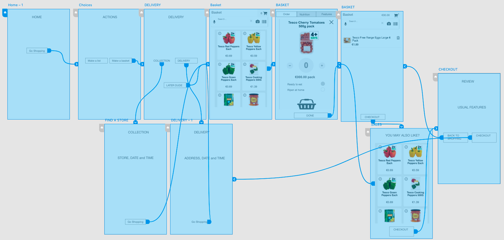
Axure’s variables and repeater data tables enabled the dynamic emulation our user interactions, data input, and system output experience required to test the flow. (See Figure 4.)
Guerrilla user testing of the updated flow with my two participants has yielded only positive feedback. Changes are summarised in Table 4.
| Status | Change |
|---|---|
| New | Easing the choice between three app pathways: book delivery, book collection, or just fill the basket. |
| New | Concentrating the search and basket list on one page. |
| New | Options to input quantity (by text input, [+] and [-] buttons, and by drag-and-drop) and the basket filling animation |
| Improved | Enabling a Quality request: ripen at home, or ready to eat. |
| New | Collating the product configuration and mandatory information in one space (tabbed) |
| New | The intention to save baskets to accelerate shopping on return. |
Fun addition
Some fun came to the prototype with a drag-and-drop interaction, too. (See Figure 5.)
Summary
Updating an established UI design pattern is a risk. We are pleased that our early user testing steered us toward a more successful flow strategy. (Caveat more testing and design iteration is necessary.)
Appendices:
- User testing Plan
- Tesco mobile app usability testing script
- Invitation letter
- Consent form (video)
- User testing result sheet
References
Goodman, E., Kuniavsky, M., and Moed, A. (2012). Observing the User Experience: A Practioner’s Guide to User Research. Waltham, MA, USA: Morgan Kaufmann.
Nielson, N. (2000, March 19). Why You Only Need to Test with 5 Users. Retrieved October 10, 2018 from https://www.nngroup.com/articles/why-you-only-need-to-test-with-5-users/
Rubin, J., and Chisnell, D. (2008). Handbook of Usability Testing (Second Edition): How to Plan, Design, and Conduct Effective Tests. Indianapolis, IN, USA: Wiley Publishing.
Travis, D. (2014, December 1). The 7 Deadly Sins of User Research. Retrieved November 10, 2018 from https://www.userfocus.co.uk/articles/7-sins-of-user-research.html
Navigate this post
- Planning
- When to user test
- What to test
- Sampling
- Equipment and logistics
- Setup and record keeping
- test conduct
- Examples
- Analysing results
- Refinements
- Summary
- Appendices
- references
Word count less figures, captions, and navigation: 1076