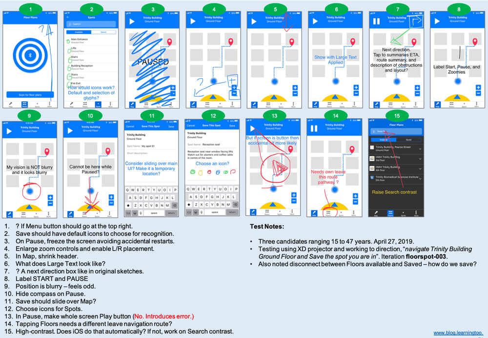
This is the text version of the ad-hoc user testing feedback.
Tab bar navigation buttons
- Should the Menu button go at the top right?
Spots page
- Save should have default icons to choose for recognition.
- Choose icons for Spots.
Navigation / Maps page
- On Pause, freeze the screen avoiding accidental restarts.
- Enlarge zoom controls and enable left and right placement.
- Shrink the header.
- What does Large Text look like?
- A next direction box should be in the header (as originally sketched).
- Visibly label the START and PAUSE buttons.
- The position indicator is blurry – it feels odd. A triangle is preferred (3 of 3 candidates)
- Hide the compass on Pause.
- The Save Spot page should slide over Map, perhaps?
- In Pause, make whole screen the PLAY button (We agreed not. It Introduces error.)
- Tapping Floors button needs a different leave navigation route or pathway? (This is likely a prototype issue and needs adjusting).
High contrast UI
- High-contrast. Does iOS update that automatically with accessibility settings? If not, work on the Search input contrast.

