| Objectives |
|---|
| Design development & application of design language(s) – sketches, wireframes, design mock-ups, prototypes showing design decisions & process – 100 words |
Design Caveat
This project requires a fictitious IPS system and collaboration of participating venues.
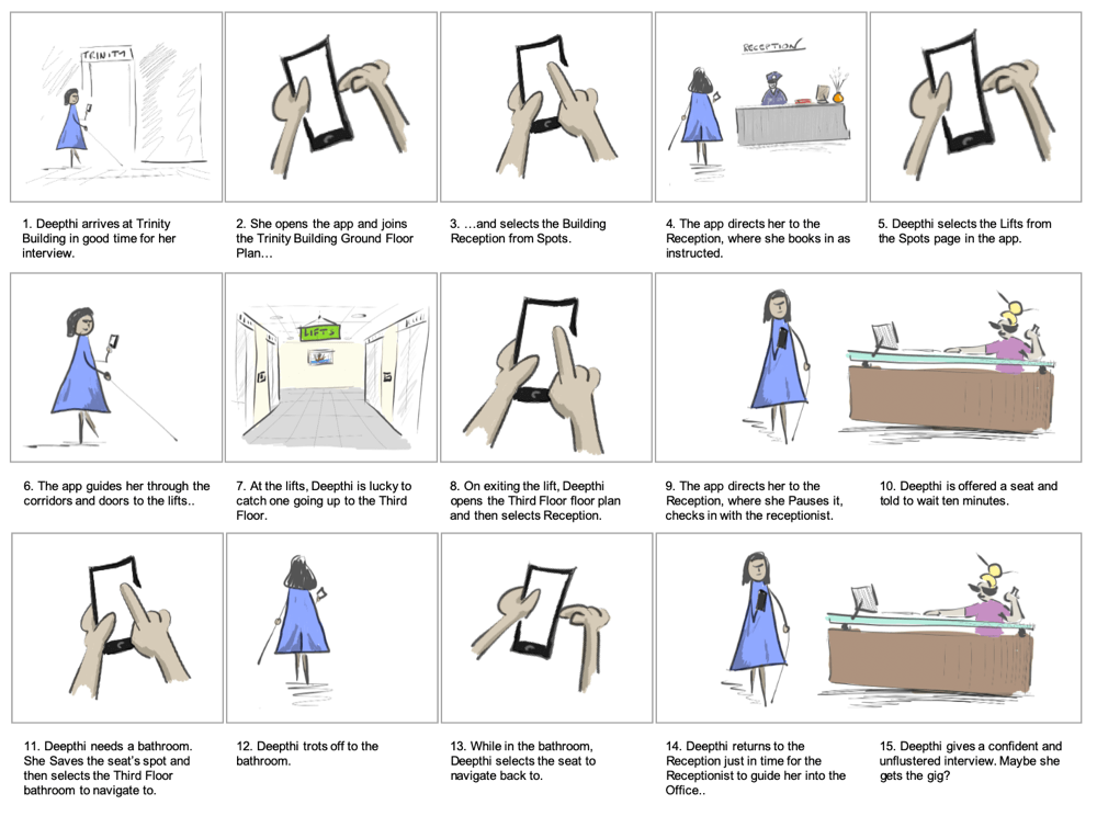
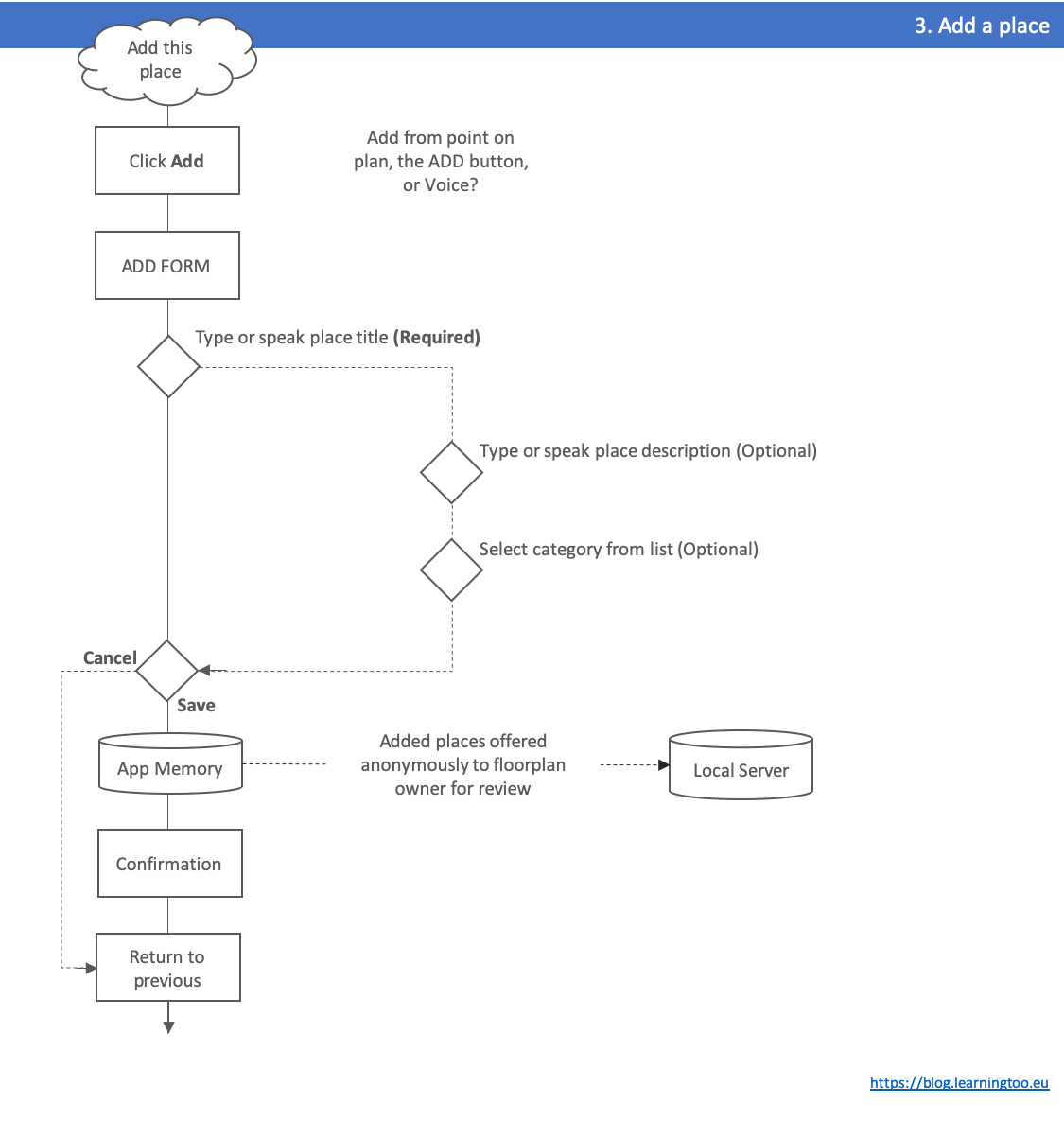
Storyboard
Our storyboard visualises the application improving Deepthi’s experience of her interview scenario found in blog 3.2. Analysis. See Figure 2. (Open a text version of the storyboard).
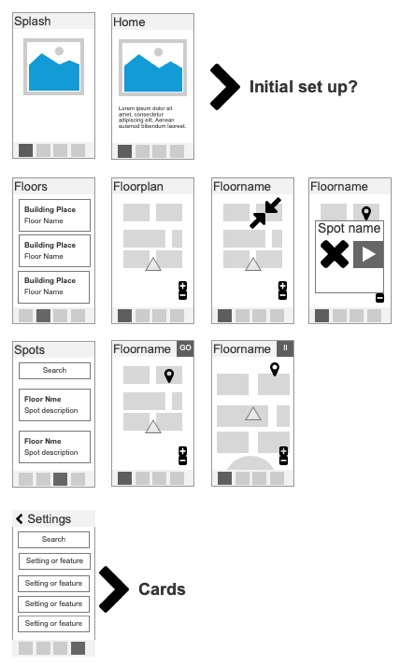
Sketching
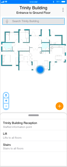
Our users’ goals and our storyboard feed ideas to sketch. The application UI is constrained to Apple 6 to 8 smartphone screen dimensions and resolutions. Some project sketches are at Figure 3.
Paper outlines explored tasks vs. features (see Figures 3.2. and 3.3).
Axure’s rapid drag-and-drop sketching organised an overview of user pathways. (See Figures 3.4. and 3.5.).
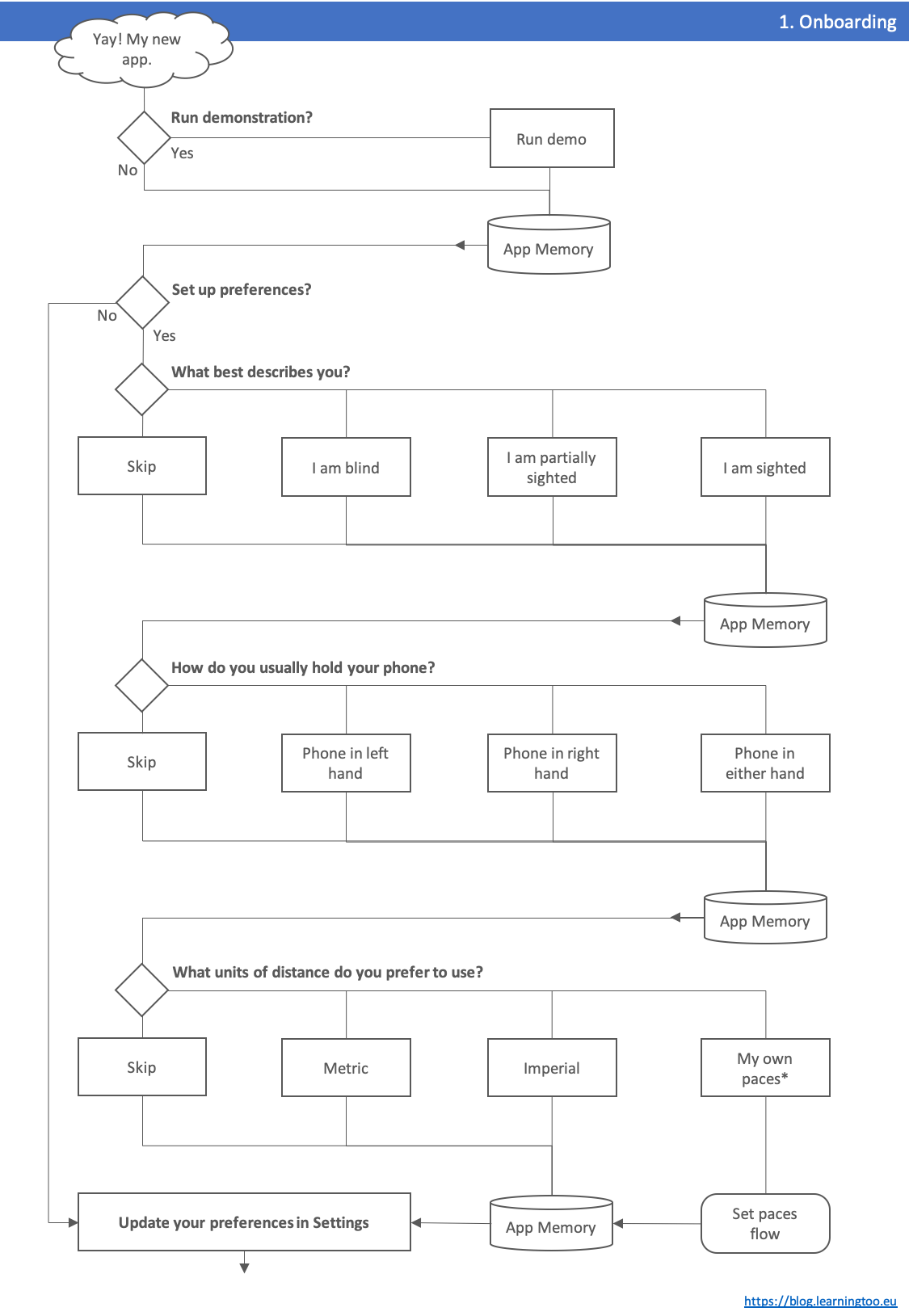
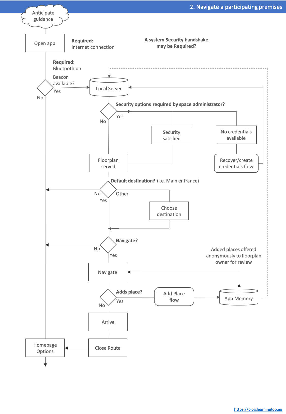
Draft Task Flows
Together with sketching, the storyboard suggests task flows:
- On boarding (see Figure 4.1).
- Connecting to an IPS service (see Figure 4.2.).
- Saving an arbitrary spot (see Figure 4.3.).
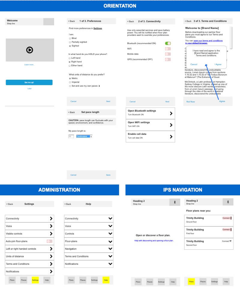
Wireframing
Wireframing gave opportunity to explore the ideas of flow and excise tasks, and to inform inclusive design. (See Figure 5.).
Without access to iOS developer skills, an HTML wireframe illustrated navigation differences between Primary, Secondary, and Tertiary users.
For example, Primary users hear the tab bar options at the head of the page. Sighted users experience it presented at the bottom. (See Figure 5.1.).
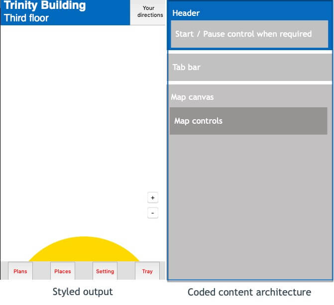
Simple outline wireframes are useful. A design system adds detail with drag-and-drop simplicity. (See Figure 5.2.).
Click-thru
The video shows an Axure click-thru wireframe. It enables an early experience of flows.
Content
UI and presentation copy text scripting is not final. The tone is inclusive of age and ability: approachable, clear, and respectful.
Guidance is taken from Microsoft’s (2019) Writing Style Guide and Redish (2007).
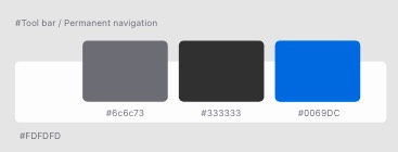
Design System
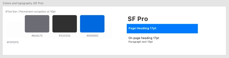
“Vanilla” iOS appears to fail contrast tests. Updates are required. See Figure 7.
Colour and contrast adjustments
The colour pallet “piggy-backs” trusted NCBI branding.
Moroshko and Arnautovic’s (n.d.) contrast checker adjusted the iOS colour pallet, which failed WCAG AA standards. (See examples at Figure 7.1.).

Adjustments exceed WCAG AA expectations. (See Figure 6.2.).
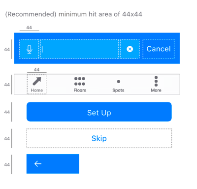
Tap targets
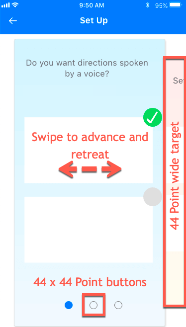
iOS interaction tap target minimum dimensions are recommended 44 point by 44 points (Apple, n.d.-a). Some Apple interactions are smaller, which Hoober (2018) allows.
The design adheres to the 44 x 44 Point minimum to accommodate hand and hand-eye coordination while walking.
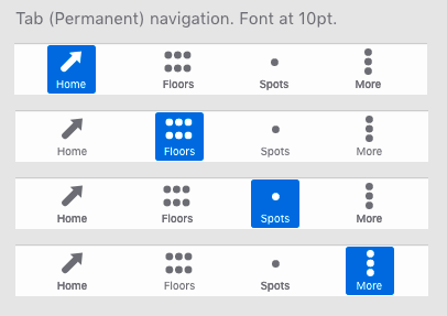
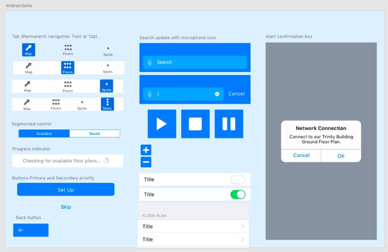
Tab Bar
Apple’s tab bar selected state is conveyed by colour alone, which fails W3C (n.d.) WCAG Success Criteria 1.4.1., . (See Figure 7.5.).
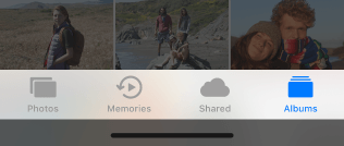
Contrast of selected tab bar buttons is improved by adding a selected shape and improved contrast between Off and Selected states. (See Figure 7.6.).
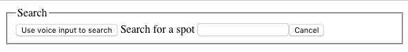
Search
The Search interaction follows iOS presentation and animation patterns. It includes a speech input (microphone) button encoded and positioned before the text input for priority user groups.
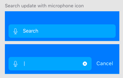
The coded copy texts are longer than those visible: giving screen readers an equal experience of semantic without overwhelming visual users.
In HTML, the accessible strategy is to move screen-reader content out of the visual flow. See Figures 7.8. and 7.9. The iOS development environment is expected to perform an equivalent.
<form id=searchForm">
<fieldset>
<legend><span>Search</span></legend>
<!-- microphone button styled from spritesheet-->
<button type="button" id="voiceInput"><span class="hidden">Use voice input to search</span></button>
<label for="search">Search<span class="hidden"> for a spot</span></label>
<input type="search" id="search" name="spotSearch"/>
<!-- NOTE: iOS adds search Reset Text button-->
<!-- Cancel button hidden/shown with scripted class update-->
<button type="reset">Cancel</button>
<button type="submit">Submit</button><!--visually concealed-->
</fieldset>
</form>
Note: when Search is given initial focus, should focus be on the voice input button, or the text input? As with anything in design, it depends. Test.
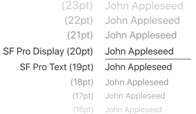
Typography
Selecting a typeface involves more than size. A font’s bowls, stems, ascenders and descenders and whether it is serif or sans-serif each affect legibility. Add weight and stressing, kerning and letterform or leading, and the choice of font becomes complex (Hoober & Berkman, 2011, Appendix C).
Combining more than one font increases font choices exponentially including how they work together. Legibility, readability, and mood are affected by screen display vs. print, too: more when rasterized as an image. And then colour, opacity, and contrast and in some cases, licensing.
The iOS SF Pro typeface is optimised for, “unmatched legibility, clarity, and consistency”, and works well with the system accessibility adjuncts” (Apple, n.d.-c.). It is accessible and familiar to our Secondary users and trusted to this application.
Components
Combining the above, prototyping components are at Figures 7.11. and 7.12.
Prototyping
Prototyping using Adobe XD and Sketch constrains the functionality of a prototype and provides higher fidelity presentation. See examples at Figure 8.
Prototyping an interactive navigation usefully was not possible and animations illustrate the intention.
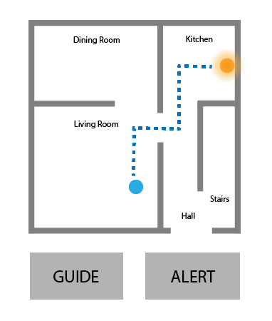
Direction Giving
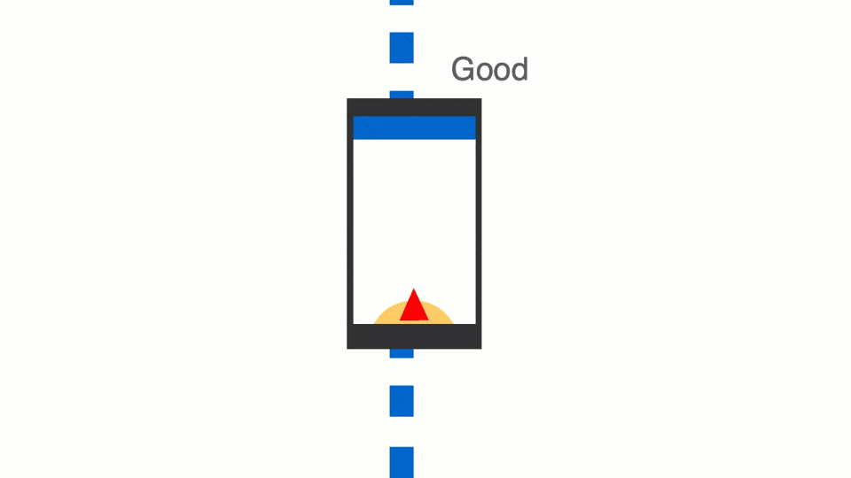
Guiding our blind users along an indoor path between obstructions requires more accuracy than when outdoors with GPS.
Visual users are guided by their avatar, perhaps indicating a heading. Blind users are not.
Sounds and hepatic feedback
Considering sound vs. hepatic feedback:
- Sound. Avalanche locator beacons, etc. use directional sound cadence and tones. There is no standard (Beacon Reviews, n.d.) and work on proximity. They are not suitable for this project. Tones may be ignored by the brain over time and take effort to decode. They may distract our user from excise tasks.
- Hepatic feedback requires cognitive effort in decoding. The initial “tap” or vibration may be missed confusing numeric codes. Other applications using hepatic feedback may interrupt.
Ad-hoc testing with a volunteer who was directed by tones and voice commands using a phone call (see Figure 8.1.), found voice commands more effective over coded taps* or beeps.
Note: An introductory tap preceded the coded taps to alert the volunteer a command was to follow.

The verbal commands must be cognated quickly before, for example, the subject collides with an obstruction. Commands to consider are:
- “Walk left.” (Back onto path).
- “Walk right.” (Back onto path).
- “Turn left.”
- “Turn right.”
- “Good (for back on path).”
- “Stop.”
- “You have arrived at your destination.”
Visual compass
Visual users benefit a directional avatar to guide them on path. For partially sighted users a larger “compass” synchronised with audible commands may be easier to follow.
Without developer support, prototyping a working compass is not possible. Animations communicate the intention. (See Figure 6.11.).
This captioned video captures an Adobe XD voice-enabled prototype exploring the concept:
Prototype Iteration 3
This captioned video walks through the penultimate iteration:
Testing
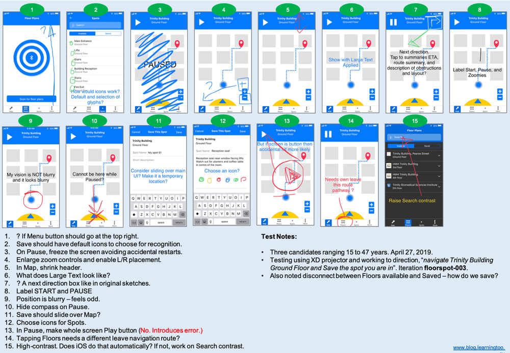
Ad-hoc testing of Prototype v.3 was carried out with three volunteers. Feedback was useful and is summarised at Figure 9. (Open an accessible version of the test feedback). One volunteer had an issue with saving a spot and agreed that, having learned to Pause navigation first, it was no longer an issue.
Prototype Iteration 4
Figure 10. details the improvements made following feedback.
Improvements include:
- (On-boarding) Set Up design pattern.
- Settings (content tbc).
- Removed “More” from tab bar. (Remaining buttons are easier to find).
- Added Settings/Menu button to header. (“Kebab” under review).
- Improved avatar (directional).
- Save Spot has Voice input and choice of icons.
- Spots have icons (which can be repeated on the floor plan map).
On-boarding
The on-boarding Set Up pattern is demonstrated in the following video. The interaction design is described at Figure 10. It offers a choice of navigation strategy to our users of different abilities. Content to be confirmed once user testing identifies key performance support needs.
The Prototype
You can interact with the Adobe XD prototype and watch a (silent) demonstration in the following video.
References
Moroshko, M., Arnautovic, V. (n.d.). Accessible Colors. Retrieved April 24, 2019, from http://accessible-colors.com/
Apple. (n.d.-a.). Human Interface Guidelines – Adaptivity and Layout. Retrieved April 20, 2019, from https://developer.apple.com/design/human-interface-guidelines/ios/visual-design/adaptivity-and-layout/
Apple. (n.d.-b.). Human Interface Guidelines – Tab Bars. Retrieved April 20, 2019, from https://developer.apple.com/design/human-interface-guidelines/ios/bars/tab-bars/
Apple. (n.d.-c.). Human Interface Guidelines – Typography. Retrieved April 20, 2019, from https://developer.apple.com/design/human-interface-guidelines/ios/visual-design/typography/
Apple. (2019, March 4). Indoor Mapping Data Format. Retrieved April 7, 2019, from https://register.apple.com/resources/imdf/
Beacon Reviews. (n.d.). Indicators. Retrieved March 20, 2019, from https://beaconreviews.com/indicators.php
Hoober, S. (2013, March 18). Designing for Every Screen. Retrieved March 18, 2019, from https://www.uxmatters.com/mt/archives/2013/03/common-misconceptions-about-touch.php
Hoober, S. and Berkman, E. (2011). Designing Mobile Interfaces: Patterns for interaction design. Sebastopol, CA, USA: O’Reilly Media.
Microsoft. (2019). Writing Style Guide. Retrieved April 20, 2019, from https://docs.microsoft.com/en-us/style-guide/welcome/
Redish, J. (2007). Letting Go of the Words: Writing web content that works. San Francisco, CA, USA: Morgan Kaufman.
W3C. (n.d.). Use of Color, Understanding Success Criterion 1.4.1. Retrieved April 26, 2019, from https://developer.apple.com/design/human-interface-guidelines/ios/visual-design/typography/