| Objectives |
|---|
| Reflection / critical analysis – strengths, weaknesses, changes & future work – 400 words |
The assignment
I am pleased with my own learning outcomes. I am only disappointed that an inclusive design assignment is, “mainly visual”. I have failed to understand how to deliver this assignment in the few words available. Perhaps I would understand the requirements better if the assignment were modeled?
 IPS
IPS

I was naïve of IPS. Early research failed to include the term and returned a paucity of examples. Once familiar, a wider gamut of solutions emerged – too late to be of great influence.
As blind users’ use of iPhone became understood, the applications appeared overly complex for the speed of use our Primary user needs to be confident of their safety. I aimed to present one or two buttons on the map screen and to prioritise navigation. I settled with four.
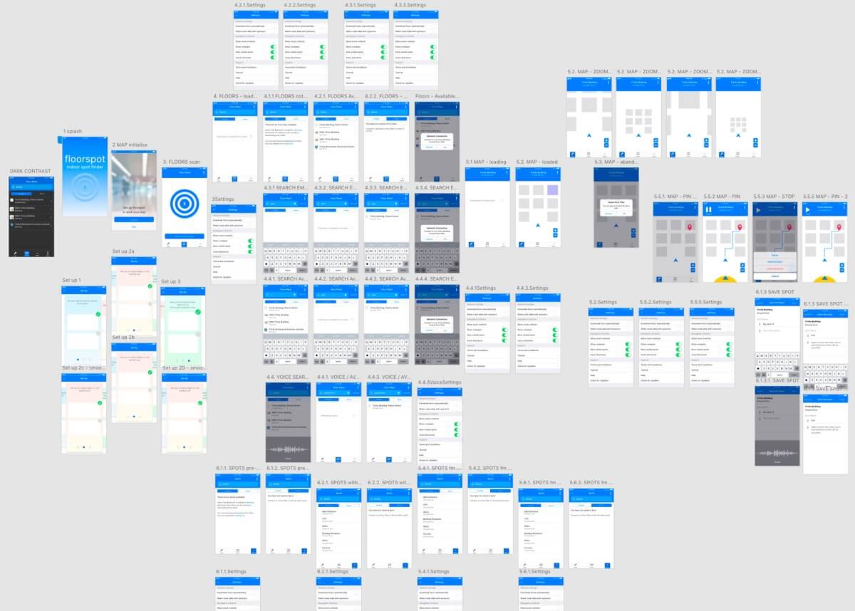
Project Progress
Being familiar with HTML development and accessibility strategies, I took time to appreciate iOS’ development environment. The topic would benefit the support of an iOS developer. Excise tasks were last of my priorities and left too late: seduced by the navigation task and a passion to find simplicity.
It shows in the prototype. If continued:
- There would be more work tying the Floors and Spots pages to the navigation flow.
- I would more confidently update the “vanilla” iOS design system.
- I would better specify the accessible adjuncts for iOS development environments.
- The application would provide descriptions of spaces, obstructions, etc. in addition to Apple’s markers.
As UX designers, if we strategise for and exploit inclusive and universal design methodologies and technologies, then we should understand them. That or delay production while engineers cover our omissions?
And there are positives.
- I simplified map controls.
- The iOS patterns reduce the learning required for our Primary user (caveat testing with our Primary users).
- IPS guidance needs more speed and accuracy than for GPS. Speech instructions such as, “Walk Left” and the compass are not perfect. Ad-hoc experimentation showed promise.
Vanilla iOS is familiar to our Primary users. I did not expect it to fail a W3C accessibility standard. Apple’s and W3C’s guidance is only guidance after all. Design depends on our users.
The final XD prototype has omissions perhaps avoided if working in familiar Axure. Although crisp presentations, XD’s and Sketch’s scenario methods reproduce art boards exponentially to depth. At expense of an organised workflow, I enjoyed the learning.
Summary
I am not overly satisfied with the last prototype (v.004) presented to you. It omits early design thinking and fails to deliver the experience I wanted.
I was working in unfamiliar territory including:
- Vanilla iOS, which should have been only straight forward.
- A large branching prototype produced with XD, which I find less capable than my preferred Axure.
- Independence without consultation or collaboration with a team – particularly iOS engineers.
It’s not all negative. My learning and discovery extends beyond the pages of this assignment. And I have dipped a toe into inclusive mobile application development. I may take a swim.