 Reading Time: 2 minutes
Everything was meant to be bigger in America. The US Department of State uses a condensed font for whole-page body copy. Where are the wide open spaces I was promised?
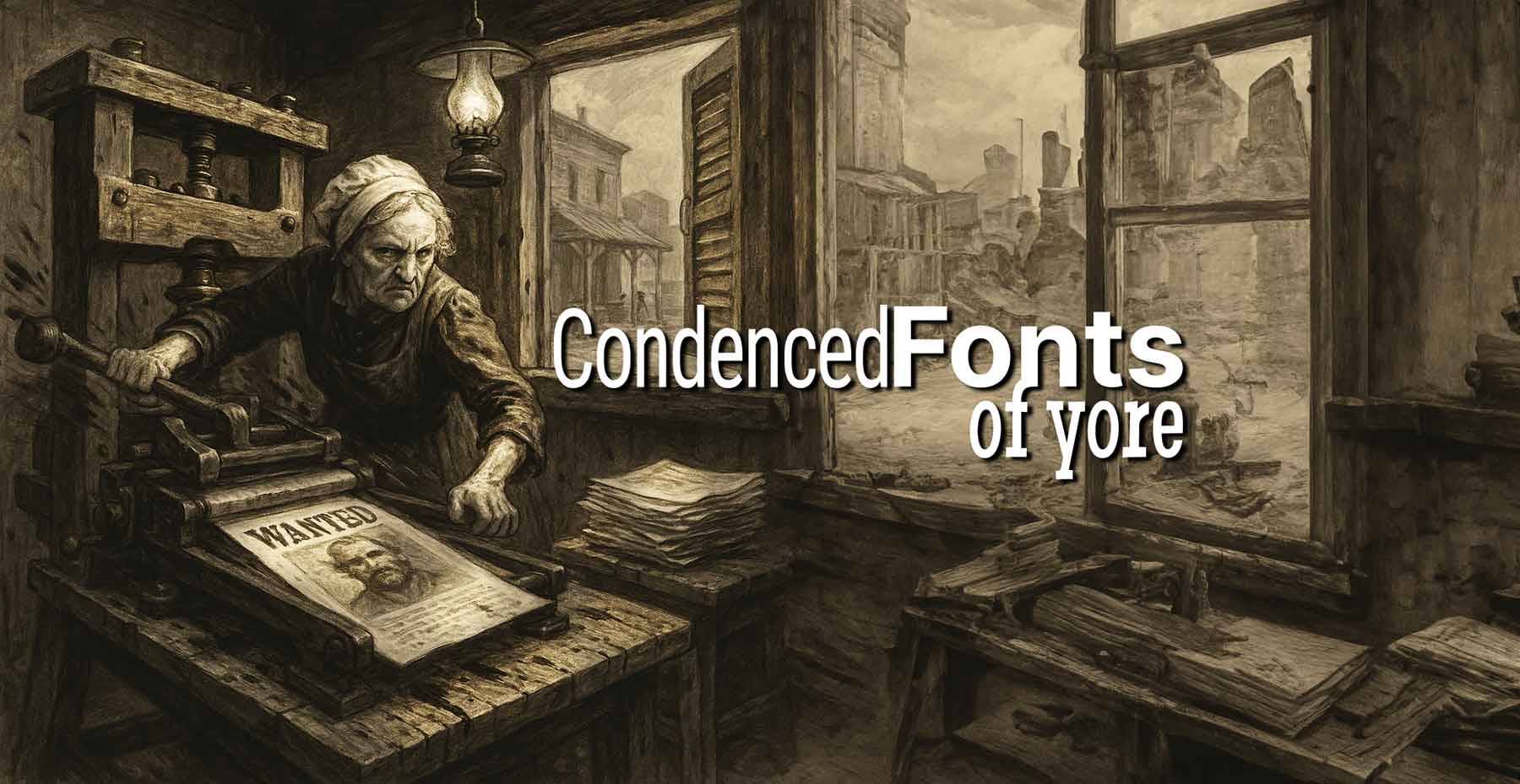
Condensed fonts may “save space” and they also add density, disrupt reading flow, and are generally harder to decipher. When I struggle to read and understand the content in a condensed font, what must people with even less visual acuity or different levels of reading skills experience?
I’ve had condensed fonts explained as a cross-Atlantic cultural thing, and I don’t believe it is. At least, not naturally so. Leading, kerning, and tracking are foundations of typography and directly affect readability, aesthetics, and user experience. Narrowing the letters can’t help to improve it. Maybe the locals have learned to get on with them because they’ve always been that way.
Condensed fonts appear to prioritise aesthetics over the human content experience, and I don’t know why. Font choice is about designing for the human reader and not the container. Web content should flow and adapt to our readers’ environment and preferences. It’s not fixed or paid by the inch like print is. We have an almost infinite space and when encoded properly, our readers can scroll and update the browser presentation to meet their preferences—if they know how.
It’s not only reader preferences. Condensed fonts design-in a barrier. They can disrupt the natural if learned reading rhythm, create de-motivating density, and lead to eye strain. Leading organisations focused on dyslexia and literacy consistently recommend using fonts with generous spacing to improve legibility and reduce reading errors. This principle applies to all readers, not just those with a specific diagnosis.
Instead of minimising space, let’s embrace it. We know whitespace is important and so is your spacing in typography. It’s no excuse to follow a trend set at the invention of the printing press. A relaxed kerning, generous letter spacing, and a sensible line height (leading) makes content breathe, making our words more accessible and our message more inclusive.
Let’s turn back from dense walls of near illegible condensed text and create a readable pathway for everyone to read, understand, and action to meet their goals.