 Reading Time: 5 minutes
There’s a load of ‘stuff” to do when learning–stuff. And there’s always the social stuff needed going through within any new class: Tuckman’s Storming and Forming team routines, who our tutors and our fellow students are, and where to get a brew at break time. It all starts with parking and finishes with dark thoughts of, “is that gate still open?” You know. Stuff.
Useful stuff?
And then there are the first ice-breakers to navigate and partnered and group tasks. The worst. Working within impossibly narrow scenarios stepped a million miles from those we have grown accustomed to work with. Throwing a ball around a room to “learn” names forgotten by bed time. Imagine… like my brain isn’t busy enough finding the classroom?!
Just sometimes something sticks out as useful.
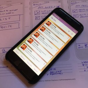
And on only our second evening brave Stefan threw out such a partnered task. Paper wireframe a shopping list and recipe app inside of fifty minutes. Yes. Fifty minutes. Imagine… and all that other meta-cognitive nightmare stuff all new students fear. Sweat. Or, is that sweet?
The 50 min app
So we heads down into our personal silos to organise our cognitive and creative processes with Biros and pencils twitching.
Challenge one: no one wireframes before completing research, an analysis, writing user flows and content, etc? Probably they do. And I criticise the very thought of it for selling the UX short with 50% UI.
And here’s the freaky part. I had great fun abandoning “formal process” and brainstorming through analysis at the quickest pace landing in the position of narrowing scope within only five minutes. Stefan asks how I’m doing. Fine, I think (I lied, still reeling from the prospect of actually wireframing an app inside 50-minutes).
Now for sure, the brief was written clearly and I only misread or misunderstood a key element: that the app is for our own personal use. There’s no user analysis to do. Usability is what we can put up with or prefer. That’s so difficult. But just imagine… the advantages. The needs and wants. The process of refining concepts to scope. Imagine. Cool.
Stefan scribbles on my smart new student notepad, “Features vs. Goals“. Of course, what do I want to do and then how will I achieve it. What is essential (Minimal Viable Product)? What can I take away from my brainstormed features before I will fail to achieve my goals?
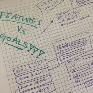
Minutes later I have prioritised my goals and reduced my features. Gone were the social sharing aspirations, the linking list items with recipes, and an exclusive contract with Amazon, Tescos, or Dunnes. Remaining was the choice to add and manage lists or recipes. Boolean. Lists or Recipes. Well, that’s the homepage sorted! This is cool.
Next, being an efficient sort, I fleshed out the achievable goals related to lists: Create lists, add and manage items, check them off when following them. There’s a host of complexity and additional features on potential. And the ones I need? Simple. Keep it simple. And there’s my lists page. And recipes? Well they’ll be listed. They’ll be added and managed. That’s the same UI as the List page. Job done, really.
Features? Add and manage. Manage needs a filter and find (search), edit and delete process. Done. App finished.
Shared
I then shared my app progress with my fellow student, Dorcas. And on her notes lay a wealth of user-centric features I made a mental note to steal. Shamelessly. And then pass off as my own some day. Really, they are that good. I’m not sharing them with you here.
On reflection
Back in my digital studio, I reflected on this 50-min exercise. The paper prototyping was fun and I wondered what value it brought to a real product? Enjoying a process doesn’t validate it.
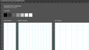
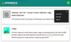
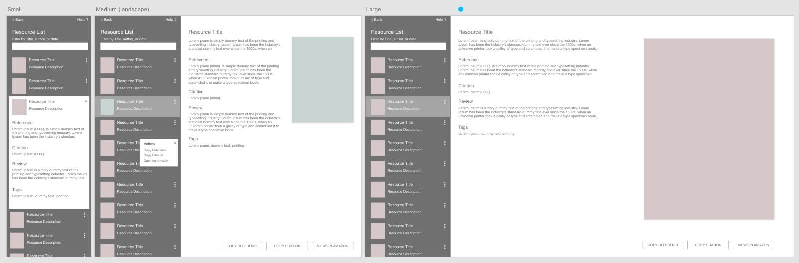
A couple of hours later I had reworked the flow, introduced a mobile-first UI using popular patterns of the day, and then transferred it into a real-life project. I’m working on a prototype to list and copy references and citations as well as a snippet library I’ve had parked for a time. I’m wading through table or definition/description list or hybrid code and usability/accessibility decisions and a little “skinning” hasn’t hurt that process. Done, not perfect. Evolving.
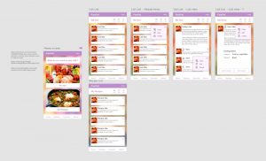
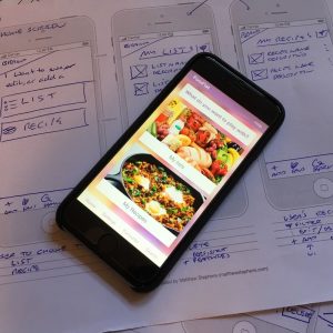
OK. NO APP is going to fall off the notepad inside 50 minutes. Not really? No. And what I did take away was to free up the mind from formal work and to let the visual UI add to the obvious content and features. In fact, I’m not going to dress up the learning. I simply enjoyed it. I’m going to hold on to that. I enjoyed the freedom.
And 50% UI? Hey! This is a 50 minute app. What do you want? A marketable product? Get real.
Chill. Then again, a little messing around later and…
Influence
While working on a list of snippets based on My UX Bookshelf list coded using a table, I implemented a similar pattern into My Snippets list prototype using definition or description lists. The copy buttons may yet display on “desktop” viewports and then reduce to the “kebab” menu button in narrower viewports. I’m researching menus and their transitions across viewports as a side project. (The Copy functions hide in “mobile” browsers that prohibit the copy function and are replaced by a “reveal”.)
Reference this post
Godfrey, P. (Year, Month Day). Title. Retrieved , from,
Image Attributions
Images by the author except:
My Lists app background:
Arraiz, N. featured by Testado, J. (2017, October 26). Feast your eyes on Pink Intruder’s colorful, food-inspired mural in Valencia, Spain. Archinect News. Retrieved September, 2018 from https://archinect.com/news/article/150035272/feast-your-eyes-on-pink-intruder-s-colorful-food-inspired-mural-in-valencia-spain.
Homepage My Lists button:
U.S. Food & Drug Administration (2018, September 17). FDA Food Safety Modernization Act (FSMA). Retrieved September, 2018 from https://www.fda.gov/Food/GuidanceRegulation/FSMA/default.htm.
Homepage My Recipes button:
Sun, M. featured by Tasting Table (2017, May 16). Chorizo Hash and Eggs. Retreived from Tasting Table September, 2018 from https://www.tastingtable.com/cook/recipes/chorizo-hash-eggs-recipe.