 Reading Time: 5 minutes
Sometimes I get so hooked up on inclusive design—and rightly—that I can overlook the strategies that take an OK user interaction (UI) to delight.
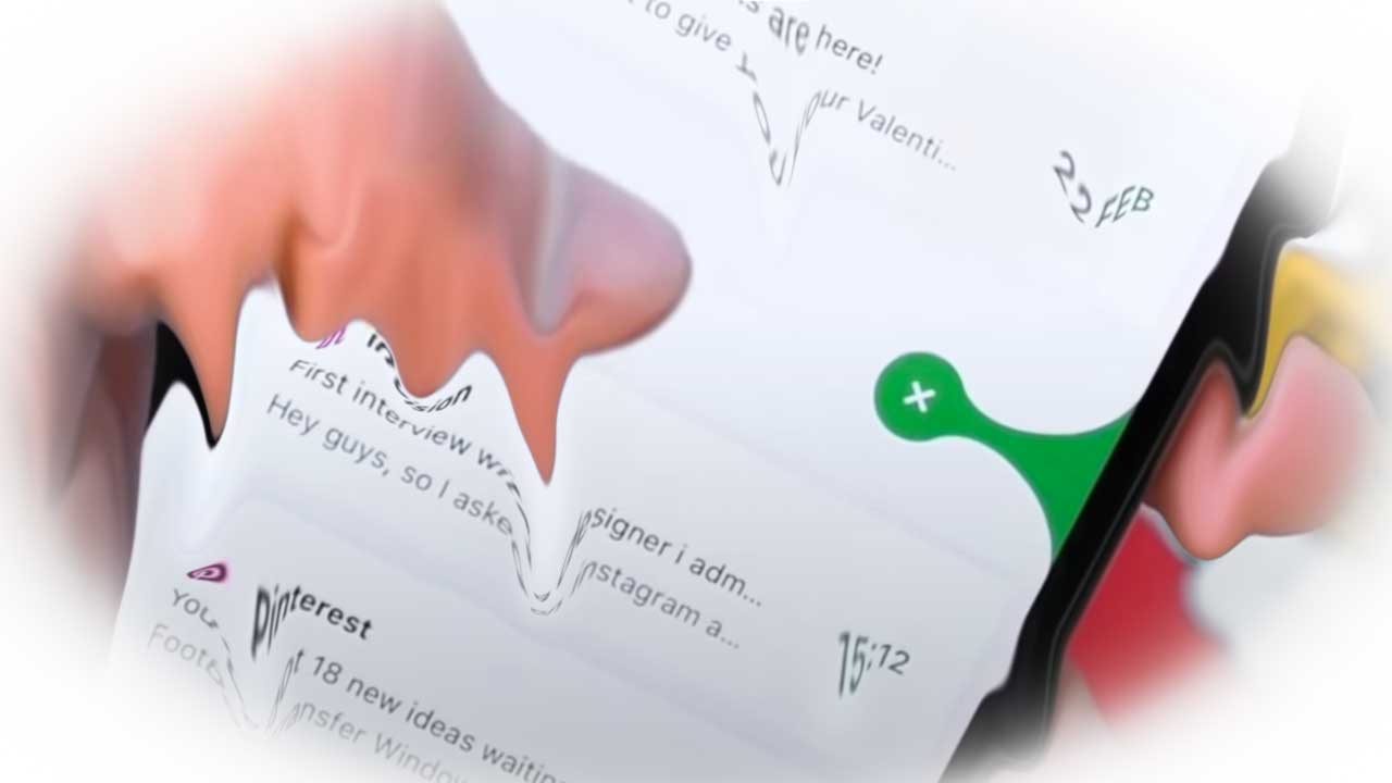
Following on from my starter-project on UI SVG animations, I found the following demonstration that exports Sketch PNG files into After Effects. Forgiving that the YouTube comments capture my own ill-ease with the interaction and experience design, the visual effect is interesting. The following questions are on my mind.
- Can we do this with ‘raw’ SVG and CSS @keyframes?
- Is the IxD as bad as some commentators say?
- Is green really a bad idea for delete when compared with red?
Let’s dive in
The Demo
1. Can we do this with ‘raw’ SVG and CSS @keyframes?
Whoa! I only just learned to bounce a bicycle! However, perhaps when we have broken down the interaction design (IxD) and component parts we can?
My thought process revolves around the idea we have three basic parts:
- The liquid source.
- The liquid spill (dot).
- The liquid drop
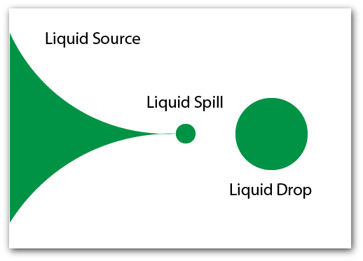
For each component or part of the SVG, the following can be animated with @keyframes:
- height
- opacity
- origin
- position
- rotation
- skew
- width
Perhaps optimistically, that’s all the wizardry and effects used in the After Effects timeline? Or have I over-simplified the UI and IxD with my conclusion-jumping brain? We’ll find out in a future post, I am sure 🙂
2. Is the IxD as bad as some commentators say?
Before even lifting a pencil I need to be certain there is value when experimenting on this project. Criticisms of the demonstrations in comments include discussions and trolls flaming around:
- Color affordances
- Confirming and undoing a destructive action
- Development strategies in existing frameworks
- Expectancy to archive email in ‘modern’ platforms
- Pointers and the use of left and right thumbs
All of the above are matters for design and as for anything with design, it depends. I am surprised so many designers are blinkered by borrowed beliefs picked up from our visual-biassed industry and, or education.
2.1. Color affordances
Commentary criticised the delete action being signified using green. In argument for allowing green or any color:
- Green for go and green for safe are a dichotomy. Green can mean safe to go, or safely stopped.
- Red is intended in this argument to be a warning of a dangerous operation. Is deleting your emails dangerous?
- We should not indicate meaning by colour alone.
- The interaction is accompanied by a cross.
As we will learn in Section 3, it’s more than all about the color.
2.2. Confirming and undoing a destructive action
Mention is made that the delete action appears to lack a confirmation stage or an undo operation in keeping with accessibility requirements for destructive actions:
- The drag is a long movement action and time enough to consider a confirmation?
- We could add a two-stage action – the second stage for the confirmation creating two drags?
- An Undo action can be made available in a Trash or Deleted items list.
The intention of this interaction is to filter out trash rapidly. The repetition of deletes is likley greater than that for restores. Providing a Deleted list from which to clear or restore one or more items may be a more involved task in comparison to the delete action, and justified when occurring far less often.
2.3. Development strategies in existing frameworks
From the developer comments, the interaction may cause some effort on the front-end. My own assessment is to look to complete the development of the design using basic HTML and CSS called by user action captured JavaScript. That’s all frameworks and component libraries are so I see no issue other than the competence of the developer and their environment
2.4. Expectancy to archive email in ‘modern’ platforms
Really? So enable that. Where the facility is not required then don’t develop for it. Ask you users. There is no dogma here?
2.5. Pointers and the use of left and right thumbs
The design is clearly intended for use on a narrow, hand-held touch screen. To my mind that is not a great business strategy as it ties the product within a narrow band of user cases.
As to the right or left thumb usage, I respect the effort to enable lefties and righties to drag toward their own hands and ask, on what research is that based? Whatever, the interaction does need to be inclusive and should not rely on only gestures and their accuracy alone.
3. Is green really a bad idea for delete when compared with red?
We have quickly covered this at Section 2.1.. The question is deeply entwined in the interaction design and the discussion is quickly going to broaden from the choice of colors.
There is no reason to use only red as suggested by commentators stuck to some rigid lore based on inaccurate beliefs. Any compliant contrast of any color is usable when supported by an alternative strategy such as pattern, shape, or text. The important thing is that our users understand the interaction and intent.
3.1. Swiping
An assumption has already been made that our user will know to swipe left or right to remove an email from the list. The pattern to swipe right is near ubiquitous. And left? I’m not so sure. However, the point is that we will swipe to execute an action and need to be informed of what that is.
3.2. Confused visual dialogue
In the demonstration, a cross or “×” is used as the icon signifying deletion. Whoa! Steady there partner. We use that to CLOSE or REMOVE, not DELETE. A trash can or similar would be an improvement.
The icon itself presents a possible frustration from needing to learn that on swiping, when the icon appears, that it is not a button needed tapping to confirm the action to tap the icon as a button. Our user may lift their digit and let go of the interaction and the icon will bounce away and the action abandoned. The strategy needs some serious thinking and user testing in context, I think.
So what?
There are so many options available to make this interesting and visually engaging treatment of a routine task work. It’s perhaps a shame the author did not complete the design task before sounding so cocky about it? Lesson learned: humility.
Let’s improve our UX with some design thinking: caveat as a non-paid venture I am not spending full resources on its investigation. It still needs to work for our users so I will be in habit-following-mode using the (R)ADDIE methodology with my Basic User Journey tool described in my parent website’s article, UX Design Process-with-ADDIE.)
Summary
For all the blusto about this fluid interaction it is easy to find fault with the demonstrated design. The video over-sponsors the success of the design and I can understand the owner company wouldn’t notice. They likely dazzle clients with visual cleverness and make a success from their gamble on the client having no idea what they are talking about. “Wow. Shiney. I want it!”
Now, how’s this project going to go…? Afterall, wow, shiney, I want it!