 Reading Time: 5 minutes
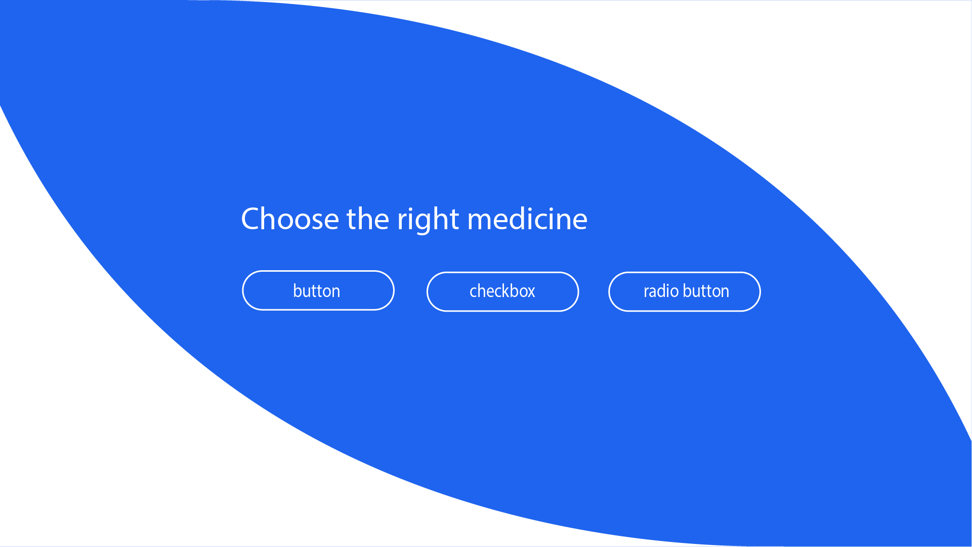
I’m irritated when those arrays of filters or options we are offered to update lists of data are badly coded. You know, those lozenge-shaped UI components designers refer to as pills or capsules? Like the pharmaceuticals they describe it’s vital we prescribe the correct one.
They look like a bunch of buttons and update the content according to their ON and OFF visual state like switches. Only, the button isn’t the semantic ON and OFF switch this interaction needs.
- The experience may be “accessible” and it certainly is not inclusive.
- It demands more JavaScript than the correct native components need.
- More ARIA is needed to compensate the incorrect choice of components.
We should be using the boolean input with an input type of checkbox or radio.
When we recall our user interaction component roles we can understand the confusion and cannot excuse it:
- Buttons update content
- Inputs manage data
- Links navigate
Easy enough. So, why do designers and developers use anchor links (a tags) in place of button and button in place of input? The answer is likely rooted in their ableist visual bias and evolving streams of use.
For example, LinkedIn are correct in presenting an array of buttons denoting a primary action and two secondary actions. Working from Material Design, the pattern and art direction are correct although within this post’s topic, perhaps the context and transaction is confusing?
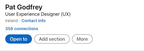
Is our users’ LinkedIn button choice destructive (when a button updates something), or non-destructive like a checkbox before a confirmatory Submit?
The visual presentation offers only the most subtle of contextual clues with the primary action button’s dark fill potentially misleading our judgement. Could this be a preselected checkbox? (I’ll not dwell on the “Open to” button value. What?! Is that the legend to choose to Open something to Add Section or More?)
There’s clearly more to UI design than drawing stuff in Figma.
Note: Be free to comment. I have my own bias to challenge and welcome your feedback.
Different Codes
The HTML of button, input and link anchor (the a tag) is as different as their tasks. Competent designers and developers must understand the differences and prescribe the correct interaction to each task.
Button
The following are the 3 available button types:the default button and type= reset and submit.
Inputs
The following are the currently available input types of input type= one of the following attributes: checkbox, color, date, datetime-local, email, file, hidden, image, month, number, password, radio, range, reset, search, submit, tel, text, time, url, and week.
Links
The following HTML identifies a simple link anchor that navigates to a separate document:
<a href="document.mime">Open the document</a>.
Different Use Cases
It’s pretty straight forward and you may recognise the following list of use cases:
- Buttons update content
- Inputs manage data
- Links navigate
The Prescription
The basic HTML needed to present a multi-select array of 3 lozenges depends on whether our user choice is a single or multi-select?
- The
checkboxsignals that we can choose more than one option in a group. - The
inputtyperadiosignifies we can choose only one option from a group. - Two or more grouped checkboxes or radio inputs are in effect a custom component.
Using a fieldset containing 3 checkboxes and labels the HTML is as follows:
<fieldset>
<legend>Filter your items by:</legend>
<input type="checkbox" name=@id="item1"><label for="item1">Item 1</label>
<input type="checkbox" id="item2"><label for="item2">Item 2</label>
<input type="checkbox" id="item3"><label for="item3">Item 3</label>
</fieldset>
Presentation
The following figure demonstrates a basic presentation.
The basic presentation doesn’t follow the art direction of our filter lozenge array. We need to create the lozenges using CSS. The following 5 steps explain how with a demonstration in the next figure:
- Style the fieldset and legend to meet art direction.
- Style the checkbox invisible and not hidden, which would remove its interaction from the DOM.
- Style the label shape, font, and colors.
- Style the label states for unchecked, checked, focus and hover to meet art direction.
- Add label pseudo classes of :before and :after to include and update glyphs, which can ease the confusion conflicting art direction as exampled on LinkedIn.
The CSS
Caution: The following CSS is a demonstration only and is working with and against the core values set in this blog’s styles
.loz label {background:white;border:1px solid green;margin-right:0.25rem;padding:0.25rem 1rem;border-radius:2rem;cursor:pointer;}
.loz label:hover {box-shadow:2px 2px 9px rgba(0,0,0,0.4);}
.loz label:after {content:" ?";padding-left:0.5rem;color:green;font-weight:bold;}
.loz input[type="checkbox"]:checked+label {background:green;color:white;}
.loz input[type="checkbox"]:checked+label:after {content:"\2713";padding-left:0.5rem;color:white;}
.loz input[type="checkbox"]:focus+label {box-shadow: 0 0 5px black;}
Note: Purists may frown on the use of a cursor="pointer" style and I would counter: we have updated the interaction’s visible style. It is now visually a custom component and not a link, input, or button.
Through abuse of the pointer or not, our users may expect the visible change of the cursor. As with anything design, it depends. Test it.
Choice UI Writing
The most important defining character of a designer who writes UI copy text is their understanding of the digital paradigm in which they work. House writing guides will vary in their use of “click”, “select” and “choose” and always on the Oxford Comma. Writers will research and have made an opinion that may conflict with that guide. That’s because, as with anything design it depends.
It depends on what? Our users, of course. It also depends on our writer’s adhesion to the paper publishing paradigm and understanding of how our digital paradigm has and is evolving. That and their user centricity.
Click or Select?
I make no secret that we should write “Click” and not “Tap” on buttons based on their semantic, visual and audible metaphor. You can read my long article, Writing for UX, Click or Tap when you disagree.
So where did “Select” come from? Select is the resulting physical action of our users’ cognitive choice. Oh dear, I sense an argument coming on!
Select or Choose?
As digital publishers, we want our user to physically click on an interaction: to make one or more selections. From our users’ point of view they must make a choice.
In the “old days” before the Noughties we were uncertain our users were digitally competent. The Twenties are turning that around. Based on the wide topographical and demographic distribution of browser-hosting devices and our mandatory use of smartphones to pass security, we can better assume a general digital literacy. We don’t need to instruct our users to physically select and need only inform that they can make a choice.
My preference is to invite the choice and not the selection. “Choose” feels a softer word than, “Select” too. For example, “Choose one or more options” invites thought where, “Select one or options” isn’t wrong; it just feels less personal and more about what our enterprise wants (a definitive and careful choice) than what our user needs, only to choose.
The argument is subtle and house style guides are generally created by highly skilled writers based on psychological and behavioural science and user testing, right? It’s left to semantics and we can leave it at that and as semantics is a science, perhaps we should not?
Summary
- The choice of inclusive interaction for selecting 1 or more items from an array is an
inputwith atypeofcheckboxorradio. - Deployment of an array of buttons results from an ableist visual bias.
- As a custom component our art direction and UI presentation is customisable.
- The default DOM presentation is easily styled to meet the needs of art direction.