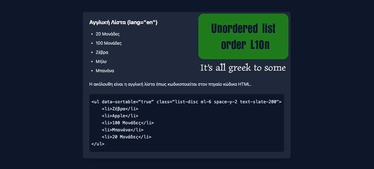
Reading Time: 3 minutes An alpha-numeric unordered list order helps readers search for an item. Meanwhile, content and a11y strategists stress not to order them. I challenge to that direction.

Reading Time: 3 minutes An alpha-numeric unordered list order helps readers search for an item. Meanwhile, content and a11y strategists stress not to order them. I challenge to that direction.

Reading Time: 2 minutes LLMs have supported the Basic User Journey and I prompted two to role play a cynical UX designer. Bing gives love daily, while Gemini gave a tougher kind of love.

Reading Time: 4 minutes My Basic User Journey (BUJ) tool just got better. AI evolves the framework to prototyping UX design thinking directly from requirements. My BUJ just grew up!
Reading Time: 2 minutes Ditch condensed fonts that hurt readability. Embrace spacing for a more accessible, inclusive web designed for humans, and not toilet paper.
Reading Time: 2 minutes Unlock the power of inclusive avatars! Discover why alt text for avatars is essential for accessibility, SEO, and richer user experiences.

Reading Time: 2 minutes A Chat GPT tool ignored my UI writing guideline to replace “view” with active terms for calls to action like, “Read” and “Open”. When challenged, it recanted.

Reading Time: 2 minutes Designers who believe inclusive content is “over-empathising” don’t understand the problem. We’re designing for all abilities and not a disability.
Reading Time: 6 minutes Like Sydik (2007), I believe alternative texts are the litmus test of accessible design. So is the Back to Top link, and its inclusive design is open to debate.
Reading Time: 6 minutes Carnivores, pescatarians, vegetarians, and vegans are offered very different experiences from omnivores in cafes and restaurants. It’s equal to discrimination.
Reading Time: 10 minutes Create inclusive content that shifts our user experience (UX) beyond accessibility. Try replacing ableist and vague content to add inclusion and precision.

Reading Time: 10 minutes My Basic User Journey (BUJ) content tool guides our design thinking of digital information and flow between our user and our business. Is it still useful today?

Reading Time: 5 minutes Content design is an empathetic UI and UX craft. Presenting a price reduction from $y to $x needs work with inclusive HTML and CSS. It’s not all done in Figma.
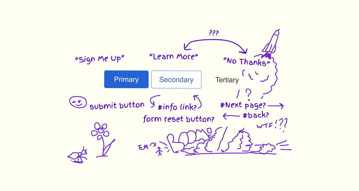
Reading Time: 8 minutes Arrays of Primary, Secondary, and Tertiary interactions are a familiar pattern. Does their content, taxonomic, and visual design assist or compound our experience?
Reading Time: 5 minutes HTML offers a choice of emphasis for individual words and blocks of content. Let’s create an inclusive experience of emphasis beyond using an em tag.
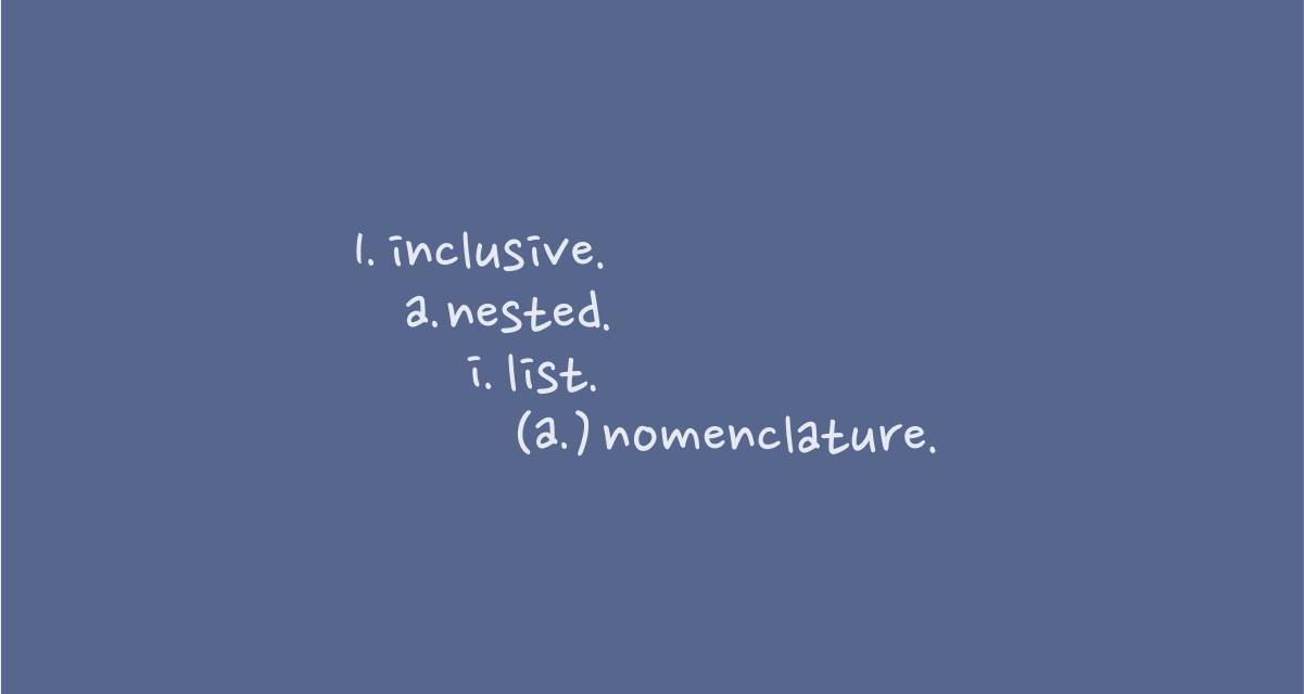
Reading Time: 7 minutes The native HTML list nomenclature and a lack of punctuation are a barrier to some of our readers. A little CSS and JavaScript improves the inclusive experience.

Reading Time: 4 minutes Browsing my favourite YouTube channels, I found an ideal lunchtime project. Online Tutorials featured a snatty CSS image erection effect. It made me think of a 4-fold flyer I created for an art show. It was ideal to play with.
Reading Time: 23 minutes Legalese and compliance copy is the pillar of trust when customers agree to our terms. It’s the specialist language of law. How do we make legalese accessible?
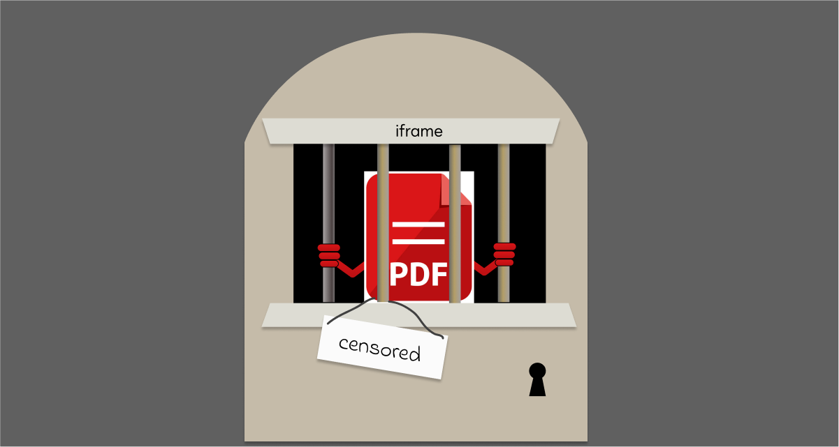
Reading Time: 5 minutes Why embed a PDF inside our HTML? Isn’t it odd? Our digital medium is HTML. It’s a wonderful space offering accessibility, beauty, inclusion, and versatility.
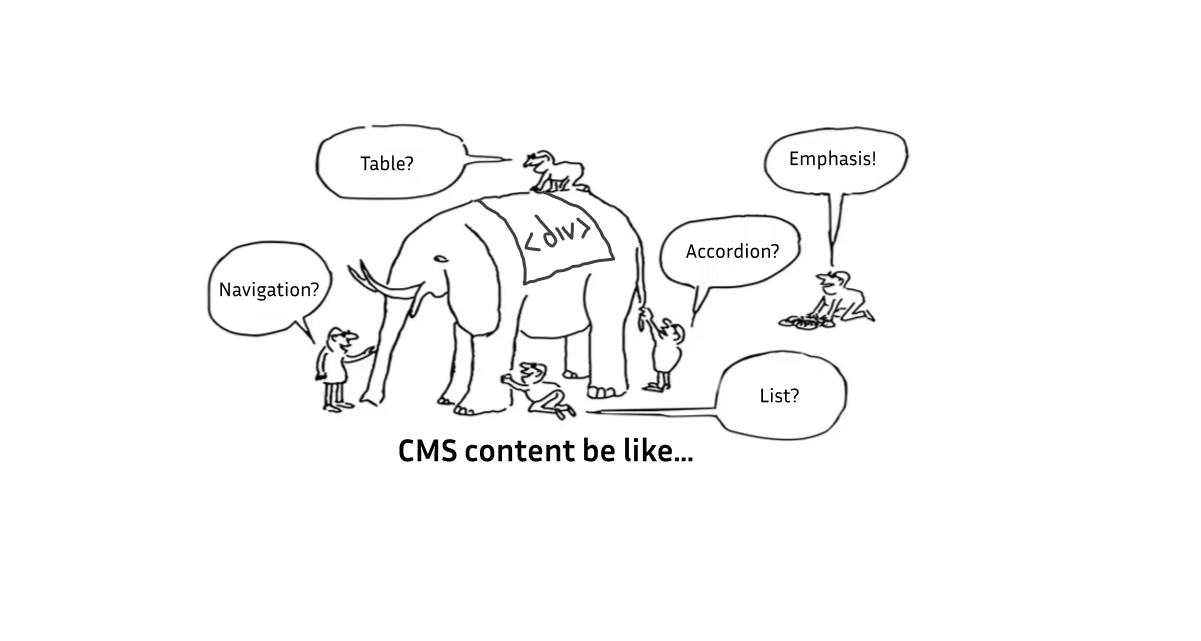
Reading Time: 4 minutes I dislike off-the-shelf content management systems (CMS). They allow anyone to publish content to the Web. That’s fantastic! If only you would deploy them accessibly!

Reading Time: 22 minutes An accessibility engineer complied with WCAG SC 1.1.1 and broke 13 others. This case study closes the gaps between accessible and inclusive assessment design.