 Reading Time: 4 minutes
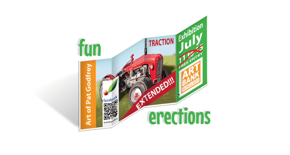
Browsing my favourite YouTube channels, I found an ideal lunchtime project. Online Tutorials featured a snatty CSS image erection effect. It made me think of a 4-fold flyer I created for an art show. It was ideal to play with.
The first problem is accessibility. The demonstration detects the hover event. That won’t work on touch devices without directing our visitor to tap it. I didn’t want that to stop my fun, so I worked to update it to work when scrolling to the image.
Aim
To make the effect more inclusive by achieving the following objectives:
- Automate the effect on scrolling.
- Make the image responsive to fit all viewports.
- Avoid blowing up my brain with math and scripts.
As always, this Blog environment adds work between prototyping on the desktop and deploying it to the page.
Cool concept huh? The image lays flat and in simple perspective. As you scroll past the trigger, the image pops up and appears to fold into 4 sections. And you can tailor the code for fewer folds, too. How about your next book cover?
Problems
There were and remain some challenges. It wouldn’t be fun without them.
- Removing the hover interaction and timing the effect when scrolling.
- The prescribed CSS deploys
spanelements styled inline with a variable. The variable is used in the math to calculate the off-set of the CSS image for eachspan. In effect, this prevented me from easily using responsive measures like percentages. - Many of the dimensions in the CSS depend on parent container’s dimensions.
- The CSS image needs a parent’s dimensions to match its own.
Partial solutions
In the browser, a media query added a breakpoint at 600 pixels viewport width. The CSS was crafted mobile-first with a demonstration set to fit a smaller viewport. On the viewport’s expanding wider that 600 pixels, the CSS updated to a larger format. That’s OK, and isn’t as flexible as I had aimed for. That math and its dependency on parent and image scales was more than a 10-minute project would resolve.
The media query won’t work in the Blog environment from an inline style declaration. I am not certain why because there are media queries in the Blog’s custom CSS. That means the interaction is at a fixed size and I have failed to achieve all objectives. There’s always something for the weekend…
Updates
Aside from swapping the hover to a scripted trigger on scrolling, I modified the code as follows:
- I updated pixel scales to CSS ems. This allows some easier update to the element’s scale by updating the parent element’s font-size.
- I narrowed the second and last spans to offer an improved perspective. This improvement didn’t survive the move to the Blog environment.
- I added the drop shadow for when the image is laid flat.
- I added the drop shadow for when the image is made erect. I haven’t spent time animating it. Yet.
- I updated the prescribed spans to avoid the Blog environment’s want to add line breaks to line breaks. This broke the flex.
- To accommodate the script, the element classes and identities were updated to offer anchors for actions.
That’s it, really. There’s room toward perfection and for now, it’s proved the concept.
The tutorial
Here’s the original YouTube video tutorial. It is really straight forward and I can only fault it for using the hover trigger.
Demo code
The following is the full HTML needed to play with the image erection for yourself. Copy and paste the code into your text editor and save as an .html file. Then navigate to the file and choose to open it in your browser of choice. Creation and testing was completed in Chrome. Have fun–and don’t be shy reporting your own solutions!
<doctype! html>
<html>
<head>
<title>Pat's 10-minute erection</title>
<style>
* {
  margin:0;
  padding:0;
}
body {
  background-color:white;
  padding:1rem;
font-size:100%;
font-family:sans-serif;
}
.demo {
  display:flex;
  justify-content:center;
  align-items:center;
  height:25em;
  margin:10rem auto;
  border:1px solid red;
}
/* flex container */
.box {
  display:flex;
  width:20em;
  height:9.37em;
  transform:rotate(-20deg) skew(20deg);
  transition:0.5s;
}
.box:hover {
  transform:rotate(-20deg) skew(-20deg) translateY(-20px);
}
.box span {
  display:block;
  width:25%;
  height:100%;
  background:white url(traction-extended.png) no-repeat;
  background-size:cover;
  background-position: calc(-5em * var(--i));
  transition:0.5s;
  border-top:2px solid white;
  border-bottom:2px solid white;
  box-shadow:-2px 2px 3px rgba(0,0,0,0.4);
}
/* folded effect */
.box:hover span:nth-child(odd) {
  transform: skewY(20deg);
  box-shadow: inset 10px 0 15px rgba(0,0,0,0.2), -1px 1px 2px rgba(0,0,0,0.4);
}
.box:hover span:nth-child(even) {
  transform: skewY(-20deg);
  box-shadow: inset 10px 0 15px rgba(0,0,0,0.2), -1px 1px 2px rgba(0,0,0,0.4);
}
/* decoration */
.box span:first-child {
  border-left:2px solid white;
}
.box span:last-child {
  border-right:2px solid white;
}
box span:nth-of-type(2) {
  width:20%;
}
.box:hover span:last-child {
/*width:20%;
  margin-top:0.1875em;*/
}
/*layering*/
.box span:first-child {
z-index:100;
}
.box span:nth-of-type(2) {
z-index:75;
}
.box span:nth-of-type(3) {
  z-index:50;
}
.box span:last-child {
border-right:5px solid white;
  z-index:25;
}
.box:hover span:last-child {
/*margin-top:0.375em;*/
}
@media screen and (min-width:55em){
  .demo {
    height:40em;
  }
  .box {
    width:40em;
    height:18.75em;
  }
  .box span {
    display:block;
    width:25%;
    height:100%;
    background-position: calc(-10em * var(--i));
    border-top:5px solid white;
    border-bottom:5px solid white;
    box-shadow:-3px 2px 3px rgba(0,0,0,0.4)
  }
  /* decoration */
  .box span:first-child {
    border-left:5px solid white;
    z-index:100;
  }
  /*shadows*/
  .box:hover span:nth-child(odd) {
    box-shadow: inset 20px 0 30px rgba(0,0,0,0.2), -3px 2px 3px rgba(0,0,0,0.4);
  }
  .box:hover span:nth-child(even) {
    box-shadow: inset 20px 0 30px rgba(0,0,0,0.2), -3px 2px 3px rgba(0,0,0,0.4);
  }
}
</style>
</head>

<body>
<h1>Pat's 10-minute erection</h1>
<p>Hover over the image. Adjust your viewport width to trigger the responsive breakpoint. Play and have fun.</p>
<div class="demo">
<div class="box">
<span style="--i:0;"></span>
<span style="--i:1;"></span>
<span style="--i:2;"></span>
<span style="--i:3;"></span>
</div>
</div>

</body>
</html>