 Reading Time: 3 minutes
Our visual designer plans a section with a heading and four numbered areas to describe four steps or areas to explore in our product. You know the thing. In this scenario:
- The code strategy is not specified.
- The developers use some CMS or framework or other, which makes their lives easy and adds weight to the payload. The owners don’t know and don’t complain.
The result?
- 204 KB of pure DIV and SPAN vomit even without Scripts or CSS
- In-line CSS
- Incomprehensible semantics
- Smatterings of otherwise unnecessary ARIA, likely added out of desperation when ‘tested’ with VoiceOver
The total payload paid for by the visitor? Five-seconds of loading scripts alone!
Perhaps we can look to the modern fashion emerging for semantic HTML. Yes, that basic web code we all learned on and employed enthusiastically before ‘frameworks’ evolved to speed to market.
Developers got comfortable with compilers and simply forgot how to do things properly. Sure, some components are complex and easier to pluck out of a decorative box finished with a bow. And let’s be honest, where a component is reusable and needed accessible and useable for your enterprise’s success and reputation, why ‘hand-off’ responsibility to some third-party framework owned by another’s enterprise?
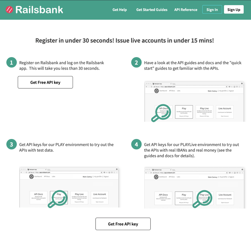
In this study case, the following screen grab from Railsbank describes a typical implementation of the four-things scenario. The designers have ‘handed-off’ a pleasant and inviting design, which is then published using the most sickly DIV and SPAN soup. Those numbers? They are encoded as spans! Crazy, I know.

Anyway, here’s how modern semantic HTML and CSS can present the same output in only 5 KB. I’ve also updated the assumption that our users’ scenarios enable them to complete a stage in 30 seconds and added ideas to introduce the list and its purpose to screen readers.
Suggested Semantic HTML and Update
<section>
<h3 id="anIdentity">Register in under 30 seconds! Issue live accounts in under 15 mins!</h3>
<p>Here are four things you can do now:</p><!--visually hide?-->
<ol>
  <li><a href="javascript:void()">Register on Railsbank</a> and log on the <a href="javascript:void()">Railsbank app</a>.  This can take you less than 30 seconds.
    <a href="javascript:void()">Get Free API Key</a>
  </li>
  <li>Have a look at the <a href="javascript:void()">API guides and docs</a> and the <a href="javascript:void()">"quick start"</a> guides to get familiar with the APIs.
    <img...alt=" " width="n" height="n" >
  </li>
  …etc…
</ol>
</section>
As it presents without CSS on this site
Register in under 30 seconds! Issue live accounts in under 15 mins!
Here are four things you can do now:
- Register on Railsbank and log on the Railsbank app. This can take you less than 30 seconds. Get Free API Key
- Have a look at the API guides and docs and the “quick start” guides to get familiar with the APIs.


- Get API keys for our PLAY environment to try out the APIs with test data.


- Get API keys for our PLAYLive environment to try out the APIs with real IBANs and real money (read the guides and docs for details).


The CSS would plan to use list item pseudo classes to provide a styled counter and lay the items in a responsive grid. All that DIV and SPAN and scripting? Nonsense. Let’s keep the web simple, accessible, and usable.
