 Reading Time: 4 minutes
The Internet is a dirty place. Surely respectable enterprises should help make it safe? Dark patterns like this from Microsoft fail to install any confidence that an honest Internet is likely.
Naive? Given our industry’s call for user-centric design, the abuse of our users with crass engineering and misleading “dark” advertising patterns is surely wrong? When we understand that it is sponsored and highly competitive scamming, perhaps as a society we can press to prevent it?
Perhaps one angle to prosecute its accessibility? Where the pattern is designed to deceive everyone, it may prove more deceptive to people experiencing disabling motor, cognitive, or environmental scenarios: the people WCAG aims to protect?
Cultural Note: In literature, light and dark indicate the good and bad because there was a time when day was safe and night was not.
Reading: The Recommended Reading list at the end of this post expands on the concept of ethical and inclusive design for behavioural change.
Microsoft Example
Sure, there are other examples. This one simply sets the scene for an enterprise’s (Microsoft’s) sponsoring of “dark” patterns.
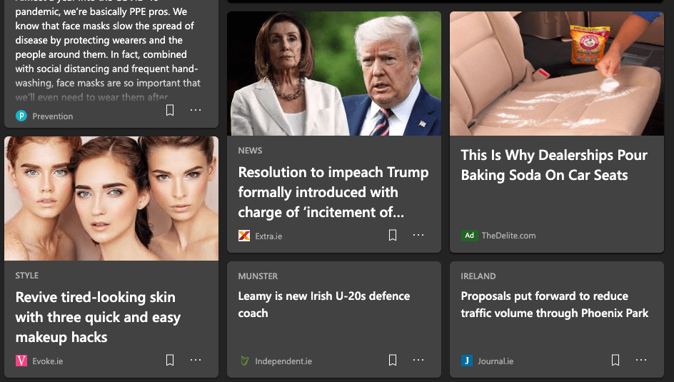
The HTML in the figure below is extracted from the MS Edge browser home screen (edge://newtab, so WAVE and AXE cannot analyse it). It forms a random advert card. The cards are scattered within a grid of news and features cards, each styled exactly the same. The only difference is in the last SPAN’s (font size 12 pixels) declaration: in this case of it being an advert.
There are a number of problems with the engineering. It is a “dark-hat” pattern designed to:
- Mislead users into clicking an advert.
- Plump out a legacy idea of Search Engine Optimisation copy writing.
- Initiate APIs the user did not subscribe to.
The “dark pattern” and nefarious intention to mislead is clear:
- The adverts are visually interspaced between, and styled as interesting features
- Using your local town name attracts your attention.
- The advertisement is only indicated to screen readers if they announce the very last span
- The visual indication as an advert is in 12 pixel sized font. That’s 4 pixels (25%) less than the minimum recommended for ease of reading across screens and resolutions.
- Each contains the usual data-grabbing API bullshit enterprise feels they need to ambush you with more bullshit.
The short description is nefarious click bait and other bollocks.

Our visual user must visually scan each 12 pixel ‘label’ to understand each click’s transaction. As headings are large to aid visual scanning, and navigable by screen readers, this is clearly a deception.
The pattern could be created using:
- An ordered list parent styled as a using CSS grid or flexbox
- A container list item for each card
- An image
- A heading
- A paragraph
- A link
- A footer paragraph
- Legible font sizes
Instead, as listed in the PRE area below, the pattern uses:
- 9 DIV containers
- 2 SPAN containers
- 5 accessible text repeats of, “Incredible 89 € Heating Device is Taking [your town] By Storm”
- A heading
- A paragraph
- Links
So What?
This is the browser’s home page; it’s meant to encourage our use of the browser.
When the browser’s default Microsoft-sponsored page misleads, then why would we want to use it? What other dark patterns lie in wait beneath its surface chrome? Perhaps exploring and turning off the hundreds of cookies gives an idea of the misdirection and abuse intended?
The pattern is designed to visually and cognitively mislead everyone. Everyone. Yes, at the least it’s an inclusive approach. What of people more susceptible to suggestion, less careful, more trusting: people with learning differences, older people with less knowledge of the deceptions, or screen reader users clicking before learning that the link is an advert? Surely, that’s only scamming? It’s a scam pattern.
A Dark Future
As we get wise to confirming our turning cookie collections off, so advertisers will be pressed to mislead us in even more covert ways.
If advertising supports the Internet, and where it can either fail or cheat, then maybe a subscription network is our only option to avoid enterprises scamming our time? Perhaps too, Internet subscribers should be identifiable, which could help reduce the ridiculous amount of online flaming and bullying we read in comment threads. Could that risk free speech in an environment where thought or culture is a already crime?
Whatever, the UX designers responsible for these dark patterns and deceptions go well rewarded. Where’s the justice in this World?
Note: The long API data has been foreshortened in the following example card code.
 <div style="grid-area: 1 / 1 / span 2 / span 1;">
 <div class="card-DS-card2-2 card-DS-card2-3 cardBase-DS-card2-1">
 <div data-t="{"n":"NativeAd","t":8}" id="extcontentsponcon_edgechrntp_river_6" data-card-index="6" data-nativead-json="{"tvb":["https://api.taboola…}" data-provider="taboola" data-ad-region="oneriver.main" data-ad-index="6" data-cb="{...}" data-encode="true" class="nativeAd-DS-card2-1 msn-206ed44b902d478ea058">
 <div data-t="{...}" class="card-DS-card2-2 contentCard-DS-card2-1 contentCard-DS-card2-6 contentCard__1x_2y-DS-card2-1">
 <div class="contentCard_positioningRegion-DS-card2-1">
 <div class="contentCard_imageRegion-DS-card2-1 contentCard_imageRegion-DS-card2-3 contentCard_obscuredRegion-DS-card2-1">
 <img title="Incredible 89 € Heating Device is Taking [your town] By Storm" class="image-DS-card2-1 contentCard_image-DS-card2-1 contentCard_image-DS-card2-3" alt="Incredible 89 € Heating Device is Taking  [your town] By Storm" src="https://img.img-taboola.com/taboola/image/fetch/f_jpg%2Cq_auto%2Ch_175%2Cw_300%2Cc_fill%2Cg_faces:auto%2Ce_sharpen/http%3A%2F%2Fcdn.taboola.com%2Flibtrc%2Fstatic%2Fthumbnails%2F8bf203b71c7e1c39c3ac649dc651c038.jpg">
 </div>
 <div class="contentCard_contentRegion-DS-card2-1">
 <a href="https://api.taboola.com/2.0/json/msn-anaheim-ireland/recommendations.notify-click?app...tuct6f6c2d6" target="_blank" data-t="{"n":"taboolasponcon","c.t":8,"c.hl":"Incredible 89 € Heating Device is Taking [your town] By Storm"}" class="contentCard_heading-DS-card2-1 contentCard_obscuredRegion-DS-card2-1">
 <h3 class="typography-DS-card2-1 typography-DS-card2-3 typography__5-DS-card2-1 contentCard_headingContent-DS-card2-1">Incredible 89 € Heating Device is Taking [your town] By Storm </h3>
 </a>
 </div>
 </div>
 <div class="contentCard_attributionRegion-DS-card2-1">
 <div class="attribution-DS-card2-1 contentCard_attribution-DS-card2-1 contentCard_attribution-DS-card2-3">
 <span class="attribution_contentRegion-DS-card2-1">
 <span title="findnewtrends.com">
 <a title="Ad" href="http://www.taboola.com/en-ie/popup?template=colorbox&taboola_utm_source=msn-msn&taboola_utm_medium=bytaboola" target="_blank" data-t="{"n":"taboolasponcon","c.t":8,"c.hl":"Ad"}" class="adLabel-DS-card2-1 adLabel-DS-card2-2 adLabel__primary-DS-card2-1">
Ad </a>
findnewtrends.com </span>
 </span>
 </div>
 </div>
 </div>
 </div>
 </div>
 </div>
Recommended Reading
White hat patterns and psychology of choice are referenced in the following books. There are others. Read them:
- Benartzi, S. (with Leher, J.). (2017). The Smarter Screen, Surprising Ways to Influence and Improve Online Behavior. Shelter Island, NY, USA: Manning Publications.
- Evans, D. (2017). Bottlenecks, Aligning UX Design with User Psychology. New York, NY, USA: Apress.
- Falbe, T., Anderson, K., and Frederiksen, M. (2017). White Hat UX, The Next Generation in User Experience. [Kindle Reader version]. Retrieved from www.amazon.com
- Pickering, H. (2016). Inclusive Design Patterns, Coding Accessibility Into Web Design. [Kindle Edition]. Retrieved from Amazon.co.uk.
- Yocco, V. (2016). Design for the Mind, Seven Psychological Principles of Persuasive Design. Shelter Island, NY, USA: Manning Publications.
