 Reading Time: 4 minutes
Off-the-shelf content management systems (CMS) allow anyone to publish content to the Web. That’s fantastic! The Internet is all about freedom and inclusion of thought and commerce.
In spite of their potential, I dislike off-the-shelf CMS. They pay poor attention to accessibility and inclusion.
- They discourage people with different abilities from accessing content.
- They encourage and allow ableist content publishing by the HTML-ignorant.
- For some people, they erode the freedom, inclusion, and commerce that the Internet offers.
- Accessibility is a basic Human Right and the use of these CMS can deny that without sanction.
It’s 2022 and we should better regulate our content when it’s framed as a public service, or not.
Today’s CMS content example
The eIDAS regulation is the European Union’s (EU) and UK’s benchmark for electronic identification and trust. The go.eIDAS group is an open initiative. It aims to promote and support a network of eIDAS stakeholders. They’ve used the TYPO3 CMS, which is copyright (1998-2022) of Kasper Skaahoj.
1998 is a clue to the poor HTML I expect this CMS to deploy. We’re likely to find the code bloat typical to ongoing updates to CMS architecture.
Problems
It takes only a few seconds to find the tell-tale hallmarks of an unqualified writer’s use of this CMS. They’ve abused HTML to achieve the visual styling of whitespace.
<div class=ui container">
  <br>
  <br>
  <br>
<div class="ui horizontal divider">
A few seconds more and the hidden horrors of off-the-shelf CMS implementation by the ignorant explode from the screen reader. I refer to the following:
- The page address bar doesn’t update for each page
- The navigation menu is unstructured.
- An SVG is imported using the Object element
- It’s accessible copy and links are not accessible.
- There’s no alternative content strategy.
- The first visual headline is a heading level 4, followed by h3, and then h2. The mind boggles!
- The default font-size is 14 pixels.
- The default scales, margins, and padding is marked up using pixels.
- The accordion architecture is implemented using links to anchors that don’t exist. There’s no UI button or panel mark up.
- My favourite; each line item of content is marked up as an individual table, which abuses HTML for visual styling.
On navigating off the page to the Map, I’m drawn to the list of Trust Service Providers. There are no headings at all. On closer inspection, I find an image of the Austrian flag with the alternative attribute value of “at”. The following flag is for Belgium with a value of, “be”. That’s not helpful, even when we know the context is for country or region codes.
Returning to the left side of the screen presentation and we can find a table of what may be filters. Each row has two columns and the author alone knows the column headings because the table has none. Thanks.
The markup that follows across the site is dizzyingly poor. It’s everything I could hope for from an off-the-shelf CMS put in the hands of the HTML and content ignorant.
How’s your CMS?
It’s a great question. I find these off-the-shelf CMS all over the big enterprise web spaces. HTML and a11y-ignorant authors easily pair with a limited CMS infrastructure. They combine to confuse and con-fuddle the non-visual experience. We find tables used for visual styling, bold text in place of headings, and definition terms squeezed into non-semantic and incorrect containers.
I return to the eID.as site and navigate to their Privacy Policy page. I inspect the visual heading of, “Responsible Entity” and find the following markup.
<p class="why">
  <b>Responsible Entity</b>
</p>
Wow. They are serious about my privacy and don’t give a damn about how I consume their content. It’s clear that we are still governed by ableist mantras and beliefs. How could anyone relying on a screen reader work in the technology industry? We need to move those beliefs to the same pile of bollocks that contemporary British politics lie on.
Empathy for the ignorant
It can take effort to publish an accessible and never mind an inclusive page to a CMS. I throw all sorts of effort into these blog Posts, so I empathise with the pain of the ignorant publisher. I’m limited to bullying the CMS with semantic HTML for content, CSS for presentation, and a mild cocktail of JQuery and JavaScript for custom functions. It can leave bruises on my forehead and keys exploding over my desktop.But I am not an enterprise-level developer. I don’t wield PHP, MySQL, React, or other framework languages. Enterprise developers do.
Enterprise has no excuse!
A wafer-thin mint, Monsieur?
In Monty Python’s sketch featuring Mr Creosote’s fine dining found on YouTube, the waiter upsells an after dinner mint. It’s the “straw that broke the camel’s back’, or in fiction, the morsel that broke Mr Creosote. Here’s my offer of an after-dinner mint from the eID.as website. It split my sides with laughing. Those who know, know.
<p class="imp">
  <a href="mailto:go@eid.as">go (-at-) eid.as</a>
</p>
All that content about meeting an EU and UK regulations and the eID.as website can’t comply with our Accessibility Acts or our basic Human Rights. That’s a shame. It’s also an evil moment to share a snippet from Siteimprove’s Overview of UK website accessibility laws.
<strong>European Accessibility Act (EEA)</strong>
In spite of their typo, the Siteimprove page is a good place to start learning how accessibility practice is expected. A11y isn’t an add-on today like it was in the UX tutorial book, “About Face” by Cooper et al (2014). In the book, an accessibility persona is only mentioned on page 400.
It’s the Modern Age!?
It’s 2022. Accessibility, inclusive design, and semantic Web architectures are not new. I could have written this Post in 2012, and I probably did, too. We need to do and can do better in 2023. Let’s not waste another decade to ignorance.
Content takes design and content and information experience is user experience (UX)!
End sermon. What are your thoughts?
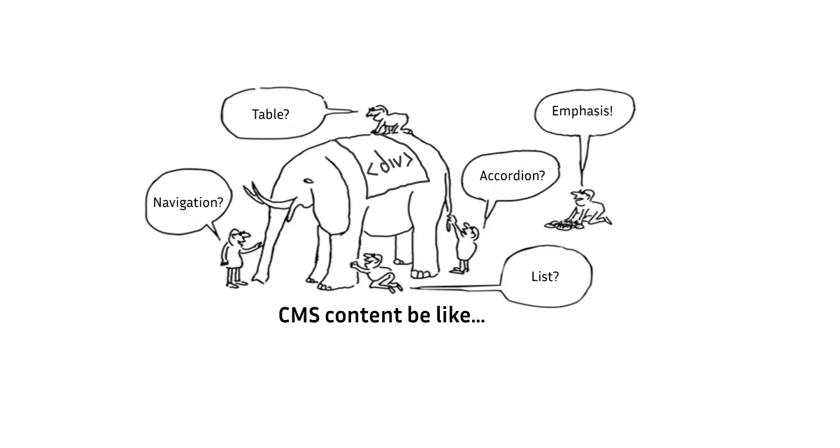
Image attribution: The featured image is adapted from the Interaction Design Foundation. They encoded the following div soup and hid it from screen readers.
<div class="card__footer" aria-hidden="true">
  <div class="button button--primary cardFooter__button">
  <div class="cardFooter__buttonText js-countdownDependentCardState">
  View Course
  </div>
  </div>
</div>
1 thought on “An elephantine dislike for off-the-shelf CMS”