 Reading Time: 22 minutes
☰ Navigate this post:
An accessibility engineer (AE) created an example of a “WCAG compliant” assessment image. I listed 14 WCAG violations. It broke our enterprise values, too. Digital inclusion isn’t all code, colours, and contrast. It needs insight, empathy, training, and experience, which the AE lacked. They even defended their ableist opinions using WCAG documentation.
This case study demonstrates why content and information experience design is essential to creating accessible, inclusive, and delightful products. It reflects on the gaps that need closing between accessibility engineering and design attitudes, and between accessible and inclusive design.
The underlying problem may be the AE’s personality, or the ambiguity of WCAG guidance? The AE couldn’t empathise with why the image can never exist in an inclusive culture. As an engineer, their approach to WCAG compliance is dogmatic. They are not a content or learning designer and failed to collaborate toward the best and user focussed learning experience. And this isn’t all about them.
It’s about me. I’m curious and passionate about inclusive design. That’s who learning, user experience, and user interface designers are. The AE has presented a problem and I want to explore how to solve it for our real world and inclusive enterprise.
“When a software feature fails compliance, then it’s broken. We don’t ship broken products” (O’Connor, 2022)
The case study
The case study outcomes are as follows:
- An inclusive component needs design from concept to presentation.
- A component’s editorial intent may be inaccessible even when tested “WCAG Compliant”.
- A closer collaboration is needed between content, learning, and engineering design.
- Inclusive needs more than accessible. Inclusive design aims to deliver an equally delightful experience to the widest range of people with different abilities and scenarios.
WCAG compliance can’t guarantee an inclusive information experience. Accessibility and inclusion needs competent content and user interface design. This case study explores the design thinking and minimal technical knowledge needed to make the proposed assessment inclusive.
The example image
The AE wanted to demonstrate an image used for assessment that is compliant with WCAG 2.1 SC.1.1.1. Non-text Content. They wanted to present an assessment that needs vision to answer the question. The guidance they were following is as follows:
“If non-text content is a test or exercise that would be invalid if presented in text, then text alternatives at least provide descriptive identification of the non-text content.”
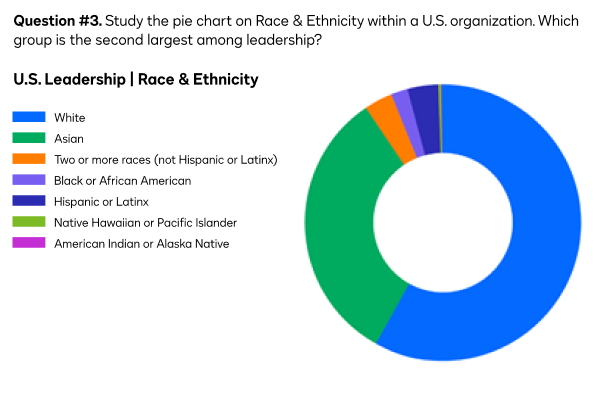
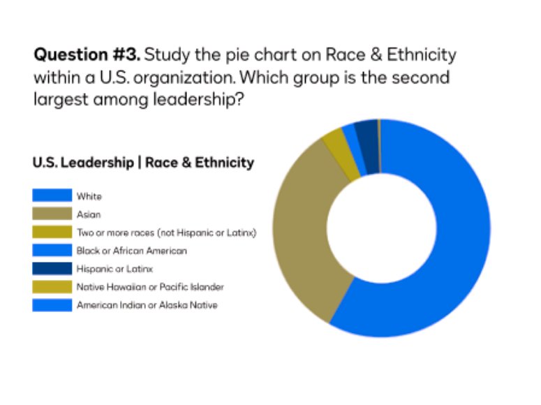
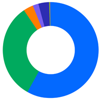
Here’s the image. It represents a question within an enterprise skills assessment. The learning objective is to visually read a pie chart. I immediately recognised that the image is ableist. It discriminates our colleagues and our customers with different accessibility scenarios.
The example’s HTML
<img src="test1.png" width="600" alt="Test question #3: a pie chart representing the race and ethnicity of U.S. leadership within an enterprise.">
Note: By default, this image displays in this blog as a responsive image.
What’s the problem?
The image presentation complies with WCAG 2.1 Success Criteria 1.1.1. It has an alternative text attribute (the HTML alt=””) and a value that doesn’t give away the assessment answer. It could be the perfect example? It’s not.
All of our colleagues need to access and compare this data. Clearly this image is designed for people with near perfect visual acuity. Common advice is not to present pie charts in any case. There’s a wealth of alternative data visualisations that help people to understand proportions much more easily than slicing pie.
To keep within the AE’s intention, the problem is how to correct their example learning objective and make its assessment inclusive.
Analysis
The question unfairly tests processing and working memory. Reading, decoding, remembering, recalling, and comparing the values is a great deal of work. It relies on visual acuity and colour perception. A person relying on a screen reader can’t access the question content. If they could, then the demand on their auditory and cognitive processes is greater still. A smaller Braille display needs consideration, too. Also critical is that, where this is designed to example an online question, there’s nowhere to answer it.
The following problems need considered:
- In context of an assessment, the “WCAG compliant” image fails up to 14 WCAG success criterion.
- The original image is not responsive. It won’t display correctly on all user devices.
- The original image is a raster image so fonts may not always display clearly.
- The alt value doesn’t match the assessment content in the image.
- The learning objective and assessment are visually ableist.
- Information is conveyed using colour alone.
- The learning design is very poor and occludes by design.
Failed success criterion
Although instinctively recognising the image’s failings, I cross-referenced it with WCAG success criterion. In context of its intended task and audience, I found 14 violated success criteria.
This list is drawn from the Web Accessibility Initiative (WAI) WCAG page, “How to Meet WCAG (Quick Reference)“. The enterprise worked to Level AA.
- SC 1.1.1 Non-text Content (Level A):
The AE was aiming to demonstrate these highlighted criteria.
- Test: If non-text content is a test or exercise that would be invalid if presented in text, then text alternatives at least provide descriptive identification of the non-text content.
- Sensory: If non-text content is primarily intended to create a specific sensory experience, then text alternatives at least provide descriptive identification of the non-text content.
- SC 1.3.1 Info and Relationships (Level A): Information, structure, and relationships conveyed through presentation can be programmatically determined or are available in text.
- SC 1.3.3 Sensory Characteristics (Level A): Instructions provided for understanding and operating content do not rely solely on sensory characteristics of components such as shape, color, size, visual location, orientation, or sound.
- SC 1.4.1 Use of Color (Level A): Color is not used as the only visual means of conveying information, indicating an action, prompting a response, or distinguishing a visual element.
- SC 1.4.3 Contrast Minimum (Level AA): The visual presentation of text and images of text has a contrast ratio of at least 4.5:1, except for the following:
- Large Text: Large-scale text and images of large-scale text have a contrast ratio of at least 3:1;
- Incidental: Text or images of text that are part of an inactive user interface component, that are pure decoration, that are not visible to anyone, or that are part of a picture that contains significant other visual content, have no contrast requirement.
- Logotypes: Text that is part of a logo or brand name has no contrast requirement.
- SC 1.4.4 Resize text (Level AA) (Relating to the presentation when other issues are fixed): Except for captions and images of text, text can be resized without assistive technology up to 200 percent without loss of content or functionality.
- SC 1.4.5 Images of Text (Level AA): If the technologies being used can achieve the visual presentation, text is used to convey information rather than images of text except for the following:
-
Sufficient techniques:
- C22: Using CSS to control visual presentation of text SL31: Using Silverlight Font Properties to Control Text Presentation
- C30: Using CSS to replace text with images of text and providing user interface controls to switch
- G140: Separating information and structure from presentation to enable different presentations
- PDF7: Performing OCR on a scanned PDF document to provide actual text
-
Advisory techniques:
- C12: Using percent for font sizes
- C13: Using named font sizes
- C14: Using em units for font sizes
- C8: Using CSS letter-spacing to control spacing within a word
- C6: Positioning content based on structural markup
-
- SC 1.4.10 Reflow (Level AA):
- Vertical scrolling content at a width equivalent to 320 CSS pixels;
- Horizontal scrolling content at a height equivalent to 256 CSS pixels;
Except for parts of the content which require two-dimensional layout for usage or meaning.
- SC 1.4.11 Non-text Contrast (Level AA): The visual presentation of the following have a contrast ratio of at least 3:1 against adjacent color(s):
- User Interface Components: Visual information required to identify user interface components and states, except for inactive components or where the appearance of the component is determined by the user agent and not modified by the author;
- Graphical Objects: Parts of graphics required to understand the content, except when a particular presentation of graphics is essential to the information being conveyed
- SC 1.4.12 Text Spacing (Level AA): In content implemented using markup languages that support the following text style properties, no loss of content or functionality occurs by setting all of the following and by changing no other style property:
- Line height (line spacing) to at least 1.5 times the font size;
- Spacing following paragraphs to at least 2 times the font size;
- Letter spacing (tracking) to at least 0.12 times the font size;
- Word spacing to at least 0.16 times the font size.
Exception: Human languages and scripts that do not make use of one or more of these text style properties in written text can conform using only the properties that exist for that combination of language and script.
- SC 2.4.6 Headings and Labels (Level AA): Headings and labels describe topic or purpose.
- SC 3.1.2 Language of Parts (Level AA): The human language of each passage or phrase in the content can be programmatically determined except for proper names, technical terms, words of indeterminate language, and words or phrases that have become part of the vernacular of the immediately surrounding text.
- SC 3.1.5 Reading (Level AAA). (Although Level AAA, we included this in our writing standards): When text requires reading ability more advanced than the lower secondary education level after removal of proper names and titles, supplemental content, or a version that does not require reading ability more advanced than the lower secondary education level, is available.
- SC 3.3.2 Labels or Instructions (Level A): Labels or instructions are provided when content requires user input. (The example image is on-screen and therefore requiring user input to offer the answer. This should require adherence to SC 3.3.3 to SC 3.3.6, and SC 4.1.1 to SC 4.1.3 too.)
The image in not responsive
Presenting a meaningful image that doesn’t resize to our users’ preferred device is not helpful. Whether the device is issued, or purchased, we should support it. That’s an essential part of inclusive design.
We don’t want all the images on a page to shrink or grow with our viewport size. The solution is to select the HTML image class and control its presentation using CSS.
Use responsive CSS
The following version of the image is made responsive. The CSS makes it 100% the width of its container and instructs the browser on what the maximum and minimum size should be. You can test this when you narrow and widen your browser viewport.
Possible CSS
    img.responsive {
        display: block;
        width: 100%;
        max-width: 600px;
        min-width: 320px;
        margin: 1rem auto 1rem auto;
        padding: 1.5rem;
    }
As the image contains small text, the content may become inaccessible when it shrinks.
Prepare wide and narrow image versions
We can use CSS to swap in an updated image when the viewport is larger or smaller. The technique can help maintain a readable font size. Here’s a quickly sliced example at 320px width. The question, pie chart, and data types are stacked vertically. Ideally, the image font sizes would be updated when creating the narrow version from the original source file.
We’ll deal with the rasterised image’s text clarity later. For now, that’s the responsiveness addressed and that’s no good when the image fails to display or is approached by a screen reader.
Is that the responsiveness addressed? Not when the image fails to display, it’s announced by a screen reader, or we want to zoom in on, or select the text?
The alt value doesn’t match the assessment content in the image
When an image fails to display, visual users rely on its alternative content to understand the editorial intention of the missing image. When a person relies on a screen reader, then that alternative content is not a back-up, but a necessity.

Could you answer the assessment question without seeing the image? No. The alternative content omits the assessment question or enabling objective.
As the image contains meaningful text content, that should be included in the alternative attribute’s value. However, the author is aware that WCAG guides the value is limited to a maximum of 100 to 150 characters in length. The assessment question and enabling data exceeds that.
Accessibility practitioners may not understand that the limit on characters resolves three main issues for people using a screen reader:
- The content may not be selectable.
- The content may be overly verbose, or repeat adjacent content. This is called redundancy.
- The VoiceOver viewer window only displays around 100 characters.
When we weigh the guidance against the exclusion of a person using a screen reader, then you may agree we can exceed the recommended character count?
If we did include the text content and wanted to avoid giving away the answer, then we’d realise the one limiting factor of this example assessment. It is fundamentally visually ableist!
Information is conveyed using colour alone
A person with one or other colour perception differences may not easily determine the differences between data groups?
In the following examples, the image is passed through the Coblis Color Blindness Simulator (2022). The first image illustrates Red-Blind Protanopia and the second, Green-Blind Deuteranopia. In both examples, the colour key differentiation is made difficult, if not rendered unworkable.
Protanopia
Deuteranopia
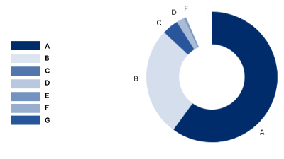
The solution is to use contrasting gradients, pattern fills, or labels. Pattern fills can be difficult to discriminate in small pie chart slices. Labels are the preference.
When using gradients of one colour, blue and pink are known to work well. However, the seven data points in the sample pie chart may affect the effectiveness of colour perception and contrast between each step in the gradient? This would make discerning between, and decoding each segment difficult.
Unfiltered blue gradient
Protanopia blue gradient
Deuteranopia blue gradient
Our sample pie chart has seven data points. When we use only shades of blue, the difference between segments appears less discernible in a circle. We could aim for a contrast ratio of at least 3.1:1 between each data colour in line with WCAG Success Criterion 1.4.11 Non-text contrast. It’s not easy.
In the following example, the colour contrast between the two largest segments is 1.81:1, which fails WCAG 2.1. AA for contrast between graphical objects. However, it’s worth noting that WCAG contrast ratios are based on a background and foreground scenario, and not side-by-side difference—if that’s a difference? And what exactly is an object?
Can you determine the segment referenced by the fourth color chip down without counting segments?

To improve the contrasts, we can mix the shades up so they can be more easily discered. However, there remain similar shades to decode, compare, and match. Additionally, when a value is 0, then its segment won’t display. Without knowing it is zero, we may question if the segment has only failed to display by mistake. This is cognitive overhead a person taking a test doesn’t need.
Can you determine the segment referenced by the fourth colour chip down without counting segments?

WAI solution
WAI (2019) uses an assessment question that is similar to the one designed by the AE. The objective is to identify a right-angled triangle from a selection of triangles. The triangles are each of a different color. The student must choose the right triangle by selecting a radio button. The labels each name the color of a triangle in the group.
WAI offers the following fix for people who experience color perception differences. The updates overcome the problem of color perception without updating the originally designed colors.
Although, this WAI example learning objective and assessment remains inaccessible to non-visual students, we can extract design ideas from its strategies.
- Each triangle is a path within an SVG image
- Each path is programatically labelled with a number.
- A corresponding number is appended to each radio button labelled with a color name.
The following examples build on the models at WAI‘s Designing for Web Accessibility.
tspan for screen reader use.From WAI (2019).
Although hinting at an improved experience, each WAI example is missing vital label information for people who use a screen reader. The question remains ableist because there is additional effort navigating between the labels and the accessible triangle content. The following hides the graphic from screen readers and updates the labels to offer the angle data to everyone. No one should need to work harder to pass trigonometry, you know!
Our example with labels
WCAG gives us a hint not to convey information by color alone. Adding labels helps the visual situation tremendously as in the following example.
Can you determine the segment labelled D without counting segments?
It’s still not accessible!
Although the visualisation may be improved, the data and the objective remain inaccessible to people using screen readers. Finding space for labels may be problem for the original pie chart example, too?
Are pie charts ableist?
It appears that, if our pie chart is to be easily discernible and decodable, then it should have no more than two to four segments and be labelled. Can the example pie chart be anything but ableist with seven segments?
Data visualisation is its own science available to study at your local university. An example is the post-graduate diploma offered by the IADT, Ireland. The following only explores how we can make this assessment image more inclusive.
Pie charts were invented in 1801 (Errity 2014). They are now believed to be more difficult to cognate than a bar-chart might be. Popular research concludes similarly to the following statement from Few (2020).
“The fundamental superiority of bar graphs over pie charts is rooted in a fact of visual perception: we can compare the 2-D positions of objects (such as the ends of bars) or their lengths (especially when they share a common baseline), more easily and precisely than we can compare the sizes or angles of pie slices.”
However, Few (2020) also refutes a research paper on the comparison with bar charts and questions the testing methods used. Watt (2021) feels the business world has also judged pie charts harshly.
“Unfortunately, they are almost always used in a way that does not clearly show a trend/comparison/outlier. When several categories are used in a pie chart, suddenly you are forced to engage your brain to scan numbers, compare them and deduce any insight. This is totally counter-intuitive to what a visualisation is supposed to do.”
The respected “founder of modern information design”, Edward Tufte (in Errity, 2014) declared the following.
“Excellence in statistical graphics consists of complex ideas communicated with clarity, precision, and efficiency.”
Watt (2021) sets ground rules for a scenario when it’s OK to use a pie chart with clarity, precision, and efficiency.
“The use case is when there are only two categories and one of those categories is at least 3x bigger than the other. In other words if the ratio is 75/25 or more then a pie chart looks fine. “
Returning to Tufte, a prescription for data visualisation included using:
- Clear labels to defeat ambiguity and graphical distortion.
- Showing entire scales.
For pie charts, showing the data helps readers discriminate between the colour key, the data values, and to discern the chart’s objective.
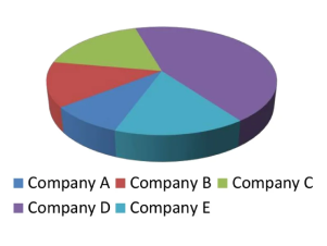
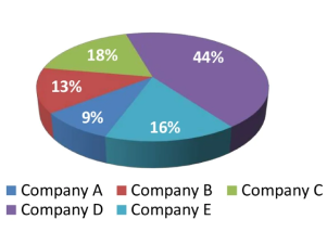
The following two images are the before and after pie chart examples in Errity (2014). They illustrate the improved data visualisation in the second image where the data percentages are presented on each pie slice.
We appear able to design pie charts that are visually appealing and that aid data cognition. However, the charts and their data remain inaccessible to people using screen readers, or who need an alternative data comprehension method.
An Inclusive solution?
We can decant the problems with the image offered as follows:
- The learning objective is ableist.
- The assessment strategy is ableist.
- The image contains content that should be available to the HTML.
- The data visualisation is ableist.
In short, the image is not fit for the purpose of illustrating WCAG 2.1 Success Criteria 1.1.1., meaningful images and in a test. An alternative example and accessible presentation should be created.
An improvement is to ensure the pie charts are accessible within the given media types, or an alternative content is provided. The objective is then to understand the data.
We need an accessible re-design.
Is an accessible re-design possible?
Although WCAG Compliant, the image, learning objective, and assessment strategy are not accessible or inclusive. Can we improve the design with the following?
- An accessible learning objective
- Accessible text and alternative content
- Accessible data content
- Accessible data visualisation
- An accessible assessment strategy
Business caveat
From an enterprise viewpoint, the monochromatic approach to colours may be a turn-off. The entertainment and engagement of the many may override a “minority scenario like colour blindness”. And yes, that’s ableist and difficult to argue otherwise when the editorial intent of the content is made accessible to all.
Accessible learning objective
The existing question copy is as follows:
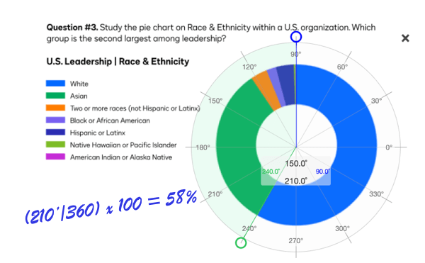
“Question #3. Study the pie chart on Race & Ethnicity at Our Enterprise. Which group is the second largest among their leadership?”
The learning objective is not accessible. It demands visual acuity and good color perception.
Accessible assessment strategy
As we’ve learned, the existing question copy is as follows:
“Question #3. Study the pie chart on Race & Ethnicity at Our Enterprise. Which group is the second largest among their leadership?”
Problems may include the following:
- The # symbol is announced by VoiceOver as, “number“. However, in some languages, the symbol may be read visually as a “gate” or “sharp”.
- “Study the pie chart” needs visual acuity and good colour perception.
- “Which group” requires visual acuity and good colour perception, and an ability to consume graphic information as data.
An improvement is to ensure the pie charts are accessible within the given media types, or an alternative content is provided. The objective is then to understand and to compare the data.
Accessible text and alternative content
We can break the image content into six parts and work on each in turn:
- Container
- Title
- Key and pie chart layout
- Key
- Pie chart
- Alternative image content
| Item | Description |
|---|---|
|
Container |
As the HTML content will need a container. A |
|
Title |
The |
|
Key and pie chart layout |
The key and pie chart can each be positioned using non-semantic containers. The HTML |
|
Key |
The key is a headline and unordered list. |
|
Pie chart |
The chart is an image. |
|
Alternative image content |
The chart is a PNG so will need an alternative text copy. It won’t need an alternative attribute value. |
Here’s the updated presentation in a figure element.
Key
- White
- Asian
- Two or more races (not Hispanic or Latinx)
- Black or African American
- Hispanic or Latinx
- Native Hawaiian or Pacific Islander
- American Indian or Alaskan Native
A person using a screen reader can now perceive the question and the list of data groups. When the image fails, the content is still available. We’ll deal with the alternative attribute and value later. It’s useless as it is. The following is how the figure presents when the image fails to load.
Key
- White
- Asian
- Two or more races (not Hispanic or Latinx)
- Black or African American
- Hispanic or Latinx
- Native Hawaiian or Pacific Islander
- American Indian or Alaskan Native

Accessible data content
When the image fails to load, the presentation emulates the frustration of a person using a screen reader. There’s no pie chart and without vision, there’s no comprehending it or its data.
WCAG Compliance!
This inaccessible assessment is still WCAG compliant!
On reviewing Google’s HTML pie charts, we find they are not screen reader friendly. The data is accessible and the chart interaction is not.
Accessible data visualisation
We can add data to the key and this may fail to meet the learning objective to read a pie chart. People of all abilities are able to read the data and answer the question without learning how to determine the answer from the chart.
The only inclusive solution is to create the chart from accessible code. The data can be hidden from view and remain available to people using a screen reader.
However, it is more useful to label each segment inclusively, which can remove the cognitive work using the color key and remove any difficulty when colour is perceived differently.
Of course, we should make sure our enterprise pie charts meet different cognitive, motor, and learning needs.
On reviewing Google’s HTML pie charts, we find they are not screen reader friendly. The data is accessible and the chart interaction is not. We’re caught between ambition and practicality. There are at least two options, which are explored in the following table.
The second option is difficult to develop with the resources available here. The third is feasible. Let’s try it.
| Option | Design |
|---|---|
|
1. Delete the example and image |
This is not the preferred option. It’s only the easiest option when imagination stalls. Easier still, we can remove the Meaningful Images section on text images? And note the following objections:
|
|
2. Build our own accessible pie chart with tab-able segments |
The pie chart represents data relationships between quantity and segment size. The segment scale ithe quantities as s based on percentages related to a proportion of 360-degrees. We can list the data and give each list item a scaled segment using a script. There’s no need for people using a screen reader to explore the graphic and we can still allow visual explorations using HCI of choice. Alternatively we could use an image map technique. We can assume that as Google pie charts graphics remain an inequitable experience, we’d need to work hard to reach the levels of inclusion we owe to our colleagues. |
|
3. Offer an accessible pie chart with data |
List the data and offer the pie chart as an image with a short and meaningful alternative text value, or leave the value empty. |
We need to know the pie segment values. Although likely to be fictional, we can use Chrome browser’s Protractor extension to convert angles to percentages.
Here’s the HTML updated with the data needed for everyone to attempt to answer the question.
Key
- 58% White
- 31% Asian
- 4% Two or more races (not Hispanic or Latinx)
- 2% Black or African American
- 4% Hispanic or Latinx
- 1% Native Hawaiian or Pacific Islander
- 0% American Indian or Alaskan Native
This may tick all the boxes for an enterprise standard on delivering data as a pie chart? It achieves the following:
- The strategy may appeal to people with different learning strategies, preferences, and abilities.
- Correct color perception and visual acuity are not necessary to access the data.
- The question can be zoomed to 200%.
- There’s no additional motor labor or fine motor motion needed to access the data.
Accessible assessment strategy
The intended answer strategy for the original image is uncertain. Do our candidates write the answer on paper, an answer sheet, or into an online form?
The easiest and most accessible strategy is to include the answer transaction on a form within the question space as follows. We can use an array of radio buttons, which we use to indicate only one answer is available.
The radio button labels include the data and color key. It is not necessary to study the pie chart unless doing so meets your learning preferences.
Let’s make CSS pie!
There are advantages to creating the pie chart from HTML and CSS. For example, using a script and visible content the pie chart can be made interactive with, or without affecting the screen reader experience. This may appeal to people with exploratory learning styles or cognitive differences, too.
Removing images always benefits performance and reduces the production resources needed to create them. Better yet, we can associate the pie values with the label values, which creates opportunities for dynamic update and reuse.
HTML’s partnership with CSS and JavaScript is powerful. Use it.
Here’s a static prototype that doesn’t use images.
The CSS pie model may appear half-baked in this blog environment. You can find the source example on Codeburst.
So, what went wrong?
The wrong person created the original image to illustrate WCAG 2.1 Success Criterion 1.1.1., Meaningful images in test scenarios.
When the situation was explained, the person just couldn’t comprehend the problems they had introduced. They needed to consult the wider accessibility team for confirmation of my arguments.
They had fixated on WCAG guidance and completely failed to consider accessibility as inclusion.
In WCAG 2.0 the explanation around test question images was described in detail. The same section is reduced in WCAG 2.1 and appears to have lost its use as useful guidance. Without that update, the person selecting the image may have thought more about the ableist barriers they were introducing to example?
The AE removed the whole section on images used in tests. I had offered an alternative and as I was not flavour of the day, it was turned down flat. What would I have offered?
Long arguments over the accessibility of cables with friends who are electricians is an area of challenge. My suggestion is, “how to wire a UK-type electrical plug”. And were the question to be included in an online assessment? Yes, it’d be crafted using accessible HTML copy and images, and include a form to answer the question.
The HTML
<img src="question-1-electrician.png" width="712" height="414" alt="Question 1. Which UK electrical appliance is wired correctly? Device A is wired brown to Live, yellow and green to Earth, and blue to Neutral. Device B is blue to Live, yellow and green to Earth, and brown to Neutral.">
Summary
The original pie chart question and model failed to deliver an inclusive assessment experience and passed WCAG compliance. This illustrates where WCAG informs accessible design and does not produce it.
The outcome is the discovery of a strategy and tooling that an enterprise could deploy when pie charts are the data representation method of choice.
Root cause for the confusion
In WCAG 2.0 the explanation around test question images was described in detail. The same section is reduced in WCAG 2.1 and appears to have lost its use as useful guidance.
“Sometimes a test or exercise must be partially or completely presented in non-text format. Audio or visual information is provided that cannot be changed to text because the test or exercise must be conducted using that sense. For example, a hearing test would be invalid if a text alternative were provided. A visual skill development exercise would similarly make no sense in text form. And a spelling test with text alternatives would not be very effective. For these cases, text alternatives should be provided to describe the purpose of the non-text content; of course, the text alternatives would not provide the same information needed to pass the test.”
“Test: If non-text content is a test or exercise that would be invalid if presented in text, then text alternatives at least provide descriptive identification of the non-text content.”
From WCAG 2.1, Understanding Success Criterion 1.1.1: Non-text Content
The context here is internal enterprise guidance. The chosen scenario is not fit to that purpose. Our inclusive values won’t allow it.