 Reading Time: 5 minutes
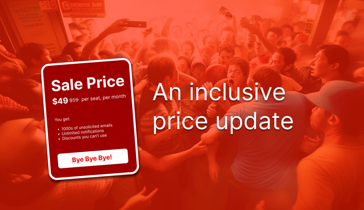
This blog post discusses the importance of providing an inclusive experience when presenting an updated and cheaper price. It first suggests a simple solution of using phrases like “Was $59. Now $49! Per seat, per month”. It then explores a coded solution.
Using HTML and CSS, a wireframe presents the pricing update audibly and visually, and without adding clutter. This highlights a need to know a little of a11y and inclusive design, and HTML and CSS.
We need to take greater care between prettying up designs in Figma and offering an inclusive experience.
Problem
- We want to display an updated and cheaper price against the earlier more expensive price.
- We want to attract all our visitors to the value proposition and drive conversion.
- In testing with a screen reader, we are failing to meet our objective.

The implemented strike-through of the old price isn’t read by all screen readers. VoiceOver announces our pricing copy as follows, “$49 $59 per seat per month”. There’s no clue on which price is correct, or if there is a mistake. For example, is this $49 per seat and $59 per month?
Simple solution
Sometimes we can’t convert our design to an inclusively coded solution. Then we can consider writing something like:
Was $59. Now $49!
per seat, per month
The punctuation may insult writing standards and the content is universally available. Alternative phrasing is available. Think around the value of saving dollars and something will come to mind.
A coded solution
The following wireframe explores the presentation of our planned price update pattern.
Our aim is for people using a screen reader to enjoy the same experience as visual users. We need to present the same information audibly and visually, and without adding clutter.
Old then new, or new then old?
Should the new price be followed by the old price, or read the other way around?
That’s a great question and one that depends on the solution you choose. In the following wireframe, you can update the visual order of the content nodes without affecting their order in the DOM.
I’m a great believer in the last thing you read is what you remember. It’s why we should consider positioning Don’ts before Do’s. With that belief applied here, then our new price should be the second one we read. However, as the content is only short, then this may not be a concern.
The intention isn’t to learn the old price, but to contrast it with the value of the new one. A visual reader may only scan the pattern and understand the contrast whatever the order. You’ll have to decide on what you want and discover what your consumers need.
“…You need to have a good understanding of the content before you even think of tackling the IA. If you don’t, your IA and content just won’t fit together later”
(Spencer in Godfrey, P. 2019)
Contrasts
We want our new price to contrast with the old price. We can use a monochrome colour scheme or introduce one from our design dialogue. In the following wireframe, we’ve styled the colours using the del and ins selectors.
The sharp-eyed among you will spot that we are enclosing the prices in the paired del and ins tags like Ying and Yang. It’s reasonable that when editing copy, we’ll insert copy when replacing copy that we marked for deletion.
There’s a chance the del strike or line-through will emphasise the degradation of the old price. The styles applied to our ins tag aim to contrast with the del tag and emphasise the fresh new and improved price.
Results with screen readers aren’t promising. The previous simple solution is the winner when an alternative CSS-based text displacement strategy isn’t available.
The wireframe
The price per seat, per month
Formerly cost $60
Now it costs only $49
Use the following form to configure the presentation:
Explanation
In our visual experience, the stronger emphasis of the new price gives it a clear hierarchy over the old price. The lower contrast former price emphasises the benefit of the new price. It’s strike-through shows that it’s no longer used.
Note: In Model 1, each node of content is has its own colour, contrast, and scale.
There’s a risk that a person using a screen reader can miss the meaning of our content. For example, the line-through style and del tag isn’t read by my VoicOver in Chrome.
We can use a combination of codes to improve the content experience for everyone. Let’s write some content–you can write better; this is only a demo.
price per seat per month used to cost $60 now it costs $49
This may be too verbose for your preferred visual design. It offers an inclusive audible experience though, and that’s where we’ll start.
Next, we can use CSS to make the excess content invisible to the eye while available to screen readers.
per seat per month $60 $49
Next, we can add the strike-through and visual emphasis for visual users:
ins and del tagsper seat per month $60 $49
Using CSS Grid, we can swap the content nodes around. This shouldn’t affect the reading order that screen readers announce, so always test.
$60 $49 per seat per month
or
$49 $60 per seat per month
There. Now people relying on a screen reader can read and understand our content in context. Our visual design is clutter free and is understood at a glance.
The basic HTML and CSS
The following outlines the basic HTML and CSS code for the wireframe. An engineer can tidy it up and save one or two kilobytes for sure.
Note: Adding an id attribute to each content node allows us to insert dynamic text copy. We can then store and call the prices and allied content in a separate data file. This will save on page maintenance.
<p id="deal" class="deal"><span class="deal__copy"><span class="invisible">The price </span><span id="mycopy">per seat, per month</span></span><br/>
<span class="deal__oldPrice"><span class="invisible"> Formerly cost </span><del id="myold">$60</del></span><br/>
<span class="deal__newPrice"><span class="invisible"> Now it costs only </span><ins id="mynew">$49</ins></span>
</p>

<style>
.inline {
  display:inline-block;
  width:auto;
}
.deal {
display:grid;
  grid-template-areas:
  'new old copy';
  justify-content: start;
}
.deal span {
  display:inline-block;
  padding:0 0.5rem 0 0;
  align-self: center;
}

.deal__copy {
  grid-area:copy;
}
.deal__oldPrice {
  grid-area:old;
  color:grey;
  font-size:150%;
}
.deal__newPrice {
  grid-area:new;
  font-weight:600;
  font-size:200%;
}
ins {
 color:green;
  font-weight:600;
 text-decoration:none;
 background:transparent;
}
del {
 color:salmon;
 text-decoration:line-through;
}
.invisible {
position:absolute;
clip: rect(0 0 0 0);
  clip-path: inset(50%);
  width: 1px;
  height: 1px;
  overflow: hidden;
  white-space: nowrap;
}
</style>
Caveats
- This page demonstrates a concept and not a final product.
- Not all screen reader technologies are created equal. Beware
insanddelfailing to announce. - Using
spancan frustrate screen readers depending on their settings. - ARIA may be used in preference to the
.invisiblecontent class, and why? (1st rule of ARIA: don’t use ARIA). - Visual consumers using a screen reader may experience some disorientation when their screen reader focus doesn’t follow the visual reading order.
- I’ve not mentioned using a slash in this pattern. So don’t use a freaking slash! It’s crass. Write words.
Summary
Content design isn’t all writing. It’s an empathetic UI and UX craft. We need to take greater care between prettying up our imaginations in Figma and offering an inclusive experience for all.
We UI designers and UX writers really do need knowledge of a11y, inclusive design, HTML, and CSS. We also need our engineers to meet or update our ambitions!
Reference
- Godfrey, P. (2019, March 2). Research content and information. Retrieved from, https://blog.learningtoo.eu/research-content-and-information.