 Reading Time: 6 minutes
There’s an example storyboard in Preece, Rogers, Sharp’s (2015) Interaction textbook that held my attention. In less than a moment I recognised it is a very poor example. Sure, it is intentionally simple and it is also unintentionally of poor quality.
It exemplifies why UX design can fail to reach the levels of delight we strive for.
The example
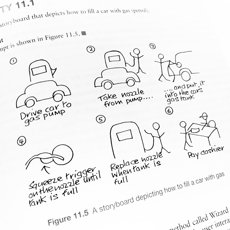
There is no thinking or learning on the part of our user. Only the process and achieving the goal of purchasing fuel is illustrated. And this set me to thinking and scanning for storyboards posted on Pinterest and paying more attention to our storyboarding curriculum as a student studying the MSc UXD.
I found the same pattern almost everywhere I looked: a process toward goals and very little evidence that our user enters a thoughtful process; following a series of episodes, interventions, decisions, and experiences toward embarking on the process. A trite, “worried”, or, “time poor”. And yes, a motivation. And no deep thinking: no real emotion.
The story
The “How to fill a car with gas” example runs like this.
- Drive car to gas pump.
- Take nozzle from pump…
- …and put it into the car’s gas tank
- Squeeze trigger on the nozzle until tank is full
- Replace nozzle when tank is full
- Pay cashier
It’s a perfect day at the gas pump.
An observed trip to the pump
I observed my Wife and I at a gas station:
- In car. Our goal is to retrieve Son from college in another town and return home before our daughter is dropped home by friends.
- We assess the amount of fuel in the car
- We decide we need more fuel and plan to stop at the gas station on the way out of town
- We check that we have a payment method available and set a budget for the fuel purchase. (We calculate and agree we need 300 miles that week: around €45.)
- We plan our route to the pumps
- We progress to the gas station
- At the gas station, there are cars at each pump. We discuss a strategy to get fuel the quickest and choose a line
- When joining the line, we observe two pumps have no diesel. We need diesel.
- We reassess the distance to the next gas station. It is a risk. We reverse into waiting cars to maneuver into a line with diesel available
- Once parked at the gas pump, we open the gas tank cap and choose which fuel we require from the pump: petrol or diesel. Diesel
- We select the black-colour-coded diesel nozzle and assess its cleanliness.
- We visually search for gloves provided somewhere on the forecourt. There are none.
- We risk lifting the nozzle…
You get the idea. We’re at Lucky Thirteen and we’ve not even started pumping gas. This is closer to the cognitive storyboarding that we should be considering: what our user’s situation and environment is Before, During, and After the experience.
That’s what a story is, isn’t it? It’s how we debrief trauma victims and rescue workers too; to reveal cognitive processes otherwise overlooked and sadly sometimes, unforgiven. Our user isn’t an avatar. They are a person. Spare them some compassion in their story.
A delightful story
Delight is a cognitive concept reliant on pleasure, surprise, simple, etc. Read my blog about delight.
We judge delight on our emotions.Traditionally, we want to feel empathy for our users and work hard to map our ideal and typical users into personas and then into empathy maps etc. Quite right, too.
Only, Morais (2015) argues that empathy is insufficient and we need to reach a state of compassion, which tames empathy and drives action. Empathy and compassion: they are emotional. And emotional is cognitively based. I.e. it is based on our learning.
To build our story we need to get inside our users’ heads and map out what they are thinking. An empathy map encourages us to do this in an organised way of blocks of attitude and belief. And what we need more is our story to begin inside our users’ heads before they enter our experience.
And that sounds simple. And maybe not because we need to KNOW our users better than we may have planned. We need to invest in researching cognitive, affective, and emotional processes – not only (resulting) behaviours.
Presentation
In class and throughout a general search of online articles on story boarding, storyboards are based on the process of producing movies and present a static series of cartoon strip frames. There’s loads on storyboarding technique written by Krause (2018) of the Nielson Norman Group, so it’s got to be worth your reading, right? And according to Babich (2017), Walt Disney started it all back in the beyond before computers hit our desks. If you were interested.
Let’s reflect on that: in the digital space, with all the dynamism and media files types available to us, we present a static comic book? It seems to me the Print-based World has struck out our creativity?
Why create a static thing? (Other than for ease of reference, I submit.) How about an engaging movie to watch?
And movies are expensive, right? Wrong. You have a smartphone? Take pictures of your user doing something. You have a mouth? Ask them what they’re up to from the beginning, middle, and end of their day and vlog it. Dig deep and “get inside the experience”.
And then arrange the photos or video snippets into something like Camtasia and make a movie. Annotate it. Narrate it. Set it to empathetic music (or like me, create your own crappy vibes). Then take screenshots so the Print Queens still get their little pack of frames laid out on A4.
Giving it a go
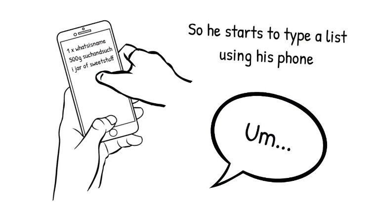
I gave it a go. I happened on an ad for Doodly – one of those sketch animation explainer video type things made popular by business entrepreneurs with no money left for marketing. Poor people like we UX designers, no?
And for sure, this is a FIRST EVER go and with a prototype script. Be kind. It’s the movie concept I’m discussing – not the completeness of the storyboard at this point.
Framing experiences
The thing is, experiences don’t happen in six or eight frames. We seem habitually tuned to doing as much as possible with as little as possible: even in college. And that is surely why, when we students check out random apps and platforms we find so much to critique that our heads spin.
I’m all for MVP but… Come on. Some of these apps are funded better than the result shows. They’re simply not thinking about how we think and learn.
Adding the learning
In the prototype movie example offered above, we’ve failed to emphasise Steve’s ultimate pain point: making his list with more than an, “Um”. This was apparent in our first ad-hoc workshop while we were scripting a storyboard in text for a class task and I was following along sketching on sticky notes.
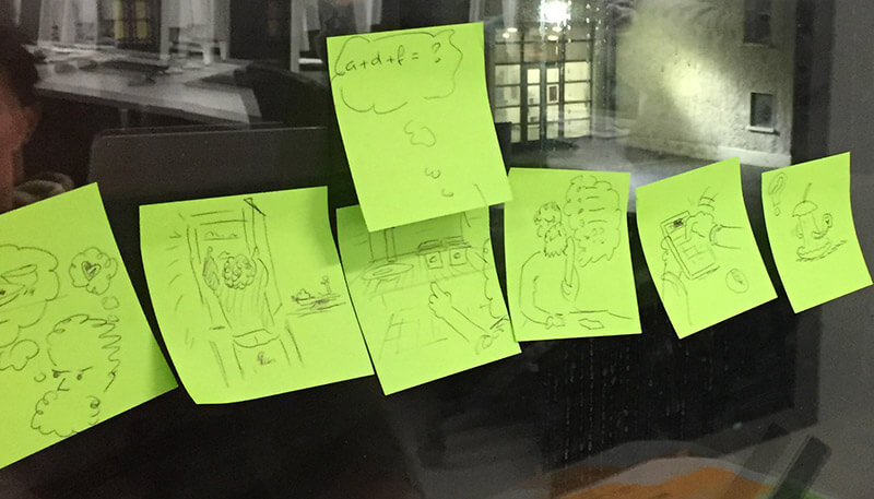


We had written akin to:
- Conceptualises needing shopping
- Assesses grocery stocks in the fridge and cupboards
- Prepares a list
- Works through a grocery shopping app
- And worries about the freshness of the products that will be delivered…
And I had sketched an extra frame: “a + d + f = ?” This represented three products in the fridge and Steve thinking what he could make from them and what additional products he needs to do that.
We almost missed and had now entered Steve’s head space and cognitive processes. His worries, fears, and beliefs. His cognitive effort and the work we would seek to remove from his life: his pain point. The pleasure of completing his shopping tasks more effortlessly. Perhaps some new toys. Possibly surprise and delight. Well, we can work toward that, can’t we?
Summary
I get excited by exploring and then designing the UX according to how we learn. It’s how we behave, after all. And learning needs motivation and an emotional investment. Reflections on experiences will inevitably be measured through feelings – emotions – as well as by the achievement of goals in record time, and so on.
Our storyboards should reflect that more compassionately and engagingly. Their place in our design chain is just too important not to?
Reference this post
Godfrey, P. (Year, Month Day). Title. Retrieved , from,
References
Babich, N. (2017, October 25). The Role of Storyboarding In UX Design. Retrieved December 14, 2018, from https://www.smashingmagazine.com/2017/10/storyboarding-ux-design/
Krause, R. (2018, July 15). Storyboards Help Visualize UX Ideas. Retrieved December 14, 2018, from https://www.nngroup.com/articles/storyboards-visualize-ideas/
Morais, L. (2016, June 6). UX and The Problem With Empathy. Retrieved December 8, 2018, from https://www.linkedin.com/pulse/ux-problem-empathy-luis-morais/
Preece, J., Rogers, Y., and Sharp, H. (2015). Interaction Design: beyond human-computer interaction. Chichester, West Sussex, UK: John Wiley & Sons.

Absolutely love this perspective! Designing UX around how we learn and feel makes the experience so much more impactful and meaningful. It’s not just about goals—it’s about connection.
Fantastic Content please check for Powerful Ways Storyboarding Design Transforms Your Website
This was apparent in our first ad-hoc workshop while we were scripting a storyboard in text for a class task and I was following along sketching on sticky notes. Thank you for the beautiful post!
nice post . Thank you for posting something like this
keep up the good work