 Reading Time: 6 minutes
Like Sydik (2007), I believe alternative texts are the litmus test of accessible design. So is the Back to Top link, and its inclusive design is open to debate.
Ableist approaches
A web document’s back-to-top link offers insight into a website’s accessibility and inclusive design. The following code represents an extreme example of a Back to Top link found during research. It communicates little to a person using a screen reader or refreshable Braille display, or to anyone overriding the default CSS.
<a href="#" id="toTop" style="display: block;"><span> </span></a>
The example’s code translates as follows:
- It’s an
<a>anchor link. - The link target is
#, which you may know as the gate, hash, or pound symbol. It signifies an on-page target. - There is no
titleattribute, which can work as an accessible name. - There is no readable copy text.
- The
spancontains a space. With CSS turned off, the browser displays as an underscored single-character width space. - The visual UI is likely styled with CSS on the
#toTop aselector.
The result is a visually ableist UI and link target with CSS turned on and its fallback is a difficult visual experience. Without an associated ID, the # navigates to the start of the HTML document. Although that may be as expected, it may not be what is needed. Our non-visual experience will involve one or more steps to return to the content’s beginning.
Buttons are not links
When I explore websites for this litmus test of accessibility, the following really makes my heart pound:
<!-- Using a button as a link -->
<button id="…">Back to Top</button>
This tells me the developer doesn’t understand the difference between a button and a link. We know the button semantic is to update the data on a page and links navigate. This matters in the realm of accessibility and inclusion. Links automatically navigate and change focus. Buttons need scripting. There’s no fallback when scripts aren’t available or allowed. That may not matter in web apps that need scripts to work all the time and it’s no excuse for ignoring a semantic guideline.
I am horrified to find W3C Schools prescribing a Back to Top button and not surprised. It’s what happens when engineers design code before experience. They stay in their comfort zone of script-thinking and forget the basics and principles of humble HTML and CSS.
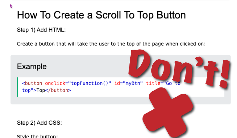
The confusion results from our fashionable habit of styling links to look like buttons. Visually ableist designers and engineers forget the UI makes the experience and the GUI decorates it. It’s such a simple concept and I fully agree with Monica Dinculescu (2016) when she said:
“If you don’t want to make accessible apps, then you are a terrible person and you shouldn’t be making apps for anybody. You should be doing something else.”
Back to Top anatomy
The attributes of a well-coded, written, and visualised Back to Top link are as follows:
- An anchor link with a useful target to an on-page element’s ID.
- A descriptive label is announced.
- A descriptive label is visible, or there’s a familiar visual meaning.
- A caveat that we can all navigate to the top of an HTML document using a Home key or short-cut key press.
How hard can that be?
Back to Top coding
From our planned anatomy, we can design an HTML architecture. We need:
- A containing semantic element. A
p(paragraph) will do nicely. It displays block by default and sits within the document flow. - The opening and closing link anchor (
a) tag. - A link target at the top of the content. For example an element with the
id="main". - The link anchor in-page address attribute and value:
href="#main". - An accessible text:
Back to Top. - A class for CSS and JavaScript: for example,
class="btt". - Styling with CSS. For example,
.btt {...}. - Optionally, JavaScript to add a little show and hide panache to the visual experience.
When using JavaScript to show and hide the Back to Top link always ensure to:
- No not use the JavaScript
.hide()method or CSS{display:none;}. These remove the link from the DOM and hide it from browser technology. - Use JavaScript to add and remove a CSS class to transition from invisible to display and back again. The fallback is to display by default.
- Place the link somewhere logical and useful on the page. The end of the footer may not be useful to everyone.
Here’s my go-to code snippet in this blog:
<p id="topper" class="btt"><a href="#top" aria-label="Back to top">Top</a></p>
I’ve used ARIA as the audible experience strategy in the blog and I use CSS-displaced copy on web pages I have control over. JavaScript adds and removes a class to show and hide the link from the visual experience.
Usability Guidelines
I won’t distance my opinion too far from the Neilson Group. They have a certain credence. I’ve also found a quantity of sub-optimal accessibility and non-inclusive content in their offer. So the following a discussion and not a prescription.
In Neilson Group’s aging article Back to Top Button Design Guidelines there’s much we can agree on and it needs updating. Reading it from the perspective of inclusive programming, I believe their ableism and visual-bias surfaces. To be fair, they do offer the following caveat:
“Before you decide to implement Back to Top links, consider your use case and determine which approach works best for your audience.”
Good advice.
One or more Back to Top links
Neilson Group user-tested Back to Top links placed at the end of each section of a content. Their recruits preferred one link to display when consistently placed in the viewport. For most visual users I am sure that’s fine and I’d like to cater for our edge scenarios too.
People using an assistive browsing technology (ABT) can navigate a page using headlines, landmarks, or interactions. They and people using keyboard navigation could experience frustration from a repeating “Back to Top, Back to Top, Back to Top” link. The solution is to position the Back to Top link at the end of the useable content. This habit risks the Back to Top link meaning, “this is the end of useful content”.
It’s likely safest to include only one Back to Top link on our pages. The ideal location will depend and I usually place mine at the end of the main content. I assume anyone wanting to navigate the page footer will do that and I don’t force them to do so.
Note: When we allow ABT users to skip features, then we can use similar links to Back to Top that target and communicate their precise purpose. We call these Skip links. Their HTML anatomy is the same and we usually update the CSS to create the best experience.
When you want to position more than one Back to Top link then you can. The last Back to Top link can display as a “button” as expected using scripts and CSS while its companions present inline. You can adjust the visual and audible experience to suit the audience.
The best Back to Top target
What of our linear reader using ABT? Should we leave their experience to an assumption that they are an expert navigating documents with ABT?
What is the top? Is it:
- The top of the document ahead of the skip link?
- The site navigation?
- The page navigation?
- The main content container?
- Other?
This is your design. Base it on what you believe is right or what your user research tells you. Be certain to recruit research candidates who represent a cross section of ability and culture.
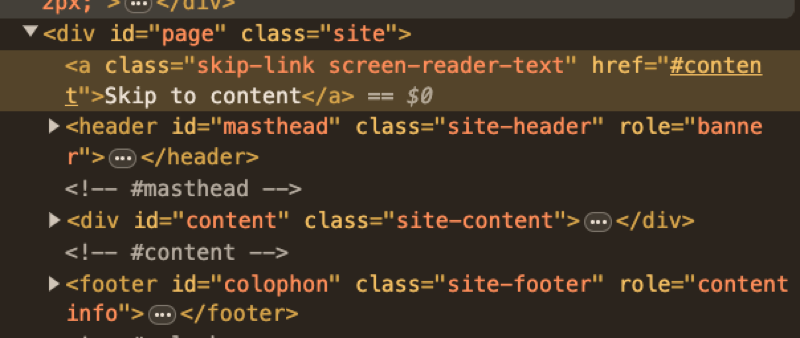
For this blog, I point the Back to Top link to just before the Skip to Content link in the header. On first Tab keypress, focus moves onto the main Skip to Content link. The skip link navigates us to the content’s top. It skips all the noise and chroma in the site navigation banner.
I believe my strategy matches what most people expect. It’s your design. You only need to think through the audible and keyboard navigator experience and offer skip links where helpful.


References
- Sydik, J. (2007). Design Accessible Websites, 36 Keys to Creating Content for All Audiences and Platforms. Raleigh, NC, USA: Pragmatic Bookshelf.
- Dinculescu, M. (2016). Practical lessons from a year of building web components [Video File]. Google I/O 2016, Retrieved from https://youtu.be/zfQoleQEa4w.
