 Reading Time: 8 minutes
Note. This post is a work in progress.
A decade ago we got excited by two new HTML tags; the details and its nested summary. We all watched the demonstrations and immediately thought, “accordions” are finally available out the box! Why not: the accordion was already a pervasive UI pattern?
The Vanilla “Details” and “Summary”
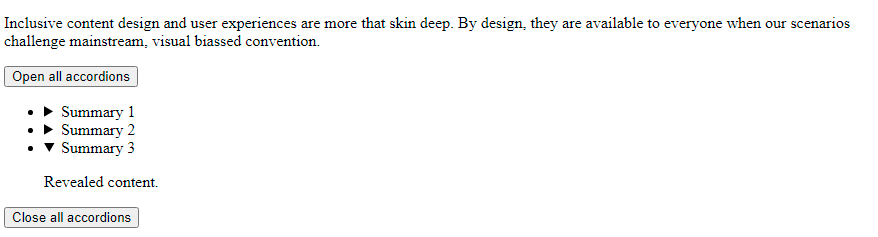
Figure 1 is an example of the vanilla details and summary.
details and summaryIn the following example, I’ve used the common example use case of a Frequently Asked Questions (FAQ) section.
FAQs
Question 1. What is the “details” tag?
The details tag groups summary tag with informative inline content.
Question 2. What is its use-case?
The details and summary pair are useful in removing excess content from the page for visual and non-visual website visitors. Progressive reveal of content can reduce the cognitive load and improve engagement with the content our visitor wants to read.
Question 3. What does the HTML look like?
The HTML nests the summary and content within the details tag. The summary acts as the trigger to toggle the content.
<details>
<summary>You click this to reveal the hidden content</summary>
<!--Your HTML content goes here-->
</details>
Note. In the example at Figure 1, the pre tag used to present the HTML in Question 3 overflows beyond the visible figure boundary. That’s an unexpected display problem. We’ll explore that later in this post.
Yay, or Nay? (2010)
The pre issue exampled in Figure 1 aside, the “yay” turned to, “nay”. Differences in how browsers handled the tag group and opinions on its semantics and accessibility bred complicated discussions:
- The HTML Doctor 2011.
Excitement and poor browser support. - Accessible Culture (n.d.).
Confusions on what thesummaryis: discussing placing anchor links in what is clearly a toggle button—maddening to read. - Bugzilla around 2010.
Discussing implementing semantics and focus and accessibility into the browser APIs. Of interest is the engineer’s claim, “I know nothing of a11y”. No wonder the Web is so fecked up? - Bruce Lawson 2011.
Bruce notes that without built in accessibility—”expecting developers to reinvent this wheel every time is ‘bolt-on’ accessibility, and we all know that they won’t actually do it.”
The detailed summary at that time was, “Don’t use this—yet“.
So, I forgot all about it in spite W3C’s tantalising inclusion of the tags in their HTML tutorial.
Renewed Interest (2020)
Roll forward to today (2020) and stumbling on a details and summary tutorial starting with the words:
“I can not believe I have never used these HTML tags before”.
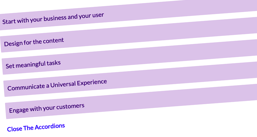
Here’s Gary illustrating a visual CSS solution. Commentators rightly observe the animation strategy can be improved and it otherwise looks and feels like a cool and mainstream accordion. There are a string of recent YouTube videos discovering the tag pair for the very first time. One or two claiming the tags are “new”. I had no idea the tags had been “parked” quite so deeply.
My heart positively skipped a beat. I cried out, “Yay! I can replace all my home-made HTML, CSS, and JavaScript accordions with details and summary.” However, my celebrations were short lived. My mind rallied. Typically, Gary gave me no confidence that the component he describes is accessible.
What is it?
The Web Hypertext Application Technology Working Group (WHATWG) HTML Living Standard — Last Updated 2 October 2020 offer the following:
The details element
- represents a disclosure widget from which the user can obtain additional information or controls.
- is not appropriate for footnotes.
- The
opencontent attribute is a boolean indicating that both thesummaryand the additional information inside thedetailselement is available to the user. When the attribute is absent, only thesummaryis available.
The summary element
- Is the expected child of the
detailselement - The first
summaryelement child of thedetailselement gives the summary or legend of the hidden content. - When there is no child
summaryelement, the user agent provides its own legend of “Details” to thedetailselement.
Working Together
The rest of the details element’s contents represents the information or controls available when the details element has the attribute of open (toggled on interaction with the summary).
In short, WHATWG is describing the interaction offered by an accordion. Only its architecture is subtly different: the summary element is the child of the details tag and acts as the interaction target like a button. It toggles the presentation of the details content without needing additional JavaScript. The browser API looks after the toggle, although JavaScript can be employed to add or subtract the open attribute. In our custom-built accordions, the button element sits outside the toggled content area.
The attraction is what the details tag can contain, which like custom accordions is any flow content. That’s handy.
Accessibility
In 2014, Léoni Watson’s, “Rock & roll guide to HTML5 & ARIA” [timestamp 18:33], she described using ARIA roles on the details and summary tags. Reading the contemporary W3C’s ARIA in HTML, W3C Editor’s Draft , the HTML page entries for Summary and Details describe each as:
- The
summarytag has a default or inferred role of “Button”. - The
detailstag has the default or inferred role of, “group”.
Additional ARIA can be added to both and the roles are not necessary. Progress. This implies a11y is available out of the box? Perhaps screen readers will even interpret the details tag’s open attribute? My excitement returns. And then I hesitated.
Is the details tag socialised?
I stopped. Breathed. And thought a moment. (Advice from Blue’s Clues). With all those early issues, is this really all ironed out? Is the details tag fully socialised now?
I hit the Interweb Search and my heart sank. Contemporary articles still question the details tag.
Even though the MDN Web Docs spells out the contemporary use of the tags, there remain many notes of caution on its MDN details and MDN summary pages.
Graham of Armfield of Hassle Inclusion (2019) revisits his list of requirements for an accessible accordion:
- Can be operated by a mouse click.
- Can be operated by touch – on smartphones, tablets or desktops/laptops with touch screens.
- Can be operated by keyboard – important for sighted keyboard-only users, and desktop/laptop screen reader users.
- Can be operated easily by speech recognition software, like Dragon NaturallySpeaking.
- Can be operated easily by users with screen magnification tools.
- Can be easily understood by screen readers – are they aware the component is interactive, and whether the content is hidden or not.
- It must be possible to close all the accordion panels if required.
- It is not reliant on JavaScript to reveal content
- The accordion should look good, and signal functionality to sighted users.
-
“…a final requirement should be added: that the solution is supported within browsers that people are using.”
Graham concludes that using details and summary is better than using poorly implemented accordions and not as good as a well-designed customs accordion component, which closely resembles my own accordions de jour.
No ARIA?
Graham omits the use of ARIA attributes in his testing, which is odd given his approach to accessibility. Perhaps we can improve on his grading of the details and summary pairing?
Implementing ARIA
The question is, is ARIA necessary and if so, does it improve the screen reader experience? This post is as good a test-bed as any. As I am writing in WordPress using Chrome browser, and I test VoiceOver with Safari, I’ll need to return with my findings later.
Test
In the following Figure 2, there are two details elements: one vanilla HTML and one with the ARIA expected of custom accordions.
Vanilla HTML
This details interaction is vanilla – straight out of the box.
With ARIA and JavaScript Support
This details is updated at run-time with ARIA attributes using JQuery. Refer to the following JavaScript section for details.
The runtime HTML of the second details block is as follows:
Before interaction (collapsed)
<details id="testBed">
<summary id="testBedButton" aria-controls="#testBed" aria-expanded="false">With ARIA and JavaScript Support</summary>
<p>content…</p>
</details>
After Interaction (expanded)
<details id="testBed" open="">
<summary id="testBedButton" aria-controls="#testBed" aria-expanded="true">With ARIA and JavaScript Support</summary>
<p>content…</p>
</details>
Result
In both examples in Figure 2, VoiceOver announces the Summary and the collapsed or expanded state of the panel. The ARIA appears to have made no difference when using Safari browser with VoiceOver. That’s actually unexpected and also all the more encouraging for the following assumptions:
- The
detailsandsummarypairing is nominally accessible ‘out of the box’. - We can use the
detailsandsummarypairing without ARIA, and therefore without JavaScript. - Legacy browser support may benefit from the ARIA and contemporary browsers are unaffected by it.
These assumptions need testing across a wider range of browser and alternative browsing technology solutions.
JavaScript
In Figure 2, JavaScript is used to add ARIA dynamically to the second details and summary pair. In this case using the JQuery library as follows:
//Set up the association between details and summary
$("#testBed>summary").attr("id","testBedButton");
$("#testBedButton").attr("aria-controls","#testBed");
$("#testBedButton").attr("aria-expanded","false");

//On clicking the Summary, update the ARIA expanded attribute to match state
$("#testBedButton").click(function(){
  if ($("#testBed").attr("open")==="open") {
    $("#testBedButton").attr("aria-expanded","false");
  } else {
    $("#testBedButton").attr("aria-expanded","true");
  }
});
Note. The JQuery deals with one instance using IDs to isolate its effect on this page. To apply to all instances, use CSS classes and consider next() or parent() methodologies to locate elements in the DOM.
As discovered by the test results, adding ARIA may be a nugatory task and needs further testing. At least we know it can be added if and when legacy browsers or assistive browsing technologies (ABT) require it.
Developer Mozilla offer a vanilla JavaScript on which to frame summary events:
details.addEventListener("toggle", event => {
  if (details.open) {
    /* the element was toggled open */
  } else {
    /* the element was toggled closed */
  }
});
Controlling a group or array of Details elements
We can also expand or collapse all or some instances of details. Where in the flow we place the control is important. I’ll discuss this in more detail in a following post. In summary, as visual users can perceive the number of details elements in an array and non-visual users cannot, placing the Expand All control before the array in the DOM is prudent, and perhaps a Collapse All control after.
It may also be prudent to place the array items within a list? Screen readers can then call out how many summary elements are available in the array.
Using CSS, we can visually position the control before or after the array, which visual users may prefer. As always it depends and we must test.
CSS Visual Styling
Overflow Issue
When writing this post, I noted the pre element in Figure 1, Question 3 visibly overflowed the details region’s right-hand-side border. Not knowing if this is a local WordPress or Theme issue, I tested a handful of ideas to solve the issue – there being nothing available in the first ten pages of Interweb Searching.
Figure 3. demonstrates both the vanilla issue and the CSS solution I thought of to implicitly declare the pre in the details region to have {box-sizing:border-box;}.
details element’s pre overflow issue and solution.Note. In these examples, the details is set to open.
The visual issue
The pre overflows outside the details group.
This <pre> element is not visibly constrained within the <details> group. It overflows, which may cause unwanted visual effects and hide characters when the viewport is narrowed.

The HTML:
<details>
<summary>The visual issue</summary>
<pre>
<!-- code -->
</pre>
</details>
The solution is to add, details pre {border-sizing:border-box;} to the details element’s style declaration.
The CSS solution
The pre is now visually constrained properly within the details group.
This <pre> element is now correctly constrained within the <details> group using the following CSS:

details pre {
box-sizing:border-box;
}
Smooth Transition
A smooth transition may be desirable and less jarring. You can find an example recipe on CSS Script.com, which relies on updating CSS classes with JavaScript in the same way our usual accessible accordion buttons. Essentially, and from what I can tell of the code without trying it, the details element still expands its summary as quickly as it ever did. The inner div tags carry the slower transition.
The benefit is that the interaction will remain available without JavaScript or CSS enabled.
A WiP. More on this later 🙂
Outstanding! Thank you for the explanation!