 Reading Time: 8 minutes
User interface (UI) arrays of primary, secondary, and tertiary “button” interactions are familiar. Does their content, taxonomic, and visual design assist or compound our inclusive experience?
Don’t expect straight answers. There’s more to styling and positioning buttons and links than meets the eye.
Problem
Adham Dannaway’s Post on LinkedIn proposes we underline the tertiary button label. I disagree.
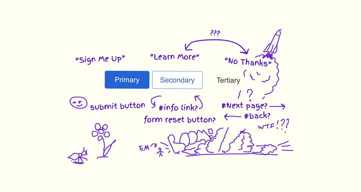
The pattern suggested as optimal with the underscore:
“Different styles ensure visual hierarchy is still clear in greyscale. Buttons don’t rely on colour alone to show they’re interactive.”
The pattern suggested as less optimal without the underscore:
“The colour blind won’t be able to tell that the tertiary button is interactive, as the only indicator that it’s interactive is colour.”
A troubled affordance?
Adham’s concern is that the tertiary interaction doesn’t present its affordance. It doesn’t look clickable and the underline will offer a clickable affordance.
Commentators all agreed that we should underline links by convention although and often, they’re not. In context, the interaction was likely a button. It didn’t matter that the primary and secondary interactions could also be links. There was no thought to underline their copy. It seemed that the border style gave the needed clickable affordance. The correct use of a button or link didn’t seem to figure.
We can program the interactions as buttons or links depending on the semantic task of each. Adham’s idea to underline the tertiary interaction indicates a link. When the interaction is a button, then its copy doesn’t fit “conventions” for styling a link. The underline then risks confusion.
Something’s not right. The underscore is either unnecessary or it confounds and confuses what are buttons and links. Perhaps we’ve so laser-focussed on the Three Stooges array pattern that we’ve lost our grip on proven UI layout and design?
Button and link mechanics
At our core and regardless of ability or HCI in play, we expect how to interact with buttons and links, and what each transaction is.
By convention our HTML button and link transactions do the following:
- Buttons update content.
- Links navigate to content.
Their native HTML HCI is each different. This determines how our consumers expect to action them when using their keyboard to control the UI:
- Buttons are actioned using the Space key.
- Links are actioned using the Enter key.
Button and link presentation
The problem is that when visual hubris steers visual design, we can overlook our users’ inclusive expectations. People using the keyboard as their HCI of choice want to see when a button is a button or a link.
A11y-101’s article, Button versus Link takes a puritan viewpoint as follows:
“Don’t confuse your users. A link should look like a link and not like some other element, in this case like a button. Links and buttons may “feel” the same for average users. They will use their mouse to hover over the link or the button and click on them with their mouse. But when using the keyboard and camouflaging a link as a button, things are bound to end in tears (well, they’re not going to work out as planned, that’s for sure).
I get the idea. You want to sell something. You need something that screams “Click me!” That’s okay when clicking on a button. I expect an immediate action. I don’t want to be redirected to a new page. Maybe even a marketing page with lots of copy on it. That is the opposite of ‘Buy me now!'”
I agree to a point and I wish it was so. However, that ship sailed long ago. We only need to limit the confusions our CTA patterns have created. Empathetic UI copywriting and accessible icons can help–to a point.
My response
It’s easy to criticise designers for “over thinking” problems and “perfectionism”. Yet, without detailed design thinking, research, and a growth mindset, how do will we achieve Brian Chesky’s “11-star” experiences?
Adham’s catch phrase is to, “sweat the small stuff”. I hope my reply to Adham’s Post is sweaty:
“I believe that the underscore is unnecessary and may add confusion and clutter.
We do underscore links by useful convention, and are these links or buttons, or links styled like buttons? The programmatic difference is blurred by visual design habit and remains important to assistive technology.
The tertiary style is in context with the Primary and Secondary styles. It shouldn’t display in isolation, and may confuse context with the underscore. Consider when proximal support links or dialog-opening buttons (styled however we choose) add to the visual hierarchy.
The priority is the copy and taxonomy. When these match the current task context and transaction offer or feature, then our solution becomes a cognitive trigger with or without vision.
The copy and correct choice of interaction types most assist people using screen readers too. Then, is the sequence of Primary, Secondary, and Tertiary fair to the audible experience? Visually we discern our choice. Using a screen reader it may be more efficient to position Tertiary, Secondary, and then Primary to save needing to cycle past every Primary action ‘just in case’. Then there’re the Yes (Primary) and No (Secondary) conundrum.
It depends. Hopefully helpfully!”
Design thinking
There’s quite a bit to unpack including the following:
- Should we style links as buttons?
- Should tertiary button copy be underlined by default?
- Does the array items’ taxonomy matter to the inclusive experience?
- Is the tertiary array item a misplaced link?
Should we style links as buttons?
By default, browsers render link copy contained between link anchor (a) tags as blue and with an underscore. On focus, an outline displays. We can use CSS to add, remove, and augment these default visual cues.
People using screen readers are informed of the link. They receive a clear announcement of what the interaction is, and of the copy contained between the a tags. This is regardless of visual style.
Native HTML button copy is contained within a border and on a solid background. On focus, an outline displays. The copy is not underlined.
We may believe that we shouldn’t mess with these native HTML conventions. And we do. We can usefully position and style links like their button cousins. We call our users to action by enhancing the link’s attractiveness and prioritising its click-ability. We also enslave links to fit our design system.
When anchor links were first styled for use from a screen, they were called buttons. Before computer HCI moved to the graphical user interface (GUI), operators pressed buttons, twisted dials, and slid sliders. These metaphors migrated to the GUI. Anchor links were new. Their semantic and transaction was different to the migrated UI. Browsers rendered them coloured blue and with an underline.
Today, we add the border and background to resemble a button again. It seems OK because we press (click) links and buttons with our pointing devices in our screen-based UI. “Everyone does it”. Even the least styled web pages like those on Wikipedia remove the default link underline and rely on colour alone to highlight their content. That’s a WCAG SC 1.4.1 infringement.
“This should not in any way discourage the use of color on a page, or even color coding if it is complemented by other visual indication.”
From WAI, Understanding Success Criterion 1.4.1: Use of Color
In truth, restyling buttons and links is the result of our institutionally ableist design practices. Designers tend to operate mice or pens, and work visually from a screen. Many of our consumers don’t. Is it OK to occlude them from our design thinking?
The core question and confusion
The core question is, should links look like buttons? Given the convention for underlining link copy, probably not.
The core confusion is our visual designers’ understanding of what buttons and links are. For example, a designer’s Post titled, “Getting to Know Buttons and Links” definitely confuses which is what and why.
I know of writing standards authored by content designers that claim buttons are icons, too. No! Buttons are a distinct UI element and links are another! Check out their code.
Coding buttons and links
It is essential to inclusive design to correctly code HTML buttons and links. When uncertain which one to use, apply this test:
- Does the component update the page content?
- Yes. It’s a button.
- No. It navigates to content and is a link.
- Does the component navigate to content?
- Yes. It’s a link.
- No. It updates content and is a button.
Accessibility and inclusion
Correct coding needs to include how the interaction and its transaction are communicated visually and to assistive technologies like screen readers.
For buttons, HTML offers attributes that can inform our users when a button submits or resets a form. Empathetic copywriting and design is essential to differentiate what work is submitted or abandoned.
For links, we can add a title attribute to inform non-visual users about the destination of the link. As with buttons, visual information can be added too, like an icon for help or support, information, and for links an indication of progress to the next or to an external document, and more.
But, oh! My poor brain! The W3 School’s Window history.back() page encourages us to use a button to navigate. We’re near doomed.
Elevating the experience
Empathetic UI copywriting and interaction patterns are essential!
We accept that the programming and styling of our pattern needs care in design. The visual experience offers a decision hierarchy. And what of our consumers listening to a screen reader?
As a visual user, we will quickly scan and understand the transactions on offer and may pick up on their taxonomy from recommended to abandonment. Our eyes move quickly back and forth, up and down, and build an impression of the offer in context the proximal tasks. A screen reader must approach content in a linear direction and in this case, from left to right.
Imagine the preceding six pages all had just one CTA of Next. Now we encounter the CTA copy, Submit. Should we expect to press Tab to search for alternative options of Reset and Cancel?
Perhaps we can consider reversing our spoken order of primary, secondary, and tertiary, and layout the array of options as tertiary, secondary, and then primary? Here’s an example.
Note: The Back interaction is encoded as a link and styled to look like a tertiary button.
The pattern from primary to tertiary:
The pattern reversed from tertiary to primary:
In our widest viewport, this looks OK. The Back button is positioned on the left of the array, which suggests the direction of travel back, or to the left in the flow. However, we’ve introduced two usability problems:
- In the narrow viewport, the buttons stack (
display:block;) and the visual hierarchy looks odd. - For the audible experience, we encounter Back and may not know there are two other actions available to us.
A solution is to add a touch of verbosity to the audible experience. We have options on how we can do this using ARIA, or positioning the buttons within a form’s fieldset, or a list. (When the buttons are all navigation links, then we could contain the list with a nav tag too?)
Caution! You may be tempted to program the buttons semantically as tertiary, secondary, and then primary, and then updating their visual position with CSS using flex-direction:row-reverse;. However, we then change the visual tab order and that will introduce other accessibility and usability problems.
Test the following using your screen reader. It will announce, “Finished? Select one of the following three options” before introducing the interaction group.
Is Back a discrete link?
This muse has reflected on Adham’s Three Stooges UI pattern of three interactions styled as buttons. It’s common to most design system outlines and shouldn’t prescribe the buttons are always arranged in an array.
But what if the array gets showtime in your product? Is that Back link the right UI choice?
We’ve reluctantly accepted the link will be styled like a button, even if the practice is based on ableist design habit and fashion. Is it really a member of the Three Stooges? It looks OK in the narrow viewport and positioned at the base of the stacked array. In wider viewports it positions to the right of the array.
Back button positioning ought to imply a direction of travel: left to go back and right to progress forward. In the wider viewport, the Back button is visually misplaced on the right of the array.
The Save Changes and Undo Changes buttons are form controls. The Back link is a navigation. Should it be grouped with the form controls? If not, then should it be positioned before or after the form and styled differently to the primary, secondary, and tertiary interactions?
Perhaps an alternative copy is available and the position is maintained? We could test Cancel, No Thanks, Not Now, or any other copy appropriate to the moment. The advantage to writing a non-directional copy is that when the navigation isn’t engineered as a step back in the browser history, we’ve not mislead our reader.
It depends
As with everything in design, it depends. Everything depends on our consumers, our task and device contexts, and of course our constraints and opportunities. However we plan our visual and audible experiences, they must work in the moment for all of our consumers.
Test, adjust, and deploy.