 Reading Time: 10 minutes
Prototype v.3. is now online in Beta.
Problem
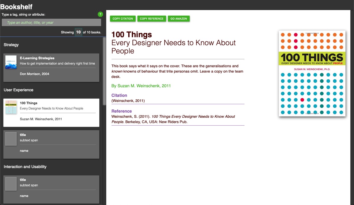
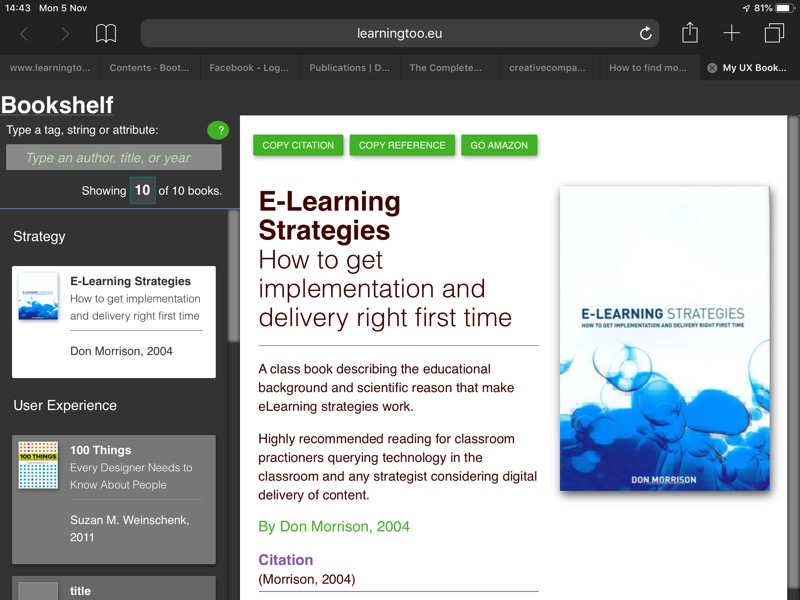
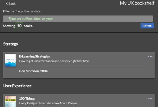
I created an online bookshelf to help me find and copy citations and references to paste into study documents. It works well when considering that I am not a developer and the page is a prototype.
In class, our tutor Stephan gave us a 50-min app design exercise to create a list app. The outcome resembled the Bookshelf page pattern, which I felt needed a refresh for more general use. It lacked grace.
Caveat
If you do not like the prototype’s visual presentation, then we can update the CSS. It’s THAT simple. Concentrate on content, architecture, functionality and usability for now.
Context: the original book list
Design
When creating the original bookshelf, referring to my Basic User Journey tool, offered a task and features framework to design against. I had clarity from the outset.
The original design was conceived to ease the journey I made to my Microsoft OneNote on OneDrive. The software is an excellent study and research aid and is ideal for managing collections of knowledge, stuff, and references.
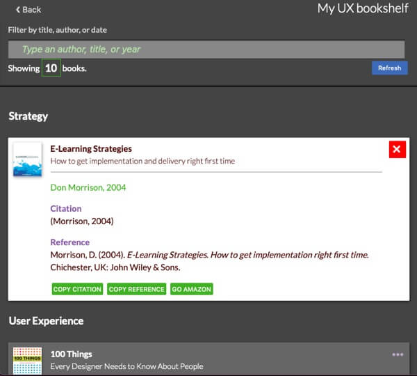
Dragging a cursor to select and copy from an alternative document is such a, well? A drag! Lazy? No. In the words of my study colleague, Goran Peuc during his Defuse 2104 presentation on YouTube, “Don’t make me work!” And accessing references and citations from a one-click library seemed an improvement to my own experience, especially when adding a filter facility.
Research
My original Basic User Journey explored my needs: open the page, find the resource, and copy the citation or reference. A link to Amazon.co.uk was desirable if referring colleagues to the volumes or to check for later editions.
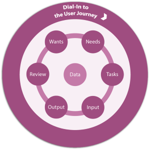
The new page needs to offer more, only without the luxury of user research. My Basic User Journey provides a frugal backstop and applies known knowns to feed the process and UI design. It helped to identify the ‘more’.
The Bookshelf’s Basic User Journey
At the page level, the Basic User Journey informs our content, features, and architecture including:
- content: page meta-data, title and heading; item heading, description, author, citation, and reference placeholders; interaction copy as required.
- the user’s cognitive, visual, and motor journey from page orientation to end-task (orient, find, select, review, act, exit)
- semantic HTML (headings and lists) usable without CSS or JS
- mobile-first, fluid responsive presentation
- feedback on interaction and transaction
- accessible and informative copy copy
- aria attributes where necessary
- a filter form with ‘for’ attributes on labels and focus-driven function
- a back to top link
- unobtrusive scripting
- visual and programmatic information architectures (articles, headings, paragraphs, divisions, lists or data tables, etc.)
We can use the Basic User Journey iteratively and apply it from the Universal Experience of the enterprise to the Universal Design of individual interactions. It surfaces our enterprise and user interests and considerations for each. It’s not a substitute to well resourced user research and is an adjunct to poor resourced design. It helps us think, analyse, and design from a user perspective aligned to our (known) enterprise goals.
The original design
Sketching flows indicated JavaScript was needed to make copying the references a programmatic experience.
A popular card or tiled list and display was the prime candidate around which to base the visual design.
Architecture: table vs. definition list
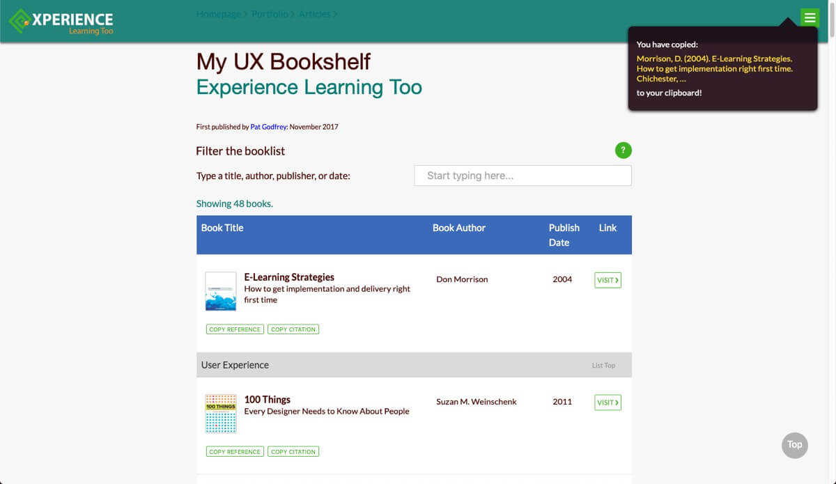
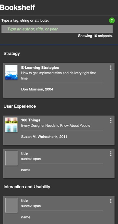
I read a great article by Jonathon Snook (2013, March 8) comparing listing items in tables or definition/description (DL) lists. Table layouts are renown for being difficult to navigate using alternative browser technologies unless correctly configured with meta-attributes. Tested against description lists, Snook found tables are narrowly more inclusive than definition/description lists.
Tables are also easy to make fluid-responsive. Not the (lazy) W3C responsive table: fully fluid-responsive. You can read my Inclusive and Responsive Table UX article where the Bookshelf table first grew legs. (A horrible pun and the only one I know.)
And that’s why the original Bookshelf list is a table – that and because there are some foibles when applying CSS to the definition list. Later, I added description lists to cells as it made semantic sense to do to give a usable presentation with CSS and JavaScript turned off in the browser.
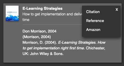
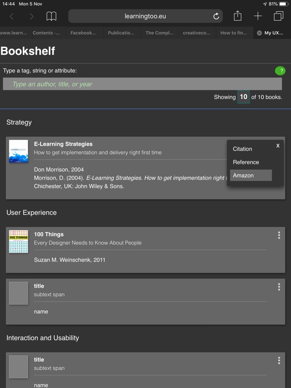
Note: The copy function does not work in iOS and some other mobile device browsers. The buttons are removed when these browsers are detected and the Help copy text is updated accordingly.
Prototyping
The prototype used HTML, CSS, and JavaScript. There was insufficient “process” to justify a round-trip with Axure, or other wireframing software. And, even with not being a developer, and as we work in the digital paradigm we should work within a digital paradigm, no? A little HTML helps me to communicate with my developer and engineering colleagues, too. (I give them so many laughs with my ambition outrunning learning I’m surprised they stay on their chair.)
The clarity of the design provided focus and direction.
Release
Using the stock CSS from my Experience Learning Too website, the prototype was published almost immediately I had satisfactory and functional results. It worked all in one evening. Done and not perfect: a minimal viable product tweaked every once in a while as my knowledge improved.
Updating the Bookshelf
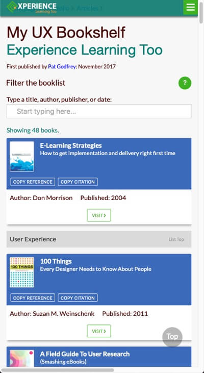
The 50-min app design resulted with an Adobe XD wireframe for a recipe list requiring a database from which to load content on demand. While sketching it, it quickly became a resource list. The new Bookshelf!
Without the necessary .PHP or similar skills, I used JavaScript to cloning one element’s HTML into another and to style the clone with CSS. It proved to be simple. The Bookshelf was about to get a make-over.
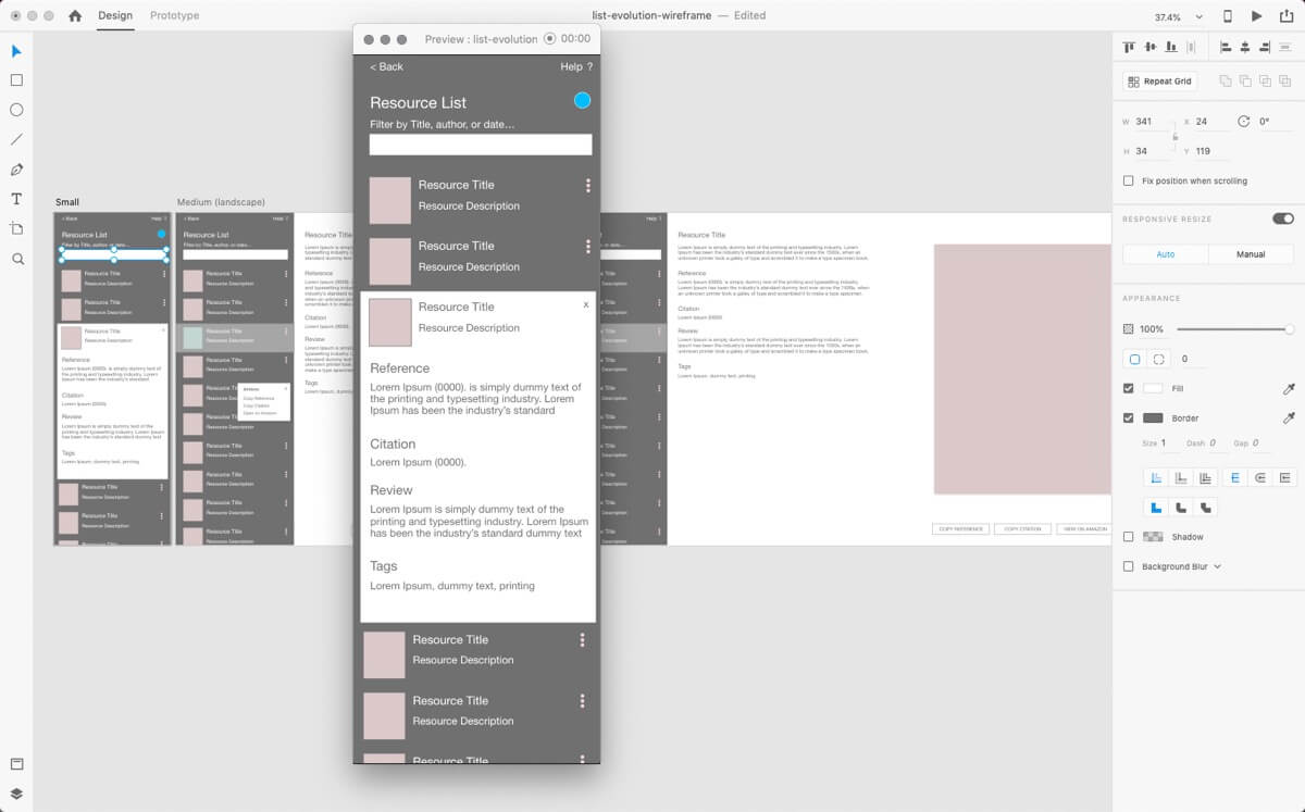
Wireframing
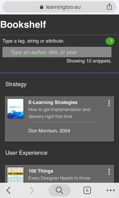
In the 50-min app design wireframe drawn in Adobe XD, the small viewport’s “Kebab” button expands hidden the content. I was considering the experience using a mobile device browser where a programmatic copy function is beyond my capability. I later added an options menu to the “Kebab” and found that introduced unneccessary work, and I reverted to the instant reveal, turning the “Kebab” 90-degrees to convey an ellipsis’ semantic of, “more”.
The “Kebab” survived to the wider viewport in the copy and paste. HTML prototyping and heuristic evaluation negated it altogether.
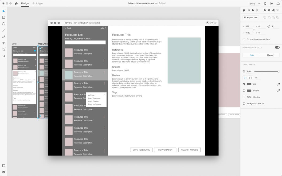
Prototype v.2
I had wanted to avoid a Fixed (CSS) presentation. CSS Grid and Table layouts initially failed to give me the panes effect I wanted across viewports.
A mix of Relative positioning in the small viewport and Fixed positioning in the larger viewport delivered the result. JavaScript called long strings of .parent().find() and .closest() , which was new to me and worked well to represent a database driven version planned for the future.
The Filter proved a little tricky to get working in the new architecture. I had modified the donor JS to the table layout and needed to remodel it to keep the function local to the list.
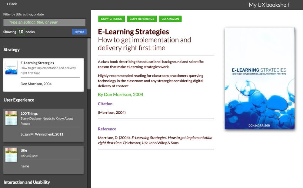
On clicking on the book card or tile in the larger viewport, the HTML is “projected” into the display panel on the right and re-styled for the new presentation.
Prototype v.2 testing
Testing on mobile devices raised some usability issues. Among them, the options menu was too fussy and precise for accurate finger poking. The heading was overwhelming the available real estate on small screens, too.
Update work
Work log raised by heuristic testing:
- Add Reset button to the filter.
- Update filter label, “Filter by title, author, or date”
- Update CSS finesse
- On Mobile browsers, hide the Copy buttons.
- Exchange Kebab Options menu button for Reveal interaction and toggle into Close.
- Consider a Select list for topic; e.g. User Experience. On Select topic, the books are grouped into divs that show when hiding none selected topics.
- Remove Help. The improved UI and Mobile browser restrictions negate its use.
- Update growler into toast LoRHS?
- Performance: Use Picture tag to load image resolutions by viewport width. SVG?
- In Mobile or smaller widths, reduce the scale of topic headings.
- Remove errant horizontal scroll artifact. (Investigate in Inspector).
- Retest.
To many, this prototype is a MVP (Minimal Viable Product): Done, and not Perfect. That’s fine. Only, it’s for me so I want better than done. So, to iterate…
Prototype v.3+
Iterative prototyping and testing identify issues and opportunities that wireframing alone fails to surface. Through using the interface and iteratively attacking needful pieces of code, the experience and functions began to meet expectations of the Basic User Journey, which guided them..
Improvements include:
- Improved functionality
- A Refresh button to reset the page
- The “Kebab” is turned sideways to convey an ellipses as we are revealing more content and not displaying a menu list.
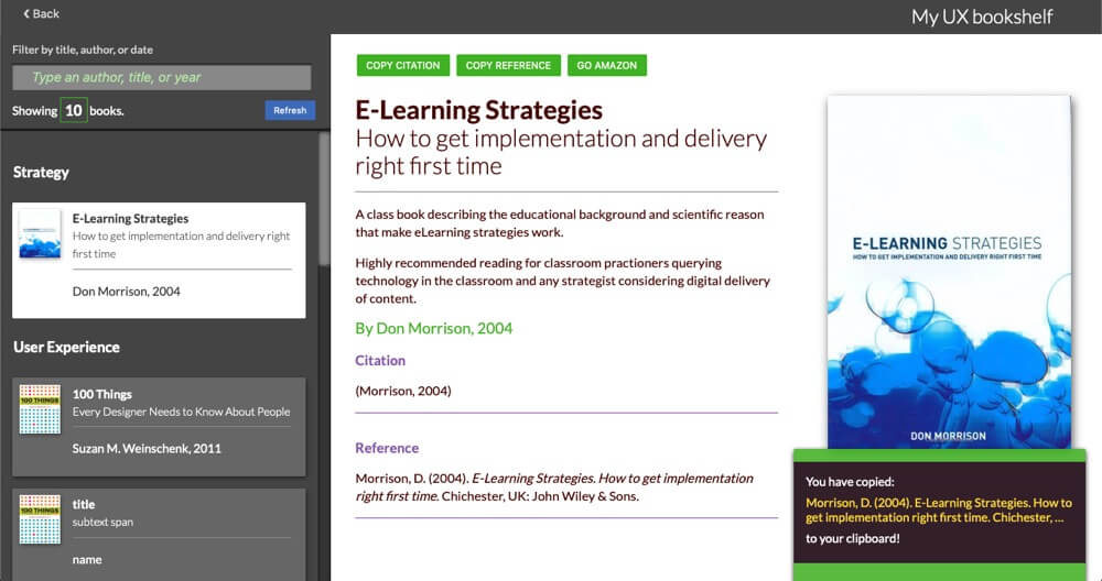
- The action buttons are removed programmatically when displayed in mobile browsers and remain when displayed in a narrow window on desktop, such as when working across multiple windows and documents at one time.
In larger viewports, the option buttons display is positioned at the top of the panel rather than at the base of the image as prescribed at design. This saves scrolling below the fold to find them – if our user knew they were there. They needed to be in view.
Presentation
The architecture is content first and HTML second. Presentation is CSS. Function is scripted.
CSS Grid
On having completed the Prototype v.3 build, I revisited and reapplied a CSS Grid.
I had made a rookie error in my calculating rows and columns correctly. The prototype layout is now CSS Grid with only a minor tweak needed to the JavaScript to deal with the display panel functionality. There remain a couple of quirks on page resizing and I see no reason not to complete the work in time.
Summary
The original Bookshelf is already useful and usable. I use the page daily to retrieve references. The visual search of the book covers or filtering by title, author, or date and the one-click Copy function are a winner.
I wanted to visually complicate it a little and to make it usable and useful to others as a side project. And it would make an excellent recipe collection pattern using a CMS or other database model. It’s just a prototype to stretch my brain and coding and there’s always another project.
And now back to our studies. Research.
Reference this post
Godfrey, P. (Year, Month Day). Title. Retrieved , from,